Some time ago I published an article on "The Cartographic Journal" regarding a method to automatically change the light azimuth in shaded relief representations.
This method was based on clustering the aspect derivative of the DTM. The method was developed originally in R and then translated into ArcGIS, with the use of model builder, so that it could be imported as a Toolbox.
The ArcGIS toolbox is available here: www.fabioveronesi.net/Cluster_Shading.html
Below is the Abstract of the article for more info:
Abstract
Manual shading, traditionally produced manually by specifically trained cartographers, is still considered superior to automatic methods, particularly for mountainous landscapes. However, manual shading is time-consuming and its results depend on the cartographer and as such difficult to replicate consistently. For this reason there is a need to create an automatic method to standardize its results. A crucial aspect of manual shading is the continuous change of light direction (azimuth) and angle (zenith) in order to better highlight discrete landforms. Automatic hillshading algorithms, widely available in many geographic information systems (GIS) applications, do not provide this feature. This may cause the resulting shaded relief to appear flat in some areas, particularly in areas where the light source is parallel to the mountain ridge. In this work we present a GIS tool to enhance the visual quality of hillshading. We developed a technique based on clustering aspect to provide a seamless change of lighting throughout the scene. We also provide tools to change the light zenith according to either elevation or slope. This way the cartographer has more room for customizing the shaded relief representation. Moreover, the method is completely automatic and this guarantees consistent and reproducible results. This method has been embedded into an ArcGIS toolbox.
Article available here: The Cartographic Journal
Today I decided to go back to R to distribute the original R script I used for developing the method.
The script is downloadable from here: Cluster_Shading_RSAGA.R
Both the ArcGIS toolbox and the R script are also available on my ResearchGate profile:
ResearchGate - Fabio Veronesi
Basically it replicates all the equations and methods presented in the paper (if you cannot access the paper I can send you a copy privately). The script loads a DTM, calculates slope and aspect with the two dedicated functions in the raster package; then it cluster aspect, creating 4 sets.
At this point I used RSAGA to perform the majority filter and the mean filter. Then I applied a sine wave equation to automatically calculate the azimuth value for each pixel in the raster, based on the clusters.
Zenith can be computed in 3 ways: constant, elevation and slope.
Constant is the same as the classic method, when the zenith value does not change in space. For elevation and slope, zenith changes according to weights calculated from these two parameters.
This allows the creation of maps with a white tone in the valleys (similar to the combined shading presented by Imhof) and a black tone that increases with elevation or slope.
Wednesday, 24 September 2014
Tuesday, 19 August 2014
Transform point shapefile to SpatStat object
Today I wanted to do some point pattern analysis in R using the fantastic package spatstat.
The problem was that I only had a point shapefile, so I googled a way to transform a shapefile into a ppp object (which is the point pattern object used by spatstat).
I found a method that involves the use of
The problem was that I only had a point shapefile, so I googled a way to transform a shapefile into a ppp object (which is the point pattern object used by spatstat).
I found a method that involves the use of
as.ppp(X) to transform both spatial points and spatial points data frames into ppp objects. The problem is when I tested with my dataset I received an error and I was not able to perform the transformation.So I decided to do it myself and I now want to share my two lines of code for doing it, maybe someone has has encountered the same problem and does not know how to solve it. Is this not the purpose of these blogs?
First of all, you need to create the window for the ppp object, which I think it is like a bounding box.
To do that you need to use the function owin.
This functions takes 3 arguments: xrange, yrange and units.
Because I assumed you need to give spatstat a sort of bounding box for your data, I imported a polygon shapefile with the border of my area for creating the window.
The code therefore looks like this:
library(raster)

library(spatstat)
border <- shapefile("Data/britain_UTM.shp")
window <- owin(xrange=c(bbox(border[1,1],bbox(border[1,2]),

yrange=c(bbox(border)[2,1],bbox(border)[2,2]),

unitname=c("metre","metres"))
Then I loaded my datafile (i.e. WindData) and used the window object to transform it into a point pattern object, like so:
WindData <- shapefile("Data/WindMeanSpeed.shp")
WindDataPP <- ppp(x=WindData@coords[,1],

y=WindData@coords[,2],

marks=WindData@data$MEAN,

window=window)
Now I can use all the functions available in spatstat to explore my dataset.
summary(WindDataPP)
@fveronesi_phd
Wednesday, 11 June 2014
Extract Coordinates and Other Data from KML in R
KML files are used to visualize geographical data in Google
Earth. These files are written in XML and allow to visualize places and to attach
additional data in HTML format.
In these days I am working with the MIDAS database of wind
measuring stations across the world, which can be freely downloaded here:
First of all, the file is in KMZ format, which is a
compressed KML. In order to use it you need to extract its contents. I used
7zip for this purpose.
The file has numerous entries, one for each point on the
map. Each entry generally looks like the one below:
<Placemark><visibility>0</visibility><Snippet>ABERDEEN: GORDON BARRACKS</Snippet><description><![CDATA[ <table> <tr><td><b>src_id:</b><td>14929 <tr><td><b>Name:</b><td>ABERDEEN: GORDON BARRACKS <tr><td><b>Area:</b><td>ABERDEENSHIRE <tr><td><b>Start date:</b><td>01-01-1956 <tr><td><b>End date:</b><td>31-12-1960 <tr><td><b>Postcode:</b><td>AB23 8 </table> <center><a href="http://badc.nerc.ac.uk/cgi-bin/midas_stations/station_details.cgi.py?id=14929">Station details</a></center> ]]></description><styleUrl>#closed</styleUrl><Point><coordinates>-2.08602,57.1792,23</coordinates></Point> </Placemark>
This chunk of XML code is used to show one point on Google Earth. The coordinates and the elevation of the points are shown between the <coordinates> tag. The <styleUrl> tag tells Google Earth to visualize this points with the style declared earlier in the KML file, which in this case is a red circle because the station is no longer recording.
If someone clicks on this point the information in HTML tagged as CDATA will be shown. The user will then have access to the source ID of the station, the name, the location, the start date, end date, postcode and link from which to view more info about it.
In this work I am interested in extracting the coordinates of each point, plus its ID and the name of the station. I need to do this because then I have to correlate the ID of this file with the ID written in the txt with the wind measures, which has just the ID without coordinates.
In maptools there is a function to extract coordinates and elevation, called getKMLcoordinates.
My problem was that I also needed the other information I mentioned above, so I decided to teak the source code of this function a bit to solve my problem.
#Extracting Coordinates and ID from KMLkml.text <-readLines("midas_stations.kml") re <- "<coordinates> *([^<]+?) *<\\/coordinates>" coords <-grep(re,kml.text) re2 <- "src_id:" SCR.ID <-grep(re2,kml.text) re3 <- "<tr><td><b>Name:</b><td>" Name <-grep(re3,kml.text) kml.coordinates <-matrix(0,length(coords),4,dimnames=list(c(),c("ID","LAT","LON","ELEV"))) kml.names <-matrix(0,length(coords),1)for(i in 1:length(coords)){sub.coords <- coords[i] temp1 <-gsub("<coordinates>"," ",kml.text[sub.coords]) temp2 <-gsub("</coordinates>"," ",temp1) coordinates <-as.numeric(unlist(strsplit(temp2,","))) sub.ID <- SCR.ID[i] ID <-as.numeric(gsub("<tr><td><b>src_id:</b><td>"," ",kml.text[sub.ID])) sub.Name <- Name[i] NAME <-gsub(paste("<tr><td><b>Name:</b><td>"),"",kml.text[sub.Name]) kml.coordinates[i,] <-matrix(c(ID,coordinates),ncol=4) kml.names[i,] <-matrix(c(NAME),ncol=1)}write.table(kml.coordinates,"KML_coordinates.csv",sep=";",row.names=F)
The first thing I had to do was import the KML in R. The function readLines imports the KML file and stores it as a large character vector, with one element for each line of text.
For example, if we look at the KML code shown above, the vector will look like this:
 kml.text <- c("<Placemark>", "<visibility>0</visibility>",
 "<Snippet>ABERDEEN: GORDON BARRACKS</Snippet>", ...
So if I want to access the tag <Placemark>, I need to subset the first element of the vector:
kml.text [1]This allows to locate the elements of the vector (and therefore the rows of the KML) where a certain word is present.
I can create the object re and use the function grep to locate the line where the tag <coordinates> is written. This method was taken from the function getKMLcoordinates.
By using other key words I can locate the lines on the KML that contains the ID and the name of the station.
Then I can just run a loop for each element in the coords vector and collect the results into a matrix with ID and coordinates.
Conclusions
I am sure that this is a rudimentary effort and that there are other, more elegant ways of doing it, but this was quick and easy to implement and it does the job perfectly.
NOTE
In this work I am interested only in stations that are still collecting data, so I had to manually filter the file by deleting all the <Placemark> for non-working stations (such as the one shown above).
It would be nice to find an easy way of filtering a file like this by ignoring the whole <Placemark> chunk if R finds this line:
<styleUrl>#closed</styleUrl>Any suggestions?
Wednesday, 2 April 2014
Merge .ASC grids with R
A couple of years ago I found online a script to merge several .asc grids into a single file in R.
I do not remember where I found it but if you have the same problem, the script is the following:
It is a simple and yet very affective script.
To use this script you need to put all the .asc grids into the working directory, the script will take all the file with extension .asc in the folder, turn them into raster layers and then merge them together and save the combined file.
NOTE:
if there are other file with ".asc" in their name, the function
will consider them and it may create errors later on. For example, if you are using ArcGIS to visualize your file, it will create pyramids files that will have the same exact name of the ASCII grid and another extension.
I need to delete these file and keep only the original .asc for this script and the following to work properly.
A problem I found with this script is that if the raster grids are not properly aligned it will not work.
The function merge from the raster package has a work around for this eventuality; using the option tolerance, it is possible to merge two grids that are not aligned.
This morning, for example, I had to merge several ASCII grids in order to form the DTM shown below:

The standard script will not work in this case, so I created a loop to use the tolerance option.
This is the whole script to use in with non-aligned grids:
The loop merge the first ASCII grid with all the other iteratively, re-saving the first grid with the newly created one. This way I was able to create the DTM in the image above.
I do not remember where I found it but if you have the same problem, the script is the following:
 setwd("c:/temp")
 library(rgdal)
 library(raster)


 # make a list of file names, perhaps like this:
 f <-list.files(pattern = ".asc")


 # turn these into a list of RasterLayer objects
 r <- lapply(f, raster)


 # as you have the arguments as a list call 'merge' with 'do.call'
 x <- do.call("merge",r)


 #Write Ascii Grid
 writeRaster(x,"DTM_10K_combine.asc")
It is a simple and yet very affective script.
To use this script you need to put all the .asc grids into the working directory, the script will take all the file with extension .asc in the folder, turn them into raster layers and then merge them together and save the combined file.
NOTE:
if there are other file with ".asc" in their name, the function
list.files(pattern = ".asc") will consider them and it may create errors later on. For example, if you are using ArcGIS to visualize your file, it will create pyramids files that will have the same exact name of the ASCII grid and another extension.
I need to delete these file and keep only the original .asc for this script and the following to work properly.
A problem I found with this script is that if the raster grids are not properly aligned it will not work.
The function merge from the raster package has a work around for this eventuality; using the option tolerance, it is possible to merge two grids that are not aligned.
This morning, for example, I had to merge several ASCII grids in order to form the DTM shown below:
The standard script will not work in this case, so I created a loop to use the tolerance option.
This is the whole script to use in with non-aligned grids:
 setwd("c:/temp")
 library(rgdal)
 library(raster)

 # make a list of file names, perhaps like this:
 f <-list.files(pattern = ".asc")

 # turn these into a list of RasterLayer objects
 r <- lapply(f, raster)


 ##Approach to follow when the asc files are not aligned
 for(i in 2:length(r)){
 x<-merge(x=r[[1]],y=r[[i]],tolerance=5000,overlap=T)
 r[[1]]<-x
 }

 #Write Ascii Grid
 writeRaster(r[[1]],"DTM_10K_combine.asc")
The loop merge the first ASCII grid with all the other iteratively, re-saving the first grid with the newly created one. This way I was able to create the DTM in the image above.
Monday, 3 March 2014
Plotting an Odd number of plots in single image
Sometimes I have the need to reduce the number of images for a presentation or an article. A good way of doing it is putting multiple plot on the same tif or jpg file.
R has multiple functions to achieve this objective and a nice tutorial for this topic can be reached at this link: http://www.statmethods.net/advgraphs/layout.html
The most common function is par. This function let the user create a table of plots by defining the number of rows and columns.
An example found in website above, is:
In this case I create a table with 3 rows and 1 column and therefore each of the 3 plot will occupy a single line in the table.
The limitation of this method is that I can only create ordered tables of plots. So for example, if I need to create an image with 3 plots, my options are limited:
 A plot per line, created with the code above, or a table of 2 columns and 2 rows:

However, for my taste this is not appealing. I would rather have an image with 2 plots on top and 1 in the line below but centered.
To do this we can use the function layout. Let us see how it can be used:
First of all I created a fake dataset:
The lines of code to create a single boxplot are the following:

I used the same options I explored in one of my previous post about box plots: BoxPlots
Notice however how the label of the y axes is bigger than the label on the x axes. This was done by using the option cex.lab = 1.5 in the boxplot function.
Also notice that the label on the x axes ("Time (days)") is two lines below the names. This was done by increasing the line parameter in the mtext call.
These two elements are crucial for producing the final image, because when we will plot the three boxplots together in a jpg file, all these elements will appear natural. Try different option to see the differences.
Now we can put the 3 plots together with the function layout.
This function uses a matrix to identify the position of each plots, in may case I use the function with the following options:
This creates a 2x11 matrix that looks like this:

The script is available here: Multiple_Plots_Script.r
R has multiple functions to achieve this objective and a nice tutorial for this topic can be reached at this link: http://www.statmethods.net/advgraphs/layout.html
The most common function is par. This function let the user create a table of plots by defining the number of rows and columns.
An example found in website above, is:
attach(mtcars)

par(mfrow=c(3,1))


hist(wt)

hist(mpg)

hist(disp)
In this case I create a table with 3 rows and 1 column and therefore each of the 3 plot will occupy a single line in the table.
The limitation of this method is that I can only create ordered tables of plots. So for example, if I need to create an image with 3 plots, my options are limited:
attach(mtcars)
par(mfrow=c(2,2))
hist(wt)
hist(mpg)
hist(disp)
However, for my taste this is not appealing. I would rather have an image with 2 plots on top and 1 in the line below but centered.
To do this we can use the function layout. Let us see how it can be used:
First of all I created a fake dataset:
I will use this data frame to create 3 identical boxplots.data<-data.frame(D1=rnorm(500,mean=2,sd=0.5), D2=rnorm(500,mean=2.5,sd=1), D3=rnorm(500,mean=5,sd=1.3), D4=rnorm(500,mean=3.5,sd=1), D5=rnorm(500,mean=4.3,sd=0.8), D6=rnorm(500,mean=5,sd=0.4), D7=rnorm(500,mean=3.3,sd=1.3))
The lines of code to create a single boxplot are the following:
This creates the following image:boxplot(data,par(mar = c(10, 5, 1, 2) + 0.1), ylab="Rate of Change (%)", cex.lab=1.5, names=c("24/01/2011","26/02/2011", "20/03/2011","25/04/2011","23/05/2011", "23/06/2011","24/07/2011"), col=c("white","grey","red","blue"), at=c(1,3,5,7,9,11,13), yaxt="n", las=2) axis(side=2,at=seq(0,8,1),las=2) abline(0,0) mtext("Time (days)",1,line=8,at=7) mtext("a)",2,line=2,at=-4,las=2,cex=2)
I used the same options I explored in one of my previous post about box plots: BoxPlots
Notice however how the label of the y axes is bigger than the label on the x axes. This was done by using the option cex.lab = 1.5 in the boxplot function.
Also notice that the label on the x axes ("Time (days)") is two lines below the names. This was done by increasing the line parameter in the mtext call.
These two elements are crucial for producing the final image, because when we will plot the three boxplots together in a jpg file, all these elements will appear natural. Try different option to see the differences.
Now we can put the 3 plots together with the function layout.
This function uses a matrix to identify the position of each plots, in may case I use the function with the following options:
layout(matrix(c(1,1,1,1,1,0,2,2,2,2,2,0,0,0,3,3,3,3,3,0,0,0), 2, 11, byrow = TRUE))
This creates a 2x11 matrix that looks like this:
1 1 1 1 1 0 2 2 2 2 2
0 0 0 3 3 3 3 3 0 0 0what this tells the function is:
- create a plotting window with 2 rows and 11 columns
- populate the first 5 cells of the first row with plot number 1
- create a space (that's what the 0 means)
- populate the remaining 5 spaces of the first row with plot number 2
- in the second row create 3 spaces
- add plot number 3 and use 5 spaces to do so
- finish with 3 spaces
The script is available here: Multiple_Plots_Script.r
Wednesday, 26 February 2014
Displaying spatial sensor data from Arduino with R on Google Maps
For
Christmas I decided to treat myself with an Arduino starter kit. I started
doing some basic experiments and I quickly found out numerous website that sell
every sort of sensor: from temperature and humidity, to air quality.
Long story short, I bought a
bunch of sensors to collect spatial data. I have a GPS, accelerometer/magnetometer,
barometric pressure, temperature/humidity, UV Index sensor.
Below is the picture of the
sensors array, still in a breadboard version. Of course I also had to use an
Arduino pro mini 3.3V and an openlog to record the data. Below the breadboard there
is a 2200mA lithium battery that provides 3.7V to the Arduino pro mini.

With this system I can collect 19
columns of data: Date, Time, Latitude and Longitude, Speed, Angle, Altitude,
Number of Satellites and Quality of the signal, Acceleration in X, Y and Z,
Magnetic field in X, Y and Z, Temperature, Humidity, Barometric Pressure, UV
Index.
With all these data I can have
some fun testing different plotting method on R. In particular I was interested
in plotting my data on Google Maps.
These are my results.
First of all I installed the
package xlsx, because I have to first import the data into Excel for some
preliminary cleaning. Sometimes the satellite sensor loses the connection and I
have to delete those entries, or maybe the quality of the signal is poor and
the coordinates are not reliable. In all these case I have to delete the entry
and I cannot do it in R because of the way the GPS write the coordinates.
In fact, the GPS
library, created by Adafruit, writes the coordinate in a format similar to
this: 4725.43N 831.39E
This is read into a string format
in R, so it requires a visual inspection to get rid of bad data.
This format is a combination of
degrees and minutes, so it needs to be cleaned up before use. In the example
above, the real coordinate in decimal degrees in calculated using the following
formula:
47 + 25.43/60 N 8 + 31.39/60 E
Luckily, the fact that R
recognises it as a string facilitates this transformation. With the following
two lines of code I can transform each entry into a format that I can use:
UPDATE 28.02.2014:data$LAT <- as.numeric(substr(paste(data[,"Lat"]),1,2)) + as.numeric(substr(paste(data[,"Lat"]),3,7))/60data$LON <- as.numeric(substr(paste(data[,"Lon"]),1,1)) + as.numeric(substr(paste(data[,"Lon"]),2,6))/60
I found this website http://arduinodev.woofex.net/2013/02/06/adafruit_gps_forma/ where the author suggest a function to convert the coordinates in decimal degrees directly within the arduino code. I tried it and it works perfectly.
Then I assign these two columns as coordinate for the file with the sp package and set the projection to WGS84.
Now I can start working on
visualising the data. I installed two packages: plotGoogleMaps and RgoogleMaps
The first is probably the
simplest to use and let the user create a javascript page to plot the data from
R to google maps through the google maps API. The plot is displayed into the
default web browser and it looks extremely good.
With one line of code I can plot
the temperature for each spatial point with bubble markers:
plotGoogleMaps(data,zcol="Temp")
"Temp" is the name of the column in the SpatialPointsDataFrame that has the temperature data.

By adding an additional line of
code I can set the markers as coloured text:
ic=iconlabels(data$Temp, height=12)
plotGoogleMaps(data,iconMarker=ic,zcol="Temp")

The package RgoogleMaps works
differently, because it allows the user to plot google maps as background for
static plots. This creates less stunning results but also allows more
customisation of the output. It also requires a bit more work.
In this example, I will plot the
locations for which I have a data with the road map as background.
I first need to create the map
object and for centre the map in the centre of the area I visited, I used the
bounding box of my spatial dataset:
box<-bbox(data)
Map<-GetMap(center = c(lat =(box[2,1]+box[2,2])/2, lon = (box[1,1]+box[1,2])/2), size = c(640, 640),zoom=16,maptype = c("roadmap"),RETURNIMAGE = TRUE, GRAYSCALE = FALSE, NEWMAP = TRUE)
Then I need to transform the
spatial coordinates into plot coordinates:
tranf=LatLon2XY.centered(Map,data$LAT, data$LON, 16)x=tranf$newXy=tranf$newY
this function creates a new set
of coordinates optimised for the zoom of the Map I created above.
At this point I can create the
plot with the following two lines:
PlotOnStaticMap(Map)points(x,y,pch=16,col="red",cex=0.5)
as you would do with any other
plot, you can add points to the google map with the function points.

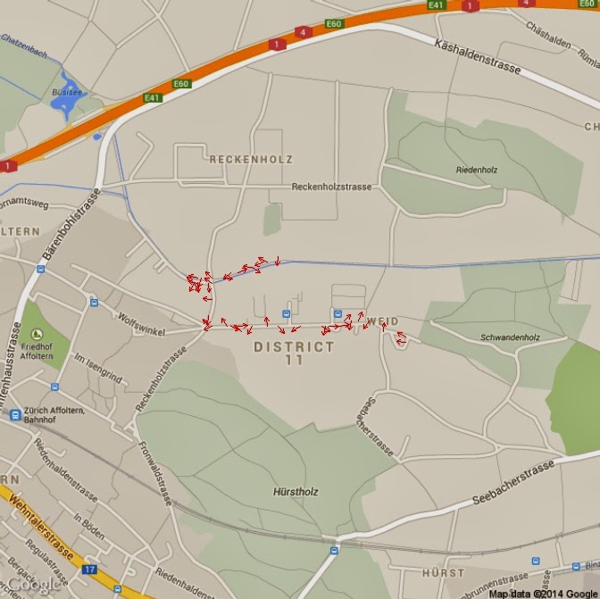
As I mentioned above, this
package creates less appealing results, but allows you to customise the output.
In the following example I will compute the heading (the direction I was
looking at) using the data from the magnetometer to plot arrows on the map.
I computed the heading with these
lines:
Isx = as.integer(data$AccX)
Isy = as.integer(data$AccY)
heading = (atan2(Isy,Isx) * 180) / piheading[heading<0]=360+heading[heading<0]
I did not tilt compensated the
heading because the sensor was almost horizontal all the times. If you need
tilt compensation, please look at the following websites for help:
http://theccontinuum.com/2012/09/24/arduino-imu-pitch-roll-from-accelerometer/
With the heading I can plot
arrows directed toward my heading with the following loop:
PlotOnStaticMap(Map)for(i in 1:length(heading)){
if(heading[i]>=0 & heading[i]<90){arrows(x[i],y[i],x1=x[i]+(10*cos(heading[i])), y1=y[i]+(10*sin(heading[i])),length=0.05, col="Red")}
if(heading[i]>=90 & heading[i]<180){arrows(x[i],y[i],x1=x[i]+(10*sin(heading[i])), y1=y[i]+(10*cos(heading[i])),length=0.05, col="Red")}
if(heading[i]>=180 & heading[i]<270){arrows(x[i],y[i],x1=x[i]-(10*cos(heading[i])), y1=y[i]-(10*sin(heading[i])),length=0.05, col="Red")}
if(heading[i]>=270 & heading[i]<=360){arrows(x[i],y[i],x1=x[i]-(10*sin(heading[i])), y1=y[i]-(10*cos(heading[i])),length=0.05, col="Red")}
}
I also tested the change of the
arrow length according to my speed, using this code:
length=data$Speed.Km.h.*10for(i in 1:length(heading)){if(heading[i]>=0 & heading[i]<90){arrows(x[i],y[i],x1=x[i]+(length[i]*cos(heading[i])), y1=y[i]+(length[i]*sin(heading[i])),length=0.05, col="Red")}if(heading[i]>=90 & heading[i]<180){arrows(x[i],y[i],x1=x[i]+(length[i]*sin(heading[i])), y1=y[i]+(length[i]*cos(heading[i])),length=0.05, col="Red")}if(heading[i]>=180 & heading[i]<270){arrows(x[i],y[i],x1=x[i]-(length[i]*cos(heading[i])), y1=y[i]-(length[i]*sin(heading[i])),length=0.05, col="Red")}if(heading[i]>=270 & heading[i]<=360){arrows(x[i],y[i],x1=x[i]-(length[i]*sin(heading[i])), y1=y[i]-(length[i]*cos(heading[i])),length=0.05, col="Red")}}
However, the result is not
perfect because in some occasions the GPS recorded a speed of 0 km/h, even
though I was pretty sure to be walking.
The arrow plot looks like this:
Subscribe to:
Comments (Atom)