In this post I will briefly discuss ways to create interactive plots of the results of the point pattern analysis using the Google Maps API and Leaflet from R.
Number of Crimes by Borough
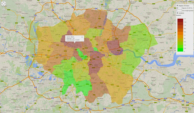
In the previous post we looped through the GreaterLondonUTM shapefile to extract the area of each borough and then counted the number of crimes within its border. To show the results we used a simple barplot. Here I would like to use the same method I presented in my post Interactive Maps for the Web to plot these results on Google Maps.
This post is intended to be a continuation of the previous, so I will not present again the methods and objects we used in the previous experiment. To make this code work you can just copy and paste it below the code you created before and it should work just fine.
First of all, let's create a new object including only the names of the boroughs from the GreaterLondonUTM shapefile. We need to do this because otherwise when we will click on a polygons on the map it will show us a long list of useless data.
GreaterLondon.Google <- GreaterLondonUTM[,"name"]
The new object has only one column with the name of each borough.
Now we can create a loop to iterate through these names and calculate the intensity of the crimes:
Borough <- GreaterLondonUTM[,"name"]

for(i in unique(GreaterLondonUTM$name)){
sub.name <- Local.Intensity[Local.Intensity[,1]==i,2]

Borough[Borough$name==i,"Intensity"] <- sub.name

Borough[Borough$name==i,"Intensity.Area"] <- round(sub.name/(GreaterLondonUTM[GreaterLondonUTM$name==i,]@polygons[[1]]@area/10000),4)
}
As you can see this loop selects one name at the time, then subset the object Local.Intensity (which we created in the previous post) to extract the number of crimes for each borough. The next line attach this intensity to the object Borough as a new column named Intensity. However, the code does not stop here. We also create another column named Intensity.Area in which we calculate the amount of crimes per unit area. Since the area from the shapefile is in square meters and the number were very high, I though about dividing it by 10'000 in order to have a unit area of 10 square km. So this column shows the amount of crime per 10 square km in each borough. This should correct the fact that certain borough have a relatively high number of crimes only because their area is larger than others.
Now we can use again the package plotGoogleMaps to create a beautiful visualization of our results and save it in HTML so that we can upload it to our website or blog.
The code for doing that is very simple and it is presented below:
plotGoogleMaps(Borough,zcol="Intensity",filename="Crimes_Boroughs.html",layerName="Number of Crimes", fillOpacity=0.4,strokeWeight=0,mapTypeId="ROADMAP")
I decided to plot the polygons on top of the roadmap and not on top of the satellite image, which is the default for the function. Thus I added the option mapTypeId="ROADMAP".
The result is the map shown below and at this link: Crimes on GoogleMaps

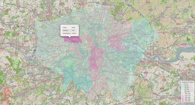
In the post Interactive Maps for the Web in R I received a comment from Gerardo Celis, whom I thank for it, telling me that now in R is also available the package leafletR, that allows us to create interactive maps based on Leaflet. So for this new experiment I decided to try it out!
I started from the sample of code presented here: https://github.com/chgrl/leafletR and I adapted with very few changes to my data.
The function leaflet does not work directly with Spatial data, we first need to transform them into GeoJSON with another function in leafletR:
Borough.Leaflet <- toGeoJSON(Borough)
Extremely simple!!
Now we need to set the style to use for plotting the polygons using the function styleGrad, which is used to create a list of colors based on a particular attribute:
In this function we need to set several options:
pro = is the name of the attribute (as the column name) to use for setting the colors
breaks = this option is used to create the ranges of values for each colors. In this case, as in the example, I just created a sequence of values from the minimum to the maximum. As you can see from the code I added 15 to the maximum value. This is because the number of breaks needs to have 1 more element compared to the number of colors. For example, if we set 10 breaks we would need to set 9 colors. For this reason if the sequence of breaks ends before the maximum, the polygons with the maximum number of crimes would be presented in grey.
This is important!!
style.val = this option takes the color scale to be used to present the polygons. We can select among one of the default scales or we can create a new one with the function color.scale in the package plotrix, which I already discussed here: Downloading and Visualizing Seismic Events from USGS
leg = this is simply the title of the legend
fill.alpha = is the opacity of the colors in the map (ranges from 0 to 1, where 1 is the maximum)
lwd = is the width of the line between polygons
After we set the style we can simply call the function leaflet to create the map:
leaflet(Borough.Leaflet,popup=c("name","Intensity","Intensity.Area"),style=map.style)
In this function we need to input the name of the GeoJSON object we created before, the style of the map and the names of the columns to use for the popups.
The result is the map shown below and available at this link: Leaflet Map
I must say this function is very neat. First of all the function plotGoogleMaps, if you do not set the name of the HTML file, creates a series of temporary files stored in your temp folder, which is not great. Then even if you set the name of the file the legend is saved into different image files every time you call the function, which you may do many times until you are fully satisfied the result.
The package leafletR on the other hand creates a new folder inside the working directory where it stores both the GeoJSON and the HTML file, and every time you modify the visualization the function overlays the same file.
However, I noticed that I cannot see the map if I open the HTML files from my PC. I had to upload the file to my website every time I changed it to actually see these changes and how they affected the plot. This may be something related to my PC, however.
Density of Crimes in raster format
As you may remember from the previous post, one of the steps included in a point pattern analysis is the computation of the spatial density of the events. One of the techniques to do that is the kernel density, which basically calculates the density continuously across the study area, thus creating a raster.
We already looked at the kernel density in the previous post so I will not go into details here, the code for computing the density and transform it into a raster is the following:
The first lines is basically the same we used in the previous post. The only difference is that here I added the option W to set the resolution of the map with eps at 100x100 m.
Then I simply transformed the first object into a raster and assign to it the same UTM projection of the object GreaterLondonUTM.
Now we can create the map. As far as I know (and for what I tested) leafletR is not yet able to plot raster objects, so the only way we have of doing it is again to use the function plotGoogleMaps:
plotGoogleMaps(Density.raster,filename="Crimes_Density.html",layerName="Number of Crimes", fillOpacity=0.4,strokeWeight=0,colPalette=rev(heat.colors(10)))
When we use this function to plot a raster we clearly do not need to specify the zcol option. Moreover, here I changed the default color scale using the function colPalette to a reverse heat.colors, which I think is more appropriate for such a map. The result is the map below and at this link: Crime Density
Density of Crimes as contour lines
The raster presented above can also be represented as contour lines. The advantage of this type of visualization is that it is less intrusive, compared to a raster, and can also be better suited to pinpoint problematic locations.
Doing this in R is extremely simple, since there is a dedicated function in the package raster:
Contour <- rasterToContour(Density.raster,maxpixels=100000,nlevels=10)
This function transforms the raster above into a series of 10 contour lines (we can change the number of lines by changing the option nlevels).
Now we can plot these lines to an interactive web map. I first tested again the use of plotGoogleMaps but I was surprised to see that for contour lines it does not seem to do a good job. I do not fully know the reason, but if I use the object Contour with this function it does not plot all the lines on the Google map and therefore the visualization is useless.
For this reason I will present below the lines to plot contour lines using leafletR:
Contour.Leaflet <- toGeoJSON(Contour)

colour.scale <- color.scale(1:(length(Contour$level)-1),color.spec="rgb",extremes=c("red","blue"))
map.style <- styleGrad(pro="level",breaks=Contour$level,style.val=colour.scale,leg="Number of Crimes", lwd=2)
leaflet(Contour.Leaflet,style=map.style,base.map="tls")
As mentioned, the first thing to do to use leafletR is to transform our Spatial object into a GeoJSON; the object Contour belongs to the class SpatialLinesDataFrame, so it is supported in the function toGeoJSON.
The next step is again to set the style of the map and then plot it. In this code I changed a few things just to show some more options. The first thing is the custom color scale I created using the function color.scale in the package plotrix. The only thing that the function styleGrad needs to set the colors in the option style.val is a vector of colors, which must be long one unit less than the vector used for the breaks. In this case the object Contour has only one property, namely "level", which is a vector of class factor. The function styleGrad can use it to create the breaks but the function color.scale cannot use it to create the list of colors. We can work around this problem by setting the length of the color.scale vector using another vector: 1:(length(Contour$level)-1, which basically creates a vector of integers from 1 to the length of Contours minus one. The result of this function is a vector of colors ranging from red to blue, which we can plug in in the following function.
In the function leaflet the only thing I changed is the base.map option, in which I use "tls". From the help page of the function we can see that the following options are available:
"One or a list of
"osm" (OpenStreetMap standard map), "tls" (Thunderforest Landscape), "mqosm" (MapQuest OSM), "mqsat" (MapQuest Open Aerial),"water" (Stamen Watercolor), "toner" (Stamen Toner), "tonerbg" (Stamen Toner background), "tonerlite" (Stamen Toner lite), "positron" (CartoDB Positron) or "darkmatter" (CartoDB Dark matter). "These lines create the following image, available as a webpage here: Contour
R code snippets created by Pretty R at inside-R.org


Hello,
ReplyDeleteWhen I did the step of which shows below error. Could you please kindly help to advise if anything went wrong? Thanks.
> GreaterLondon.Google <- GreaterLondonUTM[,"name"]
> Borough <- GreaterLondonUTM[,"name"]
> for(i in unique(GreaterLondonUTM$name)){
+ sub.name <- Local.Intensity[Local.Intensity[,1]==i,2]
+ Borough[Borough$name==i,"Intensity"] <- sub.name
+ Borough[Borough$name==i,"Intensity.Area"] <- round(sub.name/(GreaterLondonUTM[GreaterLondonUTM$name==i,]@polygons[[1]]@area/10000),4)
+ }
Error in `[<-.data.frame`(`*tmp*`, i, j, value = numeric(0)) :
replacement has length zero
> plotGoogleMaps(Borough,zcol="Intensity",filename="Crimes_Boroughs.html",layerName="Number of Crimes", fillOpacity=0.4,strokeWeight=0,mapTypeId="ROADMAP")
Error in `[.data.frame`(SP@data, , zcol) : undefined columns selected
Hi Fabio, i must say you have created awesome plots but i am facing a problem with step
ReplyDeleteDensity <- density.ppp(Drugs.ppp, sigma = 500,edge=T,W=as.mask(window,eps=c(100,100)))
its showing this error
Error in im(Re(sm)[1:nr, 1:nc], xcol.pad[1:nc], yrow.pad[1:nr], unitname = unitsX) :
Cannot determine pixel width
In addition: Warning message:
In as.mask(window, eps = c(100, 100)) :
pixel size parameter eps > size of window
Can you please help with this.
Hi,
DeleteIs this the only error you have?