Showing posts with label earthquakes. Show all posts

Saturday, 2 July 2016

Combining ArcGIS and R - Clustering Toolbox

Last year at the ESRI User Conference in San Diego, there was an announcement of an initiative to bridge ArcGIS and R. This became reality I think early this year with R-Bridge.
Basically, ESRI has created an R library that is able to communicate and exchange data between ArcGIS and R, so that we can create ArcGIS toolboxes using R scripts.

I am particularly interested in this application because R has become quite powerful for spatial data analysis in the last few years. However, I have the impression that within the geography community, R is still considered a bit of an outsider. This is because the main GIS application, i.e. ArcGIS, is based on Python and therefore courses in departments of geography and geomatics tend to focus on teaching Python, neglecting R. This I think is a mistake, since R in my opinion is easier to learn for people without a background in computer science, and has very powerful libraries for spatio-temporal data analysis.
For these reasons, the creation of the R-Bridge is particularly welcomed from my side because it will allow me to teach students how to create powerful new Toolboxes for ArcGIS based on scripts created in R. For example, this Autumn semester we will implement in the course of GIS III a module about geo-sensors, and then I will teach spatio-temporal data analysis using R within ArcGIS. This way students will learn the power of R starting from the familiar environment and user interface of ArcGIS.
Since I never worked with R-Bridge before, Today I started doing some testing and I decided that the best way to learn it was to create a simple Toolbox to do K-Means clustering on point shapefiles, which I think is a function not available in ArcGIS. In this post I will describe in details how to create the Toolbox and the R Script to perform the analysis.

R-Bridge Installation
Installing R-Bridge is extremely simple. TYou only need a recent  version of R (I have the 3.0.0) installed on your PC (32-bit or 64-bit, consistent with the version of ArcGIS you have installed) and ArcGIS 10.3.1 or more recent.
At this point you can download the installation files from the R-Bridge GitHub page: https://github.com/R-ArcGIS/r-bridge-install
You can unzip its content anywhere on your PC. At this point you need to run ArcGIS as aministrator (this is very important!!), and then in the ArcCatalog navigate to the folder where you unzip the zip you just downloaded.


Now you just need to run the script "Install R Bindings" and ArcGIS will take care of the rest. I found the process extremely easy!!

Getting Started
ESRI created two examples to help us get started with the development of packages for ArcGIS written in the R language. You can find it here: https://github.com/R-ArcGIS/r-sample-tools
When you unzip this you will find a folder named "Scripts" where you can find R scripts optimized for the use in ArcGIS. I started from these to learn how to create scripts that work.


Clustering Example - R Script
As I said, ESRI created a specific library for R to be able to communicate back and forth with ArcGIS: it is called "arcbinding" and it is installed during the installation process we completed before. This library has a series of functions that allow the R script to be run starting from the ArcGIS console and its GUI. For this reason the R script is a bit different compared to the one you would do to reach the same result outside of ArcGIS. Probably it is better if I just start including some code so that you can better understand.
Below is the full R script I used for this example:

### KMeans Clustering Toolbox
##Author: Fabio Veronesi
tool_exec <- function(in_params, out_params)
{
  if (!requireNamespace("sp", quietly = TRUE))
    install.packages("sp")
  require(sp)
 
  print("K-Means Clustering of Shapefiles")
  print("Author: Fabio Veronesi")
 
  source_dataset = in_params[[1]]
  nclust = in_params[[2]]
  variable = in_params[[3]]
 
  out_shape = out_params[[1]]
 
  ### Read Data
  arc.progress_label("Loading Dataset")
  d <- arc.open(source_dataset)
 
 
  ### Create a Data.Frame with the variables to cluster
  data <- arc.select(d, variable)
  data_clust <- data.frame(data[,variable[1]])
 
 
  if(length(variable)>1){
 for(i in 2:length(variable)){
  data_clust <- cbind(data_clust,data[,variable[i]])
 }
  }
 
  names(data_clust) <- variable
 
  for(i in 1:length(variable)){
 dev.new()
 plot(hist(data_clust[,i]),main=paste0("Histogram of ",variable[i]),xlab=variable[i])
  }
 
  clusters <- kmeans(data_clust, nclust)
 
  result <- data.frame(cluster=clusters$cluster)
 
  arc.write(out_shape, result, coords = arc.shape(data))
 
  print("Done!!")
  return(out_params)
}
Created by Pretty R at inside-R.org

As you can see, the whole script is wrapped in a function called tool_exec with two arguments in_params and out_params. These are the list of input and output parameters that will be passed to R from ArcGIS.
The next three lines are taken directly from the script that ESRI provides. Basically, if the user does not have the package sp installed, R will download, install and load it. You can copy and paste these lines if you need other packages installed on the user's machine to perform your analysis. In this case I am only using the function kmeans, available in the package stats, which is loaded by default in R.
At this point I inserted two print calls with the title and my name on them. This has no real purpose except to let you know that you can print information from R directly onto the dialog in ArcGIS with simple print calls. We will see at the end how they look.
Now we need to create an object for each input and output parameter you need. We will need to specify these in ArcGIS once we create the Toolbox. Since I want to cluster a shapefile, the first input parameter will be this object. Then I want the user to select the number of clusters, so I will create another option for this. Then I would like the user to be able to select the variables s/he wants to use for clustering, so I will need to create an option for this in ArcGIS and then collect it into the object variable. Finally, ArcGIS will save another shapefile with the points plus their cluster. This will be the only output parameter, and I collect it into the object out_shape.

Now I can start the real computation. The function arc.open allows to import in R the shapefile from the Toolbox in ArcGIS. If you want you can take a look at the structure of this object by simply inserting print(str(d)) right after it. This will print the structure of the object d in the dialog created in ArcGIS.
Now we have the function arc.select, which allows to extract from d only the variables we need and that are selected by the user on the Toolbox GUI.
At this point we need to create a data.frame that we are going to fill with only the variables the user selected in the Toolbox. The object variable is a list of strings, therefore we can use its elements to extract single columns from the object data, with the syntax data[,variable[1]].
Since we do not know how many variables will users select and we do not want to limit them, I created an if statement with a loop to attach additional columns to the object data_clust. Then I replaced the column names in data_clust with the names of the variables, this will help me in the next phase.
Now in fact, I want to produce histograms of the variables the user selected. This will allow me to check whether what I am about to do makes sense, and it is one of those things for which R excels. For this I can simply call the function plot and R will show it even if it is called from ArcGIS, as simple as that!! We only need to remember to insert dev.new() so that each plot is created separately and the user can see/save them all.
After this step we can call the function kmeans to cluster our data. Then we can collect the results in a new data.frame, and finally use the function arc.write to write the object out_shape with the results. As you can see we also need to specify the coordinates of each point and this can be done calling the function arc.shape.
Then we print the string "Done!!" and return the output parameters, that will be taken from ArcGIS and shown to the user.


Toolbox
Now that we've seen how to create the R script we can take a look at the Toolbox, since both things need to be done in parallel.
Creating a new Toolbox in ArcGIS is very simple, we just need to open ArcCatalog, click where we want to create it with the right mouse button and then select New->Toolbox.


Once this is done we will then need to add, within this Toolbox, a script. To do this we can again click with the right button on the Toolbox we just created and then select Add->Script...


At this point a dialog will appear where we can set the parameters of this script. First we add a title and a label and click proceed (my PC runs with Italian as the local language, sorry!!)


Then we need to select the R script we need to run. Since the creation of the Toolbox can also be done before taking care of the script, here we can select an R script not completed and ArcGIS will not have any problem. This is what I did to create this example, so that I could debug the R script using print calls and looking at the results on the ArcGIS dialog.


The next window is very important, because it allows us to set the input and output parameters that will then be passed to R. As we saw in the R script here I set 4 parameters, 3 inputs and 1 output. It is important that the order matches what we have in the R script, so for example the number of clusters is the second input.


The first parameter is the input data. For this I used the type "Table View", which allows the user to select a dataset s/he already imported in ArcGIS. I selected this because usually I first load data into ArcGIS, check them, and then perform some analysis. However, if you prefer I think you could also select the type shapefile, to allow users to select a shp directly from their PC.
The next parameter is the number of clusters, which is a simple number. Then we have the field variables. This is very important because we need to set it in a way that allow users to select variables directly from the dataset we are importing.


We can do that by setting the options "Filter" and "Obtained from" that you see in the image above. It is important that we set "Obtained from" with the name of our input data.
At this point we can set the output file, which is a shapefile.
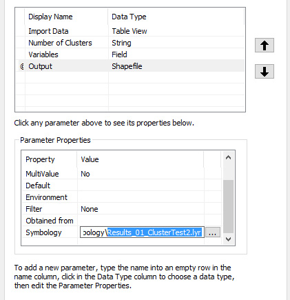


One thing we could do is set the symbology for the shapefile that will be created at the end of the script. To do so we need to create and set a layer file. I did it by changing the symbology to another shapefile and then export it. The only problem is that this technique is not really flexible, meaning that if the layer is set for 5 clusters and users select 10, the symbology will still be with 5 colors. I am not sure if that can be changed or adapted somehow. If the symbology file is not provided the R script will still run correctly and produce a result, but this will not have any colors and users will need to set these afterwards, which probably is not a big deal.
Once this final step is done we can finish the creation of the tool and take a look at the resulting GUI:


Run the Toolbox
Now that we have created both the script and the Toolbox to run it, we can test it. I included a shapefile with the location of Earthquakes that I downloaded from the USGS website yesterday (01 July 2016). This way you can test the tool with real data. As variables you can select: depth, magnitude, distance from volcanoes, faults and tectonic plates. For more info on this dataset please look at one of my previous posts: http://r-video-tutorial.blogspot.ch/2015/06/cluster-analysis-on-earthquake-data.html
We only need to fill the values in the GUI and then click OK. You can see the result in the image below:


As you can see R first produces a histogram of the variable/s the user selects, which can be saved. Then creates a shapefile that is automatically imported in ArcGIS. Moreover, as you can see from the dialog box, we can use the function print to provide messages to the user. Here I put only some simple text, but it may well be some numerical results.

Source Code
The source code for this Toolbox is provided in my GitHub at this link:
https://github.com/fveronesi/Clustering_Toolbox


Monday, 1 June 2015

Cluster analysis on earthquake data from USGS

Theoretical Background
In some cases we would like to classify the events we have in our dataset based on their spatial location or on some other data. As an example we can return to the epidemiological scenario in which we want to determine if the spread of a certain disease is affected by the presence of a particular source of pollution. With the G function we are able to determine quantitatively that our dataset is clustered, which means that the events are not driven by chance but by some external factor. Now we need to verify that indeed there is a cluster of points located around the source of pollution, to do so we need a form of classification of the points.
Cluster analysis refers to a series of techniques that allow the subdivision of a dataset into subgroups, based on their similarities (James et al., 2013). There are various clustering method, but probably the most common is k-means clustering. This technique aims at partitioning the data into a specific number of clusters, defined a priori by the user, by minimizing the within-clusters variation. The within-cluster variation measures how much each event in a cluster k, differs from the others in the same cluster k. The most common way to compute the differences is using the squared Euclidean distance (James et al., 2013), calculated as follow:

Where W_k (I use the underscore to indicate the subscripts) is the within-cluster variation for the cluster k, n_k is the total number of elements in the cluster k, p is the total number of variables we are considering for clustering and x_ij is one variable of one event contained in cluster k. This equation seems complex, but it actually quite easy to understand. To better understand what this means in practice we can take a look at the figure below. 


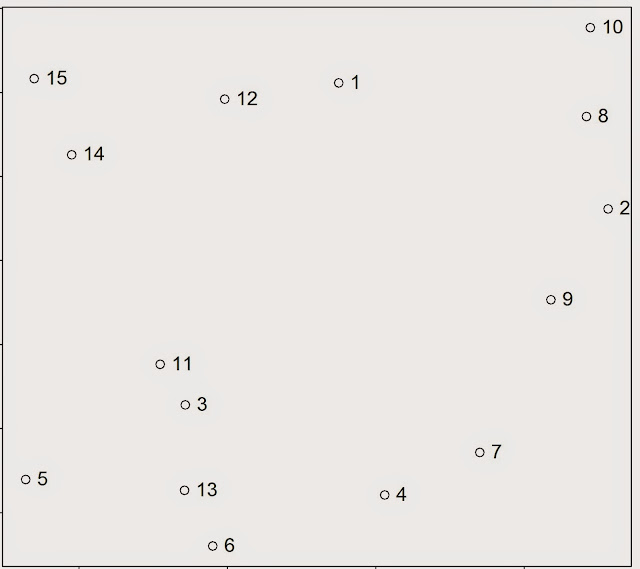
For the sake of the argument we can assume that all the events in this point pattern are located in one unique cluster k, therefore n_k is 15. Since we are clustering events based on their geographical location we are working with two variables, i.e. latitude and longitude; so p is equal to two. To calculate the variance for one single pair of points in cluster k, we simply compute the difference between the first point’s value of the first variable, i.e. its latitude, and the second point value of the same variable; and we do the same for the second variable. So the variance between point 1 and 2 is calculated as follow:


where V_(1:2) is the variance of the two points. Clearly the geographical position is not the only factor that can be used to partition events in a point pattern; for example we can divide earthquakes based on their magnitude. Therefore the two equations can be adapted to take more variables and the only difference is in the length of the linear equation that needs to be solved to calculate the variation between two points. The only problem may be in the number of equations that would need to be solved to obtain a solution. This however is something that the k-means algorithms solves very efficiently.

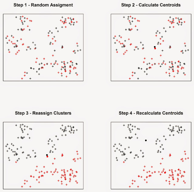
The algorithm starts by randomly assigning each event to a cluster, then it calculates the mean centre of each cluster (we looked at what the mean centre is in the post: Introductory Point Pattern Analysis of Open Crime Data in London). At this point it calculates the Euclidean distance between each event and the two clusters and reassigns them to a new cluster, based on the closest mean centre, then it recalculates the mean centres and it keeps going until the cluster elements stop changing. As an example we can look at the figure below, assuming we want to divide the events into two clusters. 


In Step 1 the algorithm assigns each event to a cluster at random. It then computes the mean centres of the two clusters (Step 2), which are the large black and red circles. Then the algorithm calculate the Euclidean distance between each event and the two mean centres, and reassign the events to new clusters based on the closest mean centre, so if a point was first in cluster one but it is closer to the mean centre of cluster two it is reassigned to the latter. Subsequently the mean centres are computed again for the new clusters (Step 4). This process keeps going until the cluster elements stop changing.


Practical Example
In this experiment we will look at a very simple exercise of cluster analysis of seismic events downloaded from the USGS website. To complete this exercise you would need the following packages: sp, raster, plotrix, rgeos, rgdal and scatterplot3d
I already mentioned in the post Downloading and Visualizing Seismic Events from USGS how to download the open data from the United States Geological Survey, so I will not repeat the process. The code for that is the following.

URL <- "http://earthquake.usgs.gov/earthquakes/feed/v1.0/summary/all_month.csv"
Earthquake_30Days <- read.table(URL, sep = ",", header = T)
 
 
#Download, unzip and load the polygon shapefile with the countries' borders
download.file("http://thematicmapping.org/downloads/TM_WORLD_BORDERS_SIMPL-0.3.zip",destfile="TM_WORLD_BORDERS_SIMPL-0.3.zip")
unzip("TM_WORLD_BORDERS_SIMPL-0.3.zip",exdir=getwd())
polygons <- shapefile("TM_WORLD_BORDERS_SIMPL-0.3.shp")

I also included the code to download the shapefile with the borders of all countries.

For the cluster analysis I would like to try to divide the seismic events by origin. In other words I would like to see if there is a way to distinguish between events close to plates, or volcanoes or other faults. In many cases the distinction is hard to make since many volcanoes are originated from subduction, e.g. the Andes, where plates and volcanoes are close to one another and the algorithm may find difficult to distinguish the origins. In any case I would like to explore the use of cluster analysis to see what the algorithm is able to do.

Clearly the first thing we need to do is download data regarding the location of plates, faults and volcanoes. We can find shapefiles with these information at the following website: http://legacy.jefferson.kctcs.edu/techcenter/gis%20data/

The data are provided in zip files, so we need to extract them and load them in R. There are some legal restrictions to use these data. They are distributed by ESRI and can be used in conjunction with the book: "Mapping Our World: GIS Lessons for Educators.". Details of the license and other information may be found here: http://legacy.jefferson.kctcs.edu/techcenter/gis%20data/World/Earthquakes/plat_lin.htm#getacopy

If you have the rights to download and use these data for your studies you can download them directly from the web with the following code. We already looked at code to do this in previous posts so I would not go into details here:

dir.create(paste(getwd(),"/GeologicalData",sep=""))
 
#Faults
download.file("http://legacy.jefferson.kctcs.edu/techcenter/gis%20data/World/Zip/FAULTS.zip",destfile="GeologicalData/FAULTS.zip")
unzip("GeologicalData/FAULTS.zip",exdir="GeologicalData")
 
faults <- shapefile("GeologicalData/FAULTS.SHP")
 
 
#Plates
download.file("http://legacy.jefferson.kctcs.edu/techcenter/gis%20data/World/Zip/PLAT_LIN.zip",destfile="GeologicalData/plates.zip")
unzip("GeologicalData/plates.zip",exdir="GeologicalData")
 
plates <- shapefile("GeologicalData/PLAT_LIN.SHP")
 
 
#Volcano
download.file("http://legacy.jefferson.kctcs.edu/techcenter/gis%20data/World/Zip/VOLCANO.zip",destfile="GeologicalData/VOLCANO.zip")
unzip("GeologicalData/VOLCANO.zip",exdir="GeologicalData")
 
volcano <- shapefile("GeologicalData/VOLCANO.SHP")

The only piece of code that I never presented before is the first line, to create a new folder. It is pretty self explanatory, we just need to create a string with the name of the folder and R will create it. The rest of the code downloads data from the address above, unzip them and load them in R.

We have not yet transform the object Earthquake_30Days, which is now a data.frame, into a SpatioPointsDataFrame. The data from USGS contain seismic events that are not only earthquakes but also related to mining and other events. For this analysis we want to keep only the events that are classified as earthquakes, which we can do with the following code:

Earthquakes <- Earthquake_30Days[paste(Earthquake_30Days$type)=="earthquake",]
coordinates(Earthquakes)=~longitude+latitude

This extracts only earthquakes and transform the object into a SpatialObject.


We can create a map that shows the earthquakes alongside all the other geological elements we downloaded using the following code, which saves directly the image in jpeg:

jpeg("Earthquake_Origin.jpg",4000,2000,res=300)
plot(plates,col="red")
plot(polygons,add=T)
title("Earthquakes in the last 30 days",cex.main=3)
lines(faults,col="dark grey")
points(Earthquakes,col="blue",cex=0.5,pch="+")
points(volcano,pch="*",cex=0.7,col="dark red")
legend.pos <- list(x=20.97727,y=-57.86364)
 
legend(legend.pos,legend=c("Plates","Faults","Volcanoes","Earthquakes"),pch=c("-","-","*","+"),col=c("red","dark grey","dark red","blue"),bty="n",bg=c("white"),y.intersp=0.75,title="Days from Today",cex=0.8) 
 
text(legend.pos$x,legend.pos$y+2,"Legend:")
dev.off()

This code is very similar to what I used here so I will not explain it in details. We just added more elements to the plot and therefore we need to remember that R plots in layers one on top of the other depending on the order in which they appear on the code. For example, as you can see from the code, the first thing we plot are the plates, which will be plotted below everything, even the borders of the polygons, which come second. You can change this just by changing the order of the lines. Just remember to use the option add=T correctly.
The result is the image below:


Before proceeding with the cluster analysis we first need to fix the projections of the SpatialObjects. Luckily the object polygons was created from a shapefile with the projection data attached to it, so we can use it to tell R that the other objects have the same projection:

projection(faults)=projection(polygons)
projection(volcano)=projection(polygons)
projection(Earthquakes)=projection(polygons)
projection(plates)=projection(polygons)

Now we can proceed with the cluster analysis. As I said I would like to try and classify earthquakes based on their distance between the various geological features. To calculate this distance we can use the function gDistance in the package rgeos.
These shapefiles are all unprojected, and their coordinates are in degrees. We cannot use them directly with the function gDistance because it deals only with projected data, so we need to transform them using the function spTransform (in the package rgdal). This function takes two arguments, the first is the SpatialObject, which needs to have projection information, and the second is the data regarding the projection to transform the object into. The code for doing that is the following:

volcanoUTM <- spTransform(volcano,CRS("+init=epsg:3395"))
faultsUTM <- spTransform(faults,CRS("+init=epsg:3395"))
EarthquakesUTM <- spTransform(Earthquakes,CRS("+init=epsg:3395"))
platesUTM <- spTransform(plates,CRS("+init=epsg:3395"))

The projection we are going to use is the standard mercator, details here: http://spatialreference.org/ref/epsg/wgs-84-world-mercator/

NOTE:
the plates object presents lines also along the borders of the image above. This is something that R cannot deal with, so I had to remove them manually from ArcGIS. If you want to replicate this experiment you have to do the same. I do not know of any method in R to do that quickly, if you know it please let me know in the comment section.


We are going to create a matrix of distances between each earthquake and the geological features with the following loop:

distance.matrix <- matrix(0,nrow(Earthquakes),7,dimnames=list(c(),c("Lat","Lon","Mag","Depth","DistV","DistF","DistP")))
for(i in 1:nrow(EarthquakesUTM)){
sub <- EarthquakesUTM[i,]
dist.v <- gDistance(sub,volcanoUTM)
dist.f <- gDistance(sub,faultsUTM)
dist.p <- gDistance(sub,platesUTM)
distance.matrix[i,] <- matrix(c(sub@coords,sub$mag,sub$depth,dist.v,dist.f,dist.p),ncol=7)
}
 
 
distDF <- as.data.frame(distance.matrix)


In this code we first create an empty matrix, which is usually wise to do since R already allocates the RAM it would need for the process and it should also be faster to fill it compared to create a new matrix directly from inside the loop. In the loop we iterate through the earthquakes and for each we calculate its distance to the geological features. Finally we change the matrix into a data.frame.

The next step is finding the correct number of clusters. To do that we can follow the approach suggested by Matthew Peeples here: http://www.mattpeeples.net/kmeans.html and also discussed in this stackoverflow post: http://stackoverflow.com/questions/15376075/cluster-analysis-in-r-determine-the-optimal-number-of-clusters

The code for that is the following:

mydata <-  scale(distDF[,5:7])
wss <- (nrow(mydata)-1)*sum(apply(mydata,2,var))
  for (i in 2:15) wss[i] <- sum(kmeans(mydata,
                                       centers=i)$withinss)
plot(1:15, wss, type="b", xlab="Number of Clusters",
     ylab="Within groups sum of squares")

We basically calculate clusters between 2 and 15 and we plot the number of clusters against the "within clusters sum of squares", which is the parameters that is minimized during the clustering process. Generally this quantity decreases very fast up to a point, and then basically stops decreasing. We can see this behaviour from the plot below generated from the earthquake data:


As you can see for 1 and 2 clusters the sum of squares is high and decreases fast, then it decreases  between 3 and 5, and then it gets erratic. So probably the best number of clusters would be 5, but clearly this is an empirical method so we would need to check other numbers and test whether they make more sense.

To create the clusters we can simply use the function kmeans, which takes two arguments: the data and the number of clusters:

clust <- kmeans(mydata,5)
distDF$Clusters <- clust$cluster

We can check the physical meaning of the clusters by plotting them against the distance from the geological features using the function scatterplot3d, in the package scatterplot3d:

scatterplot3d(distDF$DistV,xlab="Distance to Volcano",distDF$DistF,ylab="Distance to Fault",distDF$DistP,zlab="Distance to Plate", color = clust$cluster,pch=16,angle=120,scale=0.5,grid=T,box=F)

This function is very similar to the standard plot function, but it takes three arguments instead of just two. I wrote the line of code distinguishing between the three axis to better understand it. So we have the variable for x, and the corresponding axis label, and so on for each axis. Then we set the colours based on clusters, and the symbol with pch, as we would do in plot. The last options are only available here: we have the angle between x and y axis, the scale of the z axis compared to the other two, then we plot a grid on the xy plane and we do not plot a box all around the plot. The result is the following image:


It seems that the red and green cluster are very similar, they differ only because red is closer to volcanoes than faults and vice-versa for the green. The black cluster seems only to be farther away from volcanoes. Finally the blue and light blue clusters seem to be close to volcanoes and far away from the other two features.

We can create an image with the clusters using the following code:

clustSP <- SpatialPointsDataFrame(coords=Earthquakes@coords,data=data.frame(Clusters=clust$cluster))
 
jpeg("Earthquake_Clusters.jpg",4000,2000,res=300)
plot(plates,col="red")
plot(polygons,add=T)
title("Earthquakes in the last 30 days",cex.main=3)
lines(faults,col="dark grey")
points(volcano,pch="x",cex=0.5,col="yellow")
legend.pos <- list(x=20.97727,y=-57.86364)
 
points(clustSP,col=clustSP$Clusters,cex=0.5,pch="+")
legend(legend.pos,legend=c("Plates","Faults","Volcanoes"),pch=c("-","-","x","+"),col=c("red","dark grey","yellow"),bty="n",bg=c("white"),y.intersp=0.75,cex=0.6) 
 
text(legend.pos$x,legend.pos$y+2,"Legend:")
 
dev.off()

I created the object clustSP based on the coordinates in WGS84 so that I can plot everything as before. I also plotted the volcanoes in yellow, so that differ from the red cluster. The result is the following image:


To conclude this experiment I would also like to explore the relation between the distance to the geological features and the magnitude of the earthquakes. To do that we need to identify the events that are at a certain distance from each geological feature. We can use the function gBuffer, again available from the package rgeos, for this job.

volcano.buffer <- gBuffer(volcanoUTM,width=1000)
volcano.over <- over(EarthquakesUTM,volcano.buffer)
 
plates.buffer <- gBuffer(platesUTM,width=1000)
plates.over <- over(EarthquakesUTM,plates.buffer)
 
faults.buffer <- gBuffer(faultsUTM,width=1000)
faults.over <- over(EarthquakesUTM,faults.buffer)

This function takes minimum two arguments, the SpatialObject and the maximum distance (in metres because it requires data to be projected) to reach with the buffer, option width. The results is a SpatialPolygons object that include a buffer around the starting features; for example if we start with a point we end up with a circle of radius equal to width. In the code above we first created these buffer areas and then we overlaid EarthquakesUTM with these areas to find the events located within their borders. The overlay function returns two values: NA if the object is outside the buffer area and 1 if it is inside. We can use this information to subset EarthquakesUTM later on.

Now we can include the overlays in EarthquakesUTM as follows:

EarthquakesUTM$volcano <- as.numeric(volcano.over)
EarthquakesUTM$plates  <- as.numeric(plates.over)
EarthquakesUTM$faults  <- as.numeric(faults.over)

To determine if there is a relation between the distance from each feature and the magnitude of the earthquakes we can simply plot the magnitude's distribution for the various events included in the buffer areas we created before with the following code:

plot(density(EarthquakesUTM[paste(EarthquakesUTM$volcano)=="1",]$mag),ylim=c(0,2),xlim=c(0,10),main="Earthquakes by Origin",xlab="Magnitude")
lines(density(EarthquakesUTM[paste(EarthquakesUTM$faults)=="1",]$mag),col="red")
lines(density(EarthquakesUTM[paste(EarthquakesUTM$plates)=="1",]$mag),col="blue")
legend(3,0.6,title="Mean magnitude per origin",legend=c(paste("Volcanic",round(mean(EarthquakesUTM[paste(EarthquakesUTM$volcano)=="1",]$mag),2)),paste("Faults",round(mean(EarthquakesUTM[paste(EarthquakesUTM$faults)=="1",]$mag),2)),paste("Plates",round(mean(EarthquakesUTM[paste(EarthquakesUTM$plates)=="1",]$mag),2))),pch="-",col=c("black","red","blue"),cex=0.8)

which creates the following plot:


It seems that earthquakes close to plates have higher magnitude on average.


R code snippets created by Pretty R at inside-R.org