Introduction
Police in Britain (
http://data.police.uk/) not only register every single crime they encounter, and include coordinates, but also distribute their data free on the web.
They have two ways of distributing data: the first is through an
API, which is extremely easy to use but returns only a limited number of crimes for each request, the second is a good old manual download from this page
http://data.police.uk/data/. Again this page is extremely easy to use, they did a very good job in securing that people can access and work with these data; we can just select the time range and the police force from a certain area, and then wait for the system to create the dataset for us. I downloaded data from all forces for May and June 2014 and it took less than 5 minutes to prepare them for download.
These data are distributed under the
Open Government Licence, which allows me to do basically whatever I want with them (even commercially) as long as I cite the origin and the license.
Data Preparation
For completing this experiment we would need the following packages:
sp,
raster,
spatstat,
maptools and
plotrix.
As I mentioned above, I downloaded all the crime data from the months of May and June 2014 for the whole Britain. Then I decided to focus on the Greater London region, since here the most crimes are committed and therefore the analysis should be more interesting (while I am writing this part I have not yet finished the whole thing so I may be wrong). Since the Open Government License allows me to distribute the data, I uploaded them to my website so that you can easily replicate this experiment.
The dataset provided by the British Police is in
csv format, so to load it we just need to use the
read.csv function:
data <- read.csv("http://www.fabioveronesi.net/Blog/2014-05-metropolitan-street.csv")
We can look at the structure of the dataset simply by using the function
str:
> str(data)
'data.frame':   79832 obs. of  12 variables:
 $ Crime.ID             : Factor w/ 55285 levels "","0000782cea7b25267bfc4d22969498040d991059de4ebc40385be66e3ecc3c73",..: 1 1 1 1 1 2926 28741 19664 45219 21769 ...
 $ Month                : Factor w/ 1 level "2014-05": 1 1 1 1 1 1 1 1 1 1 ...
 $ Reported.by          : Factor w/ 1 level "Metropolitan Police Service": 1 1 1 1 1 1 1 1 1 1 ...
 $ Falls.within         : Factor w/ 1 level "Metropolitan Police Service": 1 1 1 1 1 1 1 1 1 1 ...
 $ Longitude            : num  0.141 0.137 0.14 0.136 0.135 ...
 $ Latitude             : num  51.6 51.6 51.6 51.6 51.6 ...
 $ Location             : Factor w/ 20462 levels "No Location",..: 15099 14596 1503 1919 12357 1503 8855 14060 8855 8855 ...
 $ LSOA.code            : Factor w/ 4864 levels "","E01000002",..: 24 24 24 24 24 24 24 24 24 24 ...
 $ LSOA.name            : Factor w/ 4864 levels "","Barking and Dagenham 001A",..: 2 2 2 2 2 2 2 2 2 2 ...
 $ Crime.type           : Factor w/ 14 levels "Anti-social behaviour",..: 1 1 1 1 1 3 3 5 7 7 ...
 $ Last.outcome.category: Factor w/ 23 levels "","Awaiting court outcome",..: 1 1 1 1 1 21 8 21 8 8 ...
 $ Context              : logi  NA NA NA NA NA NA ...
This dataset provides a series of useful information regarding the crime: its locations (longitude and latitude in degrees), the address (if available), the type of crime and the court outcome (if available). For the purpose of this experiment we would only need to look at the coordinates and the type of crime.
For some incidents the coordinates are not provided, therefore before we can proceed we need to remove NAs from data:
data <- data[!is.na(data$Longitude)&!is.na(data$Latitude),]
This eliminates 870 entries from the file, thus data now has 78'962 rows.
Point Pattern Analysis
A point process is a stochastic process for which we observe its results, or events, only in a specific region, which is the area under study, or simply window. The location of the events is a point pattern (Bivand et al., 2008).
In R the package for Point Pattern Analysis is
spatstat, which works with its own format (i.e. ppp). There are ways to transform a
data.frame into a
ppp object, however in this case we have a problem. The crime dataset contains lots of duplicated locations. We can check this by first transform data into a
SpatialObject and then use the function
zerodist to check for duplicated locations:
> coordinates(data)=~Longitude+Latitude
> zero <- zerodist(data)
> length(unique(zero[,1]))
[1] 47920
If we check the amount of duplicates we see that more than half the reported crimes are duplicated somehow. I checked some individual cases to see if I could spot a pattern but it is not possible. Sometime we have duplicates with the same crime, probably because more than one person was involved; in other cases we have two different crimes for the same locations, maybe because the crime belongs to several categories. Whatever the case the presence of duplicates creates a problem, because the package
spatstat does not allow them. In R the function
remove.duplicates is able to get rid of duplicates, however in this case I am not sure we can use it because we will be removing crimes for which we do not have enough information to assess whether they may in fact be removed.
So we need to find ways to work around the problem.
This sort of problems are often encountered when working with real datasets, but are mostly not referenced in textbook, only experience and common sense helps us in these situations.
There is also another potential issue with this dataset. Even though the large majority of crimes are reported for London, some of them (n=660) are also located in other areas. Since these crimes are a small fraction of the total I do not think it makes much sense to include them in the analysis, so we need to remove them. To do so we need to import a shapefile with the borders of the Greater London region. Natural Earth provides this sort of data, since it distributes shapefiles at various resolution. For this analysis we would need the following dataset:
Admin 1 – States, Provinces
To download it and import it in R we can use the following lines:
download.file("http://www.naturalearthdata.com/http//www.naturalearthdata.com/download/10m/cultural/ne_10m_admin_1_states_provinces.zip",destfile="ne_10m_admin_1_states_provinces.zip")
unzip("ne_10m_admin_1_states_provinces.zip",exdir="NaturalEarth")
border <- shapefile("NaturalEarth/ne_10m_admin_1_states_provinces.shp")
These lines download the shapefile in a compressed archive (.zip), then uncompress it in a new folder named NaturalEarth in the working directory and then open it.
To extract only the border of the Greater London regions we can simply subset the
SpatialPolygons object as follows:
GreaterLondon <- border[paste(border$region)=="Greater London",]
Now we need to overlay it with crime data and then eliminate all the points that do not belong to the Greater London region. To do that we can use the following code:
The first line assigns to the object
data the same projection as the object
border, we can do this safely because we know that the crime dataset is in geographical coordinates (WGS84), the same as
border.
Then we can use the function
over to overlay the two objects. At this point we need a way to extract from
data only the points that belong to the Greater London region, to do that we can create a new column and assign to it the values of the overlay object (here the column of the overlay object does not really matter, since we only need it to identify locations where this has some data in it). In locations where the data are outside the area defined by
border the new column will have values of NA, so we can use this information to extract the locations we need with the last line.
We can create a very simple plot of the final dataset and save it in a jpeg using the following code:
jpeg("PP_plot.jpg",2500,2000,res=300)
plot(data.London,pch="+",cex=0.5,main="",col=data.London$Crime.type)
plot(GreaterLondon,add=T)
legend(x=-0.53,y=51.41,pch="+",col=unique(data.London$Crime.type),legend=unique(data.London$Crime.type),cex=0.4)
dev.off()
This creates the image below:
Now that we have a dataset of crimes only for Greater London we can start our analysis.
Descriptive Statistics
The focus of a point pattern analysis is firstly to examine the spatial distribution of the events, and secondly making inferences about the process that generated the point pattern. Thus the first step in every point pattern analysis, as in every statistical and geostatistical analysis, is describe the dataset in hands with some descriptive indexes. In statistics we normally use mean and standard deviation to achieve this, however here we are working in 2D space, so things are slightly more complicated. For example instead of computing the mean we compute the
mean centre, which is basically the point identified by the mean value of longitude and the mean value of latitude:
Using the same principle we can compute the standard deviation of longitude and latitude, and the
standard distance, which measures the standard deviation of the distance of each point from the mean centre. This is important because it gives a measure of spread in the 2D space, and can be computed with the following equation from Wu (2006):
In R we can calculate all these indexes with the following simple code:
mean_centerX <- mean(data.London@coords[,1])
mean_centerY <- mean(data.London@coords[,2])
standard_deviationX <- sd(data.London@coords[,1])
standard_deviationY <- sd(data.London@coords[,2])
standard_distance <- sqrt(sum(((data.London@coords[,1]-mean_centerX)^2+(data.London@coords[,2]-mean_centerY)^2))/(nrow(data.London)))
We can use the standard distance to have a visual feeling of the spread of our data around their mean centre. We can use the function
draw.circle in the package
plotrix to do that:
jpeg("PP_Circle.jpeg",2500,2000,res=300)
plot(data.London,pch="+",cex=0.5,main="")
plot(GreaterLondon,add=T)
points(mean_centerX,mean_centerY,col="red",pch=16)
draw.circle(mean_centerX,mean_centerY,radius=standard_distance,border="red",lwd=2)
dev.off()
which returns the following image:
The problem with the standard distance is that it averages the standard deviation of the distances for both coordinates, so it does not take into account possible differences between the two dimensions. We can take those into account by plotting an ellipse, instead of a circle, with the two axis equal to the standard deviations of longitude and latitude. We can use again the package
plotrix, but with the function
draw.ellipse to do the job:
jpeg("PP_Ellipse.jpeg",2500,2000,res=300)
plot(data.London,pch="+",cex=0.5,main="")
plot(GreaterLondon,add=T)
points(mean_centerX,mean_centerY,col="red",pch=16)
draw.ellipse(mean_centerX,mean_centerY,a=standard_deviationX,b=standard_deviationY,border="red",lwd=2)
dev.off()
This returns the following image:
Working with spatstat
Let's now look at the details of the package
spatstat. As I mentioned we cannot use this if we have duplicated points, so we first need to eliminate them. In my opinion we cannot just remove them because we are not sure about their cause. However, we can subset the dataset by type of crime and then remove duplicates from it. In that case the duplicated points are most probably multiple individuals caught for the same crime, and if we delete those it will not change the results of the analysis.
I decided to focus on drug related crime, since they are not as common as other and therefore I can better present the steps of the analysis. We can subset the data and remove duplicates as follows:
Drugs <- data.London[data.London$Crime.type==unique(data.London$Crime.type)[3],]
Drugs <- remove.duplicates(Drugs)
we obtain a dataset with 2745 events all over Greater London.
A point pattern is defined as a series of events in a given area, or window, of observation. It is therefore extremely important to precisely define this window. In
spatstat the function
owin is used to set the observation window. However, the standard function takes the coordinates of a rectangle or of a polygon from a matrix, and therefore it may be a bit tricky to use. Luckily the package
maptools provides a way to transform a
SpatialPolygons into an object of class
owin, using the function
as.owin (Note: a function with the same name is also available in
spatstat but it does not work with
SpatialPolygons, so be sure to load
maptools):
window <- as.owin(GreaterLondon)
Now we can use the function
ppp, in
spatstat, to create the point pattern object:
Drugs.ppp <- ppp(x=Drugs@coords[,1],y=Drugs@coords[,2],window=window)
Intensity and Density
A crucial information we need when we deal with point patterns is a quantitative definition of the spatial distribution, i.e. how many events we have in a predefined window. The index to define this is the Intensity, which is the average number of events per unit area.
In this example we cannot calculate the intensity straight away, because the we are dealing with degrees and therefore we would end up dividing the number of crimes (n=2745) by the total area of Greater London, which in degrees in 0.2. It would make much more sense to transform all of our data in UTM and then calculate the number of crime per square meter. We can transform any spatial object in a different coordinate system using the function
spTransform, in package
sp:
GreaterLondonUTM <- spTransform(GreaterLondon,CRS("+init=epsg:32630"))
We just need to define the CRS of the new coordinate system, which can be found here:
http://spatialreference.org/
Now we can compute the intensity as follows:
Drugs.ppp$n/sum(sapply(slot(GreaterLondonUTM, "polygons"), slot, "area"))
The numerator is the number of point in the
ppp object; while the denominator is the sum of the areas of all polygons (this function was copied from here:
r-sig-geo). For drug related crime the average intensity is 1.71x10^-6 per square meter, in the Greater London area.
Intensity may be constant across the study window, in that case in every square meter we would find the same number of points, and the process would be uniform of homogeneous. Most often the intensity is not constant and varies spatially throughout the study window, in that case the process is inhomogeneous. For inhomogeneous processes we need a way to determine the amount of spatial variation of the intensity. There are several ways of dealing with this problem, one example is quadrat counting, where the area is divided into rectangles and the number of events in each of them is counted:
jpeg("PP_QuadratCounting.jpeg",2500,2000,res=300)
plot(Drugs.ppp,pch="+",cex=0.5,main="Drugs")
plot(quadratcount(Drugs.ppp, nx = 4, ny = 4),add=T,col="blue")
dev.off()
which divides the area in 8 rectangles and then counts the number of events in each of them:
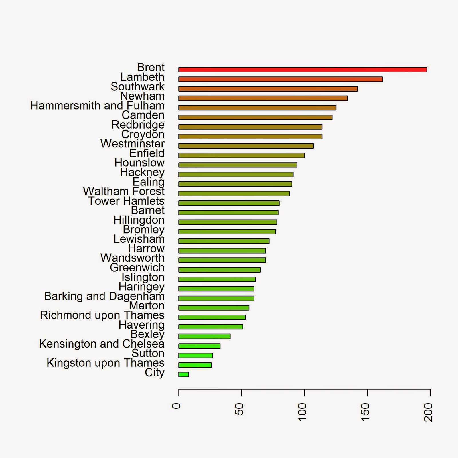
This function is good for certain datasets, but in this case it does not really make sense to use quadrat counting, since the areas it creates do not have any meaning in reality. It would be far more valuable to extract the number of crimes by Borough for example. To do this we need to use a loop and iterate through the polygons:
Local.Intensity <- data.frame(Borough=factor(),Number=numeric())
for(i in unique(GreaterLondonUTM$name)){
sub.pol <- GreaterLondonUTM[GreaterLondonUTM$name==i,]
sub.ppp <- ppp(x=Drugs.ppp$x,y=Drugs.ppp$y,window=as.owin(sub.pol))
Local.Intensity <- rbind(Local.Intensity,data.frame(Borough=factor(i,levels=GreaterLondonUTM$name),Number=sub.ppp$n))
}
We can take a look at the results in a barplot with the following code:
colorScale <- color.scale(Local.Intensity[order(Local.Intensity[,2]),2],color.spec="rgb",extremes=c("green","red"),alpha=0.8)
jpeg("PP_BoroughCounting.jpeg",2000,2000,res=300)
par(mar=c(5,13,4,2))
barplot(Local.Intensity[order(Local.Intensity[,2]),2],names.arg=Local.Intensity[order(Local.Intensity[,2]),1],horiz=T,las=2,space=1,col=colorScale)
dev.off()
which returns the image below:
Another way in which we can determine the spatial distribution of the intensity is by using kernel smoothing (Diggle, 1985; Berman and Diggle, 1989; Bivand et. al., 2008). Such method computes the intensity continuously across the study area. To perform this analysis in R we need to define the bandwidth of the density estimation, which basically determines the area of influence of the estimation. There is no general rule to determine the correct bandwidth; generally speaking if h is too small the estimate is too noisy, while if h is too high the estimate may miss crucial elements of the point pattern due to oversmoothing (Scott, 2009). In
spatstat the functions
bw.diggle,
bw.ppl, and
bw.scott can be used to estimate the bandwidth according to difference methods. We can test how they work with our dataset using the following code:
jpeg("Kernel_Density.jpeg",2500,2000,res=300)
par(mfrow=c(2,2))
plot(density.ppp(Drugs.ppp, sigma = bw.diggle(Drugs.ppp),edge=T),main=paste("h =",round(bw.diggle(Drugs.ppp),2)))
plot(density.ppp(Drugs.ppp, sigma = bw.ppl(Drugs.ppp),edge=T),main=paste("h =",round(bw.ppl(Drugs.ppp),2)))
plot(density.ppp(Drugs.ppp, sigma = bw.scott(Drugs.ppp)[2],edge=T),main=paste("h =",round(bw.scott(Drugs.ppp)[2],2)))
plot(density.ppp(Drugs.ppp, sigma = bw.scott(Drugs.ppp)[1],edge=T),main=paste("h =",round(bw.scott(Drugs.ppp)[1],2)))
dev.off()
which generates the following image, from which it is clear that every method works very differently:
As you can see a low value of bandwidth produces a very detailed plot, while increasing this value creates a very smooth surface where the local details are lost. This is basically an heat map of the crimes in London, therefore we need to be very careful in choosing the right bandwidth since these images if shown alone may have very different impact particularly on people not familiar with the matter. The first image may create the illusion that the crimes are clustered in very small areas, while the last may provide the opposite feeling.
Complete spatial randomness
Assessing if a point pattern is random is a crucial step of the analysis. If we determine that the pattern is random it means that each point is independent from each other and from any other factor. Complete spatial randomness implies that events from the point process are equally as likely to occur in every regions of the study window. In other words, the location of one point does not affect the probability of another being observed nearby, each point is therefore completely independent from the others (Bivand et al., 2008).
If a point pattern is not random it can be classified in two other ways: clustered or regular. Clustered means that there are areas where the number of events is higher than average, regular means that basically each subarea has the same number of events. Below is an image that should better explain the differences between these distributions:
In
spatstat we can determine which distribution our data have using the G function, which computes the distribution of the distances between each event and its nearest neighbour (Bivand et al., 2008). Based on the curve generated by the G function we can determine the distribution of our data. I will not explain here the details on how to compute the G function and its precise meaning, for that you need to look at the references. However, just by looking at the plots we can easily determine the distribution of our data.
Let's take a look at the image below to clarify things:
These are the curves generated by the G function for each distribution. The blue line is the G function computed for a complete spatial random point pattern, so in the first case since the data more or less follow the blue line the process is random. In the second case the line calculated from the data is above the blue line, this indicates a clustered distribution. On the contrary, if the line generated from the data is below the blue line the point pattern is regular.
We can compute the plot this function for our data simply using the following lines:
jpeg("GFunction.jpeg",2500,2000,res=300)
plot(Gest(Drugs.ppp),main="Drug Related Crimes")
dev.off()
which generates the following image:
From this image is clear that the process is clustered. We could have deduced it by looking at the previous plots, since it is clear that there are areas where more crimes are committed; however, with this method we have a quantitative way of support our hypothesis.
Conclusion
In this experiment we performed some basic Point Pattern analysis on open crime data. The only conclusion we reached in this experiment is that the data are clearly clustered in certain areas and boroughs. However, at this point we are not able to determine the origin and the causes of these clusters.
References
Bivand, R. S., Pebesma, E. J., & Gómez-Rubio, V. (2008). Applied spatial data analysis with R (Vol. 747248717). New York: Springer.
Wu, C. (2006). Intermediate Geographic Information Science – Point Pattern Analysis. Department of Geography, The University of Winsconsin-Milwaukee. http://uwm.edu/Course/416-625/week4_point_pattern.ppt - Last accessed: 28.01.2015
Berman, M. and Diggle, P. J. (1989). Estimating weighted integrals of the second-order intensity of a spatial point process. Journal of the Royal Statistical Society B, 51:81–92. [184, 185]
Diggle, P. J. (1985). A kernel method for smoothing point process data. Applied Statistics, 34:138–147. [184, 185]
Scott, D. W. (2009). Multivariate density estimation: theory, practice, and visualization (Vol. 383). John Wiley & Sons.
R code snippets created by Pretty R at inside-R.org
The full script for this experiment is available below:
library(sp)
library(plotGoogleMaps)
library(spatstat)
library(raster)
library(maptools)
library(plotrix)
library(rgeos)
data <- read.csv("http://www.fabioveronesi.net/Blog/2014-05-metropolitan-street.csv")
data <- data[!is.na(data$Longitude)&!is.na(data$Latitude),]
coordinates(data)=~Longitude+Latitude
zero <- zerodist(data)
length(unique(zero[,1]))
#Loading Natural Earth Provinces dataset to define window for Point Pattern Analysis
download.file("http://www.naturalearthdata.com/http//www.naturalearthdata.com/download/10m/cultural/ne_10m_admin_1_states_provinces.zip",destfile="ne_10m_admin_1_states_provinces.zip")
unzip("ne_10m_admin_1_states_provinces.zip",exdir="NaturalEarth")
border <- shapefile("NaturalEarth/ne_10m_admin_1_states_provinces.shp")
GreaterLondon <- border[paste(border$region)=="Greater London",]
#Extract crimes in London
projection(data)=projection(border)
overlay <- over(data,GreaterLondon)

data$over <- overlay$OBJECTID_1

data.London <- data[!is.na(data$over),]
#Simple Plot
jpeg("PP_plot.jpg",2500,2000,res=300)
plot(data.London,pch="+",cex=0.5,main="",col=data.London$Crime.type)
plot(GreaterLondon,add=T)
legend(x=-0.53,y=51.41,pch="+",col=unique(data.London$Crime.type),legend=unique(data.London$Crime.type),cex=0.4)
dev.off()
#Summary statistics for point patterns
#The coordinates of the mean center are simply the mean value of X and Y
#therefore we can use the function mean() to determine their value
mean_centerX <- mean(data.London@coords[,1])
mean_centerY <- mean(data.London@coords[,2])
#Similarly we can use the function sd() to determine the standard deviation of X and Y
standard_deviationX <- sd(data.London@coords[,1])
standard_deviationY <- sd(data.London@coords[,2])
#This is the formula to compute the standard distance
standard_distance <- sqrt(sum(((data.London@coords[,1]-mean_centerX)^2+(data.London@coords[,2]-mean_centerY)^2))/(nrow(data.London)))
jpeg("PP_Circle.jpeg",2500,2000,res=300)
plot(data.London,pch="+",cex=0.5,main="")
plot(GreaterLondon,add=T)
points(mean_centerX,mean_centerY,col="red",pch=16)
draw.circle(mean_centerX,mean_centerY,radius=standard_distance,border="red",lwd=2)
dev.off()
jpeg("PP_Ellipse.jpeg",2500,2000,res=300)
plot(data.London,pch="+",cex=0.5,main="")
plot(GreaterLondon,add=T)
points(mean_centerX,mean_centerY,col="red",pch=16)
draw.ellipse(mean_centerX,mean_centerY,a=standard_deviationX,b=standard_deviationY,border="red",lwd=2)
dev.off()
#Working with spatstat
Drugs <- data.London[data.London$Crime.type==unique(data.London$Crime.type)[3],]
Drugs <- remove.duplicates(Drugs)
#Transform GreaterLondon in UTM
GreaterLondonUTM <- spTransform(GreaterLondon,CRS("+init=epsg:32630"))
Drugs.UTM <- spTransform(Drugs,CRS("+init=epsg:32630"))
#Transforming the SpatialPolygons object into an owin object for spatstat, using a function in maptools
window <- as.owin(GreaterLondonUTM)
#Now we can extract one crime and
Drugs.ppp <- ppp(x=Drugs.UTM@coords[,1],y=Drugs.UTM@coords[,2],window=window)
#Calculate Intensity
Drugs.ppp$n/sum(sapply(slot(GreaterLondonUTM, "polygons"), slot, "area"))
#Alternative approach
summary(Drugs.ppp)$intensity
#Quadrat counting Intensity
jpeg("PP_QuadratCounting.jpeg",2500,2000,res=300)
plot(Drugs.ppp,pch="+",cex=0.5,main="Drugs")
plot(quadratcount(Drugs.ppp, nx = 4, ny = 4),add=T,col="red")
dev.off()
#Intensity by Borough
Local.Intensity <- data.frame(Borough=factor(),Number=numeric())
for(i in unique(GreaterLondonUTM$name)){
sub.pol <- GreaterLondonUTM[GreaterLondonUTM$name==i,]

sub.ppp <- ppp(x=Drugs.ppp$x,y=Drugs.ppp$y,window=as.owin(sub.pol))
Local.Intensity <- rbind(Local.Intensity,data.frame(Borough=factor(i,levels=GreaterLondonUTM$name),Number=sub.ppp$n))
}
colorScale <- color.scale(Local.Intensity[order(Local.Intensity[,2]),2],color.spec="rgb",extremes=c("green","red"),alpha=0.8)

jpeg("PP_BoroughCounting.jpeg",2000,2000,res=300)
par(mar=c(5,13,4,2))
barplot(Local.Intensity[order(Local.Intensity[,2]),2],names.arg=Local.Intensity[order(Local.Intensity[,2]),1],horiz=T,las=2,space=1,col=colorScale)
dev.off()
#Kernel Density (from: Baddeley, A. 2008. Analysing spatial point patterns in R)
#Optimal values of bandwidth
bw.diggle(Drugs.ppp)
bw.ppl(Drugs.ppp)
bw.scott(Drugs.ppp)
#Plotting
jpeg("Kernel_Density.jpeg",2500,2000,res=300)
par(mfrow=c(2,2))
plot(density.ppp(Drugs.ppp, sigma = bw.diggle(Drugs.ppp),edge=T),main=paste("h =",round(bw.diggle(Drugs.ppp),2)))
plot(density.ppp(Drugs.ppp, sigma = bw.ppl(Drugs.ppp),edge=T),main=paste("h =",round(bw.ppl(Drugs.ppp),2)))
plot(density.ppp(Drugs.ppp, sigma = bw.scott(Drugs.ppp)[2],edge=T),main=paste("h =",round(bw.scott(Drugs.ppp)[2],2)))
plot(density.ppp(Drugs.ppp, sigma = bw.scott(Drugs.ppp)[1],edge=T),main=paste("h =",round(bw.scott(Drugs.ppp)[1],2)))
dev.off()
#G Function
jpeg("GFunction.jpeg",2500,2000,res=300)
plot(Gest(Drugs.ppp),main="Drug Related Crimes")
dev.off()