Monday, 1 June 2015

Cluster analysis on earthquake data from USGS

Theoretical Background
In some cases we would like to classify the events we have in our dataset based on their spatial location or on some other data. As an example we can return to the epidemiological scenario in which we want to determine if the spread of a certain disease is affected by the presence of a particular source of pollution. With the G function we are able to determine quantitatively that our dataset is clustered, which means that the events are not driven by chance but by some external factor. Now we need to verify that indeed there is a cluster of points located around the source of pollution, to do so we need a form of classification of the points.
Cluster analysis refers to a series of techniques that allow the subdivision of a dataset into subgroups, based on their similarities (James et al., 2013). There are various clustering method, but probably the most common is k-means clustering. This technique aims at partitioning the data into a specific number of clusters, defined a priori by the user, by minimizing the within-clusters variation. The within-cluster variation measures how much each event in a cluster k, differs from the others in the same cluster k. The most common way to compute the differences is using the squared Euclidean distance (James et al., 2013), calculated as follow:

Where W_k (I use the underscore to indicate the subscripts) is the within-cluster variation for the cluster k, n_k is the total number of elements in the cluster k, p is the total number of variables we are considering for clustering and x_ij is one variable of one event contained in cluster k. This equation seems complex, but it actually quite easy to understand. To better understand what this means in practice we can take a look at the figure below. 
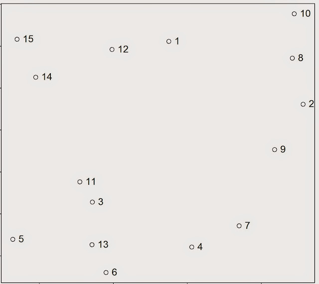


For the sake of the argument we can assume that all the events in this point pattern are located in one unique cluster k, therefore n_k is 15. Since we are clustering events based on their geographical location we are working with two variables, i.e. latitude and longitude; so p is equal to two. To calculate the variance for one single pair of points in cluster k, we simply compute the difference between the first point’s value of the first variable, i.e. its latitude, and the second point value of the same variable; and we do the same for the second variable. So the variance between point 1 and 2 is calculated as follow:


where V_(1:2) is the variance of the two points. Clearly the geographical position is not the only factor that can be used to partition events in a point pattern; for example we can divide earthquakes based on their magnitude. Therefore the two equations can be adapted to take more variables and the only difference is in the length of the linear equation that needs to be solved to calculate the variation between two points. The only problem may be in the number of equations that would need to be solved to obtain a solution. This however is something that the k-means algorithms solves very efficiently.

The algorithm starts by randomly assigning each event to a cluster, then it calculates the mean centre of each cluster (we looked at what the mean centre is in the post: Introductory Point Pattern Analysis of Open Crime Data in London). At this point it calculates the Euclidean distance between each event and the two clusters and reassigns them to a new cluster, based on the closest mean centre, then it recalculates the mean centres and it keeps going until the cluster elements stop changing. As an example we can look at the figure below, assuming we want to divide the events into two clusters. 
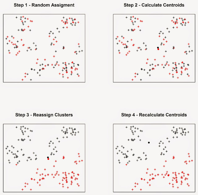


In Step 1 the algorithm assigns each event to a cluster at random. It then computes the mean centres of the two clusters (Step 2), which are the large black and red circles. Then the algorithm calculate the Euclidean distance between each event and the two mean centres, and reassign the events to new clusters based on the closest mean centre, so if a point was first in cluster one but it is closer to the mean centre of cluster two it is reassigned to the latter. Subsequently the mean centres are computed again for the new clusters (Step 4). This process keeps going until the cluster elements stop changing.


Practical Example
In this experiment we will look at a very simple exercise of cluster analysis of seismic events downloaded from the USGS website. To complete this exercise you would need the following packages: sp, raster, plotrix, rgeos, rgdal and scatterplot3d
I already mentioned in the post Downloading and Visualizing Seismic Events from USGS how to download the open data from the United States Geological Survey, so I will not repeat the process. The code for that is the following.

URL <- "http://earthquake.usgs.gov/earthquakes/feed/v1.0/summary/all_month.csv"
Earthquake_30Days <- read.table(URL, sep = ",", header = T)
 
 
#Download, unzip and load the polygon shapefile with the countries' borders
download.file("http://thematicmapping.org/downloads/TM_WORLD_BORDERS_SIMPL-0.3.zip",destfile="TM_WORLD_BORDERS_SIMPL-0.3.zip")
unzip("TM_WORLD_BORDERS_SIMPL-0.3.zip",exdir=getwd())
polygons <- shapefile("TM_WORLD_BORDERS_SIMPL-0.3.shp")

I also included the code to download the shapefile with the borders of all countries.

For the cluster analysis I would like to try to divide the seismic events by origin. In other words I would like to see if there is a way to distinguish between events close to plates, or volcanoes or other faults. In many cases the distinction is hard to make since many volcanoes are originated from subduction, e.g. the Andes, where plates and volcanoes are close to one another and the algorithm may find difficult to distinguish the origins. In any case I would like to explore the use of cluster analysis to see what the algorithm is able to do.

Clearly the first thing we need to do is download data regarding the location of plates, faults and volcanoes. We can find shapefiles with these information at the following website: http://legacy.jefferson.kctcs.edu/techcenter/gis%20data/

The data are provided in zip files, so we need to extract them and load them in R. There are some legal restrictions to use these data. They are distributed by ESRI and can be used in conjunction with the book: "Mapping Our World: GIS Lessons for Educators.". Details of the license and other information may be found here: http://legacy.jefferson.kctcs.edu/techcenter/gis%20data/World/Earthquakes/plat_lin.htm#getacopy

If you have the rights to download and use these data for your studies you can download them directly from the web with the following code. We already looked at code to do this in previous posts so I would not go into details here:

dir.create(paste(getwd(),"/GeologicalData",sep=""))
 
#Faults
download.file("http://legacy.jefferson.kctcs.edu/techcenter/gis%20data/World/Zip/FAULTS.zip",destfile="GeologicalData/FAULTS.zip")
unzip("GeologicalData/FAULTS.zip",exdir="GeologicalData")
 
faults <- shapefile("GeologicalData/FAULTS.SHP")
 
 
#Plates
download.file("http://legacy.jefferson.kctcs.edu/techcenter/gis%20data/World/Zip/PLAT_LIN.zip",destfile="GeologicalData/plates.zip")
unzip("GeologicalData/plates.zip",exdir="GeologicalData")
 
plates <- shapefile("GeologicalData/PLAT_LIN.SHP")
 
 
#Volcano
download.file("http://legacy.jefferson.kctcs.edu/techcenter/gis%20data/World/Zip/VOLCANO.zip",destfile="GeologicalData/VOLCANO.zip")
unzip("GeologicalData/VOLCANO.zip",exdir="GeologicalData")
 
volcano <- shapefile("GeologicalData/VOLCANO.SHP")

The only piece of code that I never presented before is the first line, to create a new folder. It is pretty self explanatory, we just need to create a string with the name of the folder and R will create it. The rest of the code downloads data from the address above, unzip them and load them in R.

We have not yet transform the object Earthquake_30Days, which is now a data.frame, into a SpatioPointsDataFrame. The data from USGS contain seismic events that are not only earthquakes but also related to mining and other events. For this analysis we want to keep only the events that are classified as earthquakes, which we can do with the following code:

Earthquakes <- Earthquake_30Days[paste(Earthquake_30Days$type)=="earthquake",]
coordinates(Earthquakes)=~longitude+latitude

This extracts only earthquakes and transform the object into a SpatialObject.


We can create a map that shows the earthquakes alongside all the other geological elements we downloaded using the following code, which saves directly the image in jpeg:

jpeg("Earthquake_Origin.jpg",4000,2000,res=300)
plot(plates,col="red")
plot(polygons,add=T)
title("Earthquakes in the last 30 days",cex.main=3)
lines(faults,col="dark grey")
points(Earthquakes,col="blue",cex=0.5,pch="+")
points(volcano,pch="*",cex=0.7,col="dark red")
legend.pos <- list(x=20.97727,y=-57.86364)
 
legend(legend.pos,legend=c("Plates","Faults","Volcanoes","Earthquakes"),pch=c("-","-","*","+"),col=c("red","dark grey","dark red","blue"),bty="n",bg=c("white"),y.intersp=0.75,title="Days from Today",cex=0.8) 
 
text(legend.pos$x,legend.pos$y+2,"Legend:")
dev.off()

This code is very similar to what I used here so I will not explain it in details. We just added more elements to the plot and therefore we need to remember that R plots in layers one on top of the other depending on the order in which they appear on the code. For example, as you can see from the code, the first thing we plot are the plates, which will be plotted below everything, even the borders of the polygons, which come second. You can change this just by changing the order of the lines. Just remember to use the option add=T correctly.
The result is the image below:


Before proceeding with the cluster analysis we first need to fix the projections of the SpatialObjects. Luckily the object polygons was created from a shapefile with the projection data attached to it, so we can use it to tell R that the other objects have the same projection:

projection(faults)=projection(polygons)
projection(volcano)=projection(polygons)
projection(Earthquakes)=projection(polygons)
projection(plates)=projection(polygons)

Now we can proceed with the cluster analysis. As I said I would like to try and classify earthquakes based on their distance between the various geological features. To calculate this distance we can use the function gDistance in the package rgeos.
These shapefiles are all unprojected, and their coordinates are in degrees. We cannot use them directly with the function gDistance because it deals only with projected data, so we need to transform them using the function spTransform (in the package rgdal). This function takes two arguments, the first is the SpatialObject, which needs to have projection information, and the second is the data regarding the projection to transform the object into. The code for doing that is the following:

volcanoUTM <- spTransform(volcano,CRS("+init=epsg:3395"))
faultsUTM <- spTransform(faults,CRS("+init=epsg:3395"))
EarthquakesUTM <- spTransform(Earthquakes,CRS("+init=epsg:3395"))
platesUTM <- spTransform(plates,CRS("+init=epsg:3395"))

The projection we are going to use is the standard mercator, details here: http://spatialreference.org/ref/epsg/wgs-84-world-mercator/

NOTE:
the plates object presents lines also along the borders of the image above. This is something that R cannot deal with, so I had to remove them manually from ArcGIS. If you want to replicate this experiment you have to do the same. I do not know of any method in R to do that quickly, if you know it please let me know in the comment section.


We are going to create a matrix of distances between each earthquake and the geological features with the following loop:

distance.matrix <- matrix(0,nrow(Earthquakes),7,dimnames=list(c(),c("Lat","Lon","Mag","Depth","DistV","DistF","DistP")))
for(i in 1:nrow(EarthquakesUTM)){
sub <- EarthquakesUTM[i,]
dist.v <- gDistance(sub,volcanoUTM)
dist.f <- gDistance(sub,faultsUTM)
dist.p <- gDistance(sub,platesUTM)
distance.matrix[i,] <- matrix(c(sub@coords,sub$mag,sub$depth,dist.v,dist.f,dist.p),ncol=7)
}
 
 
distDF <- as.data.frame(distance.matrix)


In this code we first create an empty matrix, which is usually wise to do since R already allocates the RAM it would need for the process and it should also be faster to fill it compared to create a new matrix directly from inside the loop. In the loop we iterate through the earthquakes and for each we calculate its distance to the geological features. Finally we change the matrix into a data.frame.

The next step is finding the correct number of clusters. To do that we can follow the approach suggested by Matthew Peeples here: http://www.mattpeeples.net/kmeans.html and also discussed in this stackoverflow post: http://stackoverflow.com/questions/15376075/cluster-analysis-in-r-determine-the-optimal-number-of-clusters

The code for that is the following:

mydata <-  scale(distDF[,5:7])
wss <- (nrow(mydata)-1)*sum(apply(mydata,2,var))
  for (i in 2:15) wss[i] <- sum(kmeans(mydata,
                                       centers=i)$withinss)
plot(1:15, wss, type="b", xlab="Number of Clusters",
     ylab="Within groups sum of squares")

We basically calculate clusters between 2 and 15 and we plot the number of clusters against the "within clusters sum of squares", which is the parameters that is minimized during the clustering process. Generally this quantity decreases very fast up to a point, and then basically stops decreasing. We can see this behaviour from the plot below generated from the earthquake data:


As you can see for 1 and 2 clusters the sum of squares is high and decreases fast, then it decreases  between 3 and 5, and then it gets erratic. So probably the best number of clusters would be 5, but clearly this is an empirical method so we would need to check other numbers and test whether they make more sense.

To create the clusters we can simply use the function kmeans, which takes two arguments: the data and the number of clusters:

clust <- kmeans(mydata,5)
distDF$Clusters <- clust$cluster

We can check the physical meaning of the clusters by plotting them against the distance from the geological features using the function scatterplot3d, in the package scatterplot3d:

scatterplot3d(distDF$DistV,xlab="Distance to Volcano",distDF$DistF,ylab="Distance to Fault",distDF$DistP,zlab="Distance to Plate", color = clust$cluster,pch=16,angle=120,scale=0.5,grid=T,box=F)

This function is very similar to the standard plot function, but it takes three arguments instead of just two. I wrote the line of code distinguishing between the three axis to better understand it. So we have the variable for x, and the corresponding axis label, and so on for each axis. Then we set the colours based on clusters, and the symbol with pch, as we would do in plot. The last options are only available here: we have the angle between x and y axis, the scale of the z axis compared to the other two, then we plot a grid on the xy plane and we do not plot a box all around the plot. The result is the following image:


It seems that the red and green cluster are very similar, they differ only because red is closer to volcanoes than faults and vice-versa for the green. The black cluster seems only to be farther away from volcanoes. Finally the blue and light blue clusters seem to be close to volcanoes and far away from the other two features.

We can create an image with the clusters using the following code:

clustSP <- SpatialPointsDataFrame(coords=Earthquakes@coords,data=data.frame(Clusters=clust$cluster))
 
jpeg("Earthquake_Clusters.jpg",4000,2000,res=300)
plot(plates,col="red")
plot(polygons,add=T)
title("Earthquakes in the last 30 days",cex.main=3)
lines(faults,col="dark grey")
points(volcano,pch="x",cex=0.5,col="yellow")
legend.pos <- list(x=20.97727,y=-57.86364)
 
points(clustSP,col=clustSP$Clusters,cex=0.5,pch="+")
legend(legend.pos,legend=c("Plates","Faults","Volcanoes"),pch=c("-","-","x","+"),col=c("red","dark grey","yellow"),bty="n",bg=c("white"),y.intersp=0.75,cex=0.6) 
 
text(legend.pos$x,legend.pos$y+2,"Legend:")
 
dev.off()

I created the object clustSP based on the coordinates in WGS84 so that I can plot everything as before. I also plotted the volcanoes in yellow, so that differ from the red cluster. The result is the following image:


To conclude this experiment I would also like to explore the relation between the distance to the geological features and the magnitude of the earthquakes. To do that we need to identify the events that are at a certain distance from each geological feature. We can use the function gBuffer, again available from the package rgeos, for this job.

volcano.buffer <- gBuffer(volcanoUTM,width=1000)
volcano.over <- over(EarthquakesUTM,volcano.buffer)
 
plates.buffer <- gBuffer(platesUTM,width=1000)
plates.over <- over(EarthquakesUTM,plates.buffer)
 
faults.buffer <- gBuffer(faultsUTM,width=1000)
faults.over <- over(EarthquakesUTM,faults.buffer)

This function takes minimum two arguments, the SpatialObject and the maximum distance (in metres because it requires data to be projected) to reach with the buffer, option width. The results is a SpatialPolygons object that include a buffer around the starting features; for example if we start with a point we end up with a circle of radius equal to width. In the code above we first created these buffer areas and then we overlaid EarthquakesUTM with these areas to find the events located within their borders. The overlay function returns two values: NA if the object is outside the buffer area and 1 if it is inside. We can use this information to subset EarthquakesUTM later on.

Now we can include the overlays in EarthquakesUTM as follows:

EarthquakesUTM$volcano <- as.numeric(volcano.over)
EarthquakesUTM$plates  <- as.numeric(plates.over)
EarthquakesUTM$faults  <- as.numeric(faults.over)

To determine if there is a relation between the distance from each feature and the magnitude of the earthquakes we can simply plot the magnitude's distribution for the various events included in the buffer areas we created before with the following code:

plot(density(EarthquakesUTM[paste(EarthquakesUTM$volcano)=="1",]$mag),ylim=c(0,2),xlim=c(0,10),main="Earthquakes by Origin",xlab="Magnitude")
lines(density(EarthquakesUTM[paste(EarthquakesUTM$faults)=="1",]$mag),col="red")
lines(density(EarthquakesUTM[paste(EarthquakesUTM$plates)=="1",]$mag),col="blue")
legend(3,0.6,title="Mean magnitude per origin",legend=c(paste("Volcanic",round(mean(EarthquakesUTM[paste(EarthquakesUTM$volcano)=="1",]$mag),2)),paste("Faults",round(mean(EarthquakesUTM[paste(EarthquakesUTM$faults)=="1",]$mag),2)),paste("Plates",round(mean(EarthquakesUTM[paste(EarthquakesUTM$plates)=="1",]$mag),2))),pch="-",col=c("black","red","blue"),cex=0.8)

which creates the following plot:


It seems that earthquakes close to plates have higher magnitude on average.


R code snippets created by Pretty R at inside-R.org

Thursday, 28 May 2015

Live Earthquake Map with Shiny and Google Map API

In the post Exchange data between R and the Google Maps API using Shiny I presented a very simple way to allow communication between R and javascript using Shiny.

This is an example of a practical approach for which the same system can be used. Here I created a tool to visualize seismic events, collected from USGS, in the Google Maps API using R to do some basic data preparation. The procedure to complete this experiment is pretty much identical to what I presented in the post mentioned above, so I will not repeated here.


The final map looks like this:


and it is accessible from this site, hosted on the Amazon Cloud: Earthquake

The colours of the markers depends on magnitude and they are set in R. For magnitudes below 2 the marker is green, between 2 and 4 is yellow, between 4 and 6 is orange and above 6 is red.
I also set R to export other information about the event to the json file that I then use to populate the infowindow of each marker.

The code for creating this map consists of two pieces, an index.html file (which needs to go in a folder names www) and the file server.r, available below:

Server.r
 # server.R  
 #Title: Earthquake Visualization in Shiny  
 #Copyright: Fabio Veronesi  
   
 library(sp)  
 library(rjson)  
 library(RJSONIO)  
   
    
 shinyServer(function(input, output) {  
   
 output$json <- reactive ({  
 if(length(input$Earth)>0){  
 if(input$Earth==1){  
 hour <- read.table("http://earthquake.usgs.gov/earthquakes/feed/v1.0/summary/all_hour.csv", sep = ",", header = T)  
 if(nrow(hour)>0){  
 lis <- list()  
 for(i in 1:nrow(hour)){  
   
 if(hour$mag[i]<=2){icon="http://maps.gstatic.com/mapfiles/ridefinder-images/mm_20_green.png"}  
 else if(hour$mag[i]>2&hour$mag[i]<=4){icon="http://maps.gstatic.com/mapfiles/ridefinder-images/mm_20_yellow.png"}  
 else if(hour$mag[i]>4&hour$mag[i]<=6){icon="http://maps.gstatic.com/mapfiles/ridefinder-images/mm_20_orange.png"}  
 else {icon="http://maps.gstatic.com/mapfiles/ridefinder-images/mm_20_red.png"}  
   
 Date.hour <- substring(hour$time[i],1,10)  
 Time.hour <- substring(hour$time[i],12,23)  
   
 lis[[i]] <- list(i,hour$longitude[i],hour$latitude[i],icon,hour$place[i],hour$depth[i],hour$mag[i],Date.hour,Time.hour)  
 }  
   
   
 #This code creates the variable test directly in javascript for export the grid in the Google Maps API  
 #I have taken this part from:http://stackoverflow.com/questions/26719334/passing-json-data-to-a-javascript-object-with-shiny  
    paste('<script>test=',         
       RJSONIO::toJSON(lis),        
       ';setAllMap();Cities_Markers();',        
       '</script>')  
 }  
 }  
   
 else if(input$Earth==4){  
 month <- read.table("http://earthquake.usgs.gov/earthquakes/feed/v1.0/summary/all_month.csv", sep = ",", header = T)  
 if(nrow(month)>0){  
 lis <- list()  
 for(i in 1:nrow(month)){  
   
 if(month$mag[i]<=2){icon="http://maps.gstatic.com/mapfiles/ridefinder-images/mm_20_green.png"}  
 else if(month$mag[i]>2&month$mag[i]<=4){icon="http://maps.gstatic.com/mapfiles/ridefinder-images/mm_20_yellow.png"}  
 else if(month$mag[i]>4&month$mag[i]<=6){icon="http://maps.gstatic.com/mapfiles/ridefinder-images/mm_20_orange.png"}  
 else {icon="http://maps.gstatic.com/mapfiles/ridefinder-images/mm_20_red.png"}  
   
 Date.month <- substring(month$time[i],1,10)  
 Time.month <- substring(month$time[i],12,23)  
   
 lis[[i]] <- list(i,month$longitude[i],month$latitude[i],icon,month$place[i],month$depth[i],month$mag[i],Date.month,Time.month)  
 }  
   
   
 #This code creates the variable test directly in javascript for export the grid in the Google Maps API  
 #I have taken this part from:http://stackoverflow.com/questions/26719334/passing-json-data-to-a-javascript-object-with-shiny  
    paste('<script>test=',         
       RJSONIO::toJSON(lis),        
       ';setAllMap();Cities_Markers();',        
       '</script>')  
 }  
 }  
   
   
 else if(input$Earth==3){  
 week <- read.table("http://earthquake.usgs.gov/earthquakes/feed/v1.0/summary/all_week.csv", sep = ",", header = T)  
 if(nrow(week)>0){  
 lis <- list()  
 for(i in 1:nrow(week)){  
   
 if(week$mag[i]<=2){icon="http://maps.gstatic.com/mapfiles/ridefinder-images/mm_20_green.png"}  
 else if(week$mag[i]>2&week$mag[i]<=4){icon="http://maps.gstatic.com/mapfiles/ridefinder-images/mm_20_yellow.png"}  
 else if(week$mag[i]>4&week$mag[i]<=6){icon="http://maps.gstatic.com/mapfiles/ridefinder-images/mm_20_orange.png"}  
 else {icon="http://maps.gstatic.com/mapfiles/ridefinder-images/mm_20_red.png"}  
   
 Date.week <- substring(week$time[i],1,10)  
 Time.week <- substring(week$time[i],12,23)  
   
 lis[[i]] <- list(i,week$longitude[i],week$latitude[i],icon,week$place[i],week$depth[i],week$mag[i],Date.week,Time.week)  
 }  
   
   
 #This code creates the variable test directly in javascript for export the grid in the Google Maps API  
 #I have taken this part from:http://stackoverflow.com/questions/26719334/passing-json-data-to-a-javascript-object-with-shiny  
    paste('<script>test=',         
       RJSONIO::toJSON(lis),        
       ';setAllMap();Cities_Markers();',        
       '</script>')  
 }  
 }  


 else {  
 day <- read.table("http://earthquake.usgs.gov/earthquakes/feed/v1.0/summary/all_day.csv", sep = ",", header = T)  
 if(nrow(day)>0){  
 lis <- list()  
 for(i in 1:nrow(day)){  
   
 if(day$mag[i]<=2){icon="http://maps.gstatic.com/mapfiles/ridefinder-images/mm_20_green.png"}  
 else if(day$mag[i]>2&day$mag[i]<=4){icon="http://maps.gstatic.com/mapfiles/ridefinder-images/mm_20_yellow.png"}  
 else if(day$mag[i]>4&day$mag[i]<=6){icon="http://maps.gstatic.com/mapfiles/ridefinder-images/mm_20_orange.png"}  
 else {icon="http://maps.gstatic.com/mapfiles/ridefinder-images/mm_20_red.png"}  
   
 Date.day <- substring(day$time[i],1,10)  
 Time.day <- substring(day$time[i],12,23)  
   
 lis[[i]] <- list(i,day$longitude[i],day$latitude[i],icon,day$place[i],day$depth[i],day$mag[i],Date.day,Time.day)  
 }  
   
   
 #This code creates the variable test directly in javascript for export the grid in the Google Maps API  
 #I have taken this part from:http://stackoverflow.com/questions/26719334/passing-json-data-to-a-javascript-object-with-shiny  
    paste('<script>test=',         
       RJSONIO::toJSON(lis),        
       ';setAllMap();Cities_Markers();',        
       '</script>')  
 }  
 }  
 }  
 })  
 })  


Index.html
 <!DOCTYPE html>  
 <html>  
 <head>  
 <title>Earthquake Visualization in Shiny</title>  
   
 <!--METADATA-->    
 <meta name="author" content="Fabio Veronesi">  
 <meta name="copyright" content="©Fabio Veronesi">  
 <meta http-equiv="Content-Language" content="en-gb">  
 <meta charset="utf-8"/>  
   
 <style type="text/css">  
   
 html { height: 100% }  
 body { height: 100%; margin: 0; padding: 0 }  
 map-canvas { height: 100%; width:100% }  
   
 .btn {  
  background: #dde6d8;  
  background-image: -webkit-linear-gradient(top, #dde6d8, #859ead);  
  background-image: -moz-linear-gradient(top, #dde6d8, #859ead);  
  background-image: -ms-linear-gradient(top, #dde6d8, #859ead);  
  background-image: -o-linear-gradient(top, #dde6d8, #859ead);  
  background-image: linear-gradient(to bottom, #dde6d8, #859ead);  
  -webkit-border-radius: 7;  
  -moz-border-radius: 7;  
  border-radius: 7px;  
  font-family: Arial;  
  color: #000000;  
  font-size: 20px;  
  padding: 9px 20px 10px 20px;  
  text-decoration: none;  
 }  
   
 .btn:hover {  
  background: #f29f9f;  
  background-image: -webkit-linear-gradient(top, #f29f9f, #ab1111);  
  background-image: -moz-linear-gradient(top, #f29f9f, #ab1111);  
  background-image: -ms-linear-gradient(top, #f29f9f, #ab1111);  
  background-image: -o-linear-gradient(top, #f29f9f, #ab1111);  
  background-image: linear-gradient(to bottom, #f29f9f, #ab1111);  
  text-decoration: none;  
 }  
   
 </style>  
   
        
 <script type="text/javascript" src="http://google-maps-utility-library-v3.googlecode.com/svn/tags/markerclusterer/1.0/src/markerclusterer.js"></script>  
   
 <script src="https://maps.googleapis.com/maps/api/js?v=3.exp&signed_in=true&libraries=drawing"></script>  
   
 <script type="application/shiny-singletons"></script>  
 <script type="application/html-dependencies">json2[2014.02.04];jquery[1.11.0];shiny[0.11.1];ionrangeslider[2.0.2];bootstrap[3.3.1]</script>  
 <script src="shared/json2-min.js"></script>  
 <script src="shared/jquery.min.js"></script>  
 <link href="shared/shiny.css" rel="stylesheet" />  
 <script src="shared/shiny.min.js"></script>  
 <link href="shared/ionrangeslider/css/normalize.css" rel="stylesheet" />  
 <link href="shared/ionrangeslider/css/ion.rangeSlider.css" rel="stylesheet" />  
 <link href="shared/ionrangeslider/css/ion.rangeSlider.skinShiny.css" rel="stylesheet" />  
 <script src="shared/ionrangeslider/js/ion.rangeSlider.min.js"></script>  
 <link href="shared/bootstrap/css/bootstrap.min.css" rel="stylesheet" />  
 <script src="shared/bootstrap/js/bootstrap.min.js"></script>  
 <script src="shared/bootstrap/shim/html5shiv.min.js"></script>  
 <script src="shared/bootstrap/shim/respond.min.js"></script>  
   
        
      <script type="text/javascript">  
      var map = null;  
      var Gmarkers = [];  
        
   
      function Cities_Markers() {  
             
           var infowindow = new google.maps.InfoWindow({ maxWidth: 500,maxHeight:500 });  
   
           //Loop to add markers to the map based on the JSON exported from R, which is within the variable test  
           for (var i = 0; i < test.length; i++) {   
                var lat = test[i][2]  
                var lng = test[i][1]  
                var marker = new google.maps.Marker({  
                     position: new google.maps.LatLng(lat, lng),  
                     title: 'test',  
                     map: map,  
                     icon:test[i][3]  
                });  
             
           //This sets up the infowindow  
           google.maps.event.addListener(marker, 'click', (function(marker, i) {  
                return function() {  
                     infowindow.setContent('<div id="content"><p><b>Location</b> = '+  
                     test[i][4]+'<p>'+  
                     '<b>Depth</b> = '+test[i][5]+'Km <p>'+  
                     '<b>Magnitude</b> = '+test[i][6]+ '<p>'+  
                     '<b>Date</b> = '+test[i][7]+'<p>'+  
                     '<b>Time</b> = '+test[i][8]+'</div>');  
                     infowindow.open(map, marker);  
                }  
                })(marker, i));  
           Gmarkers.push(marker);  
           };  
             
   
      };  
   
      //Function to remove all the markers from the map  
      function setAllMap() {  
           for (var i = 0; i < Gmarkers.length; i++) {  
                Gmarkers[i].setMap(null);  
           }  
 }  
        
      //Initialize the map  
      function initialize() {  
           var mapOptions = {  
           center: new google.maps.LatLng(31.6, 0),  
           zoom: 3,  
           mapTypeId: google.maps.MapTypeId.TERRAIN  
      };  
   
      map = new google.maps.Map(document.getElementById('map-canvas'),mapOptions);  
        
    
 }  
   
   
 google.maps.event.addDomListener(window, 'load', initialize);  
   </script>  
        
   
 </head>  
   
   
 <body>  
   
  <div id="json" class="shiny-html-output"></div>  
   
    
  <button type="button" class="btn" id="hour" onClick="Shiny.onInputChange('Earth', 1)" style="position:absolute;top:1%;left:1%;width:100px;z-index:999">Last Hour</button>  
  <button type="button" class="btn" id="day" onClick="Shiny.onInputChange('Earth', 2)" style="position:absolute;top:1%;left:10%;width:100px;z-index:999">Last Day</button>  
  <button type="button" class="btn" id="week" onClick="Shiny.onInputChange('Earth', 3)" style="position:absolute;top:1%;left:20%;width:100px;z-index:999">Last Week</button>  
  <button type="button" class="btn" id="month" onClick="Shiny.onInputChange('Earth', 4)" style="position:absolute;top:1%;left:30%;width:100px;z-index:999">Last Month</button>  
    
  <div id="map-canvas" style="top:0%;right:0%;width:100%;height:100%;z-index:1"></div>  


 </body>  
 </html>  
Created with CodeFormatter

Monday, 25 May 2015

Interactive maps of Crime data in Greater London

In the previous post we looked at ways to perform some introductory point pattern analysis of open data downloaded from Police.uk. As you remember we subset the dataset of crimes in the Greater London area, extracting only the drug related ones. Subsequently, we looked at ways to use those data with the package spatstat and perform basic statistics.
In this post I will briefly discuss ways to create interactive plots of the results of the point pattern analysis using the Google Maps API and Leaflet from R.

Number of Crimes by Borough
In the previous post we looped through the GreaterLondonUTM shapefile to extract the area of each borough and then counted the number of crimes within its border. To show the results we used a simple barplot. Here I would like to use the same method I presented in my post Interactive Maps for the Web to plot these results on Google Maps.

This post is intended to be a continuation of the previous, so I will not present again the methods and objects we used in the previous experiment. To make this code work you can just copy and paste it below the code you created before and it should work just fine.

First of all, let's create a new object including only the names of the boroughs from the GreaterLondonUTM shapefile. We need to do this because otherwise when we will click on a polygons on the map it will show us a long list of useless data.

GreaterLondon.Google <- GreaterLondonUTM[,"name"]

The new object has only one column with the name of each borough.
Now we can create a loop to iterate through these names and calculate the intensity of the crimes:

Borough <- GreaterLondonUTM[,"name"]
 
for(i in unique(GreaterLondonUTM$name)){
sub.name <- Local.Intensity[Local.Intensity[,1]==i,2]
 
Borough[Borough$name==i,"Intensity"] <- sub.name
 
Borough[Borough$name==i,"Intensity.Area"] <- round(sub.name/(GreaterLondonUTM[GreaterLondonUTM$name==i,]@polygons[[1]]@area/10000),4)
}

As you can see this loop selects one name at the time, then subset the object Local.Intensity (which we created in the previous post) to extract the number of crimes for each borough. The next line attach this intensity to the object Borough as a new column named Intensity. However, the code does not stop here. We also create another column named Intensity.Area in which we calculate the amount of crimes per unit area. Since the area from the shapefile is in square meters and the number were very high, I though about dividing it by 10'000 in order to have a unit area of 10 square km. So this column shows the amount of crime per 10 square km in each borough. This should correct the fact that certain borough have a relatively high number of crimes only because their area is larger than others.

Now we can use again the package plotGoogleMaps to create a beautiful visualization of our results and save it in HTML so that we can upload it to our website or blog.
The code for doing that is very simple and it is presented below:

plotGoogleMaps(Borough,zcol="Intensity",filename="Crimes_Boroughs.html",layerName="Number of Crimes", fillOpacity=0.4,strokeWeight=0,mapTypeId="ROADMAP")

I decided to plot the polygons on top of the roadmap and not on top of the satellite image, which is the default for the function. Thus I added the option mapTypeId="ROADMAP".
The result is the map shown below and at this link: Crimes on GoogleMaps


In the post Interactive Maps for the Web in R I received a comment from Gerardo Celis, whom I thank for it, telling me that now in R is also available the package leafletR, that allows us to create interactive maps based on Leaflet. So for this new experiment I decided to try it out!

I started from the sample of code presented here: https://github.com/chgrl/leafletR and I adapted with very few changes to my data.
The function leaflet does not work directly with Spatial data, we first need to transform them into GeoJSON with another function in leafletR:

Borough.Leaflet <- toGeoJSON(Borough)

Extremely simple!!

Now we need to set the style to use for plotting the polygons using the function styleGrad, which is used to create a list of colors based on a particular attribute:

map.style <- styleGrad(pro="Intensity",breaks=seq(min(Borough$Intensity),max(Borough$Intensity)+15,by=20),style.val=cm.colors(10),leg="Number of Crimes", fill.alpha=0.4, lwd=0)

In this function we need to set several options:
pro = is the name of the attribute (as the column name) to use for setting the colors
breaks = this option is used to create the ranges of values for each colors. In this case, as in the example, I just created a sequence of values from the minimum to the maximum. As you can see from the code I added 15 to the maximum value. This is because the number of breaks needs to have 1 more element compared to the number of colors. For example, if we set 10 breaks we would need to set 9 colors. For this reason if the sequence of breaks ends before the maximum, the polygons with the maximum number of crimes would be presented in grey.
This is important!!

style.val = this option takes the color scale to be used to present the polygons. We can select among one of the default scales or we can create a new one with the function color.scale in the package plotrix, which I already discussed here: Downloading and Visualizing Seismic Events from USGS

leg = this is simply the title of the legend
fill.alpha = is the opacity of the colors in the map (ranges from 0 to 1, where 1 is the maximum)
lwd =  is the width of the line between polygons

After we set the style we can simply call the function leaflet to create the map:

leaflet(Borough.Leaflet,popup=c("name","Intensity","Intensity.Area"),style=map.style)

In this function we need to input the name of the GeoJSON object we created before, the style of the map and the names of the columns to use for the popups.
The result is the map shown below and available at this link: Leaflet Map


I must say this function is very neat. First of all the function plotGoogleMaps, if you do not set the name of the HTML file, creates a series of temporary files stored in your temp folder, which is not great. Then even if you set the name of the file the legend is saved into different image files every time you call the function, which you may do many times until you are fully satisfied the result.
The package leafletR on the other hand creates a new folder inside the working directory where it stores both the GeoJSON and the HTML file, and every time you modify the visualization the function overlays the same file.
However, I noticed that I cannot see the map if I open the HTML files from my PC. I had to upload the file to my website every time I changed it to actually see these changes and how they affected the plot. This may be something related to my PC, however.


Density of Crimes in raster format
As you may remember from the previous post, one of the steps included in a point pattern analysis is the computation of the spatial density of the events. One of the techniques to do that is the kernel density, which basically calculates the density continuously across the study area, thus creating a raster.
We already looked at the kernel density in the previous post so I will not go into details here, the code for computing the density and transform it into a raster is the following:

Density <- density.ppp(Drugs.ppp, sigma = 500,edge=T,W=as.mask(window,eps=c(100,100)))
Density.raster <- raster(Density)
projection(Density.raster)=projection(GreaterLondonUTM)

The first lines is basically the same we used in the previous post. The only difference is that here I added the option W to set the resolution of the map with eps at 100x100 m.
Then I simply transformed the first object into a raster and assign to it the same UTM projection of the object GreaterLondonUTM.
Now we can create the map. As far as I know (and for what I tested) leafletR is not yet able to plot raster objects, so the only way we have of doing it is again to use the function plotGoogleMaps:

plotGoogleMaps(Density.raster,filename="Crimes_Density.html",layerName="Number of Crimes", fillOpacity=0.4,strokeWeight=0,colPalette=rev(heat.colors(10)))

When we use this function to plot a raster we clearly do not need to specify the zcol option. Moreover, here I changed the default color scale using the function colPalette to a reverse heat.colors, which I think is more appropriate for such a map. The result is the map below and at this link: Crime Density


Density of Crimes as contour lines
The raster presented above can also be represented as contour lines. The advantage of this type of visualization is that it is less intrusive, compared to a raster, and can also be better suited to pinpoint problematic locations.
Doing this in R is extremely simple, since there is a dedicated function in the package raster:

Contour <- rasterToContour(Density.raster,maxpixels=100000,nlevels=10)

This function transforms the raster above into a series of 10 contour lines (we can change the number of lines by changing the option nlevels).

Now we can plot these lines to an interactive web map. I first tested again the use of plotGoogleMaps but I was surprised to see that for contour lines it does not seem to do a good job. I do not fully know the reason, but if I use the object Contour with this function it does not plot all the lines on the Google map and therefore the visualization is useless.
For this reason I will present below the lines to plot contour lines using leafletR:

Contour.Leaflet <- toGeoJSON(Contour)
 
colour.scale <- color.scale(1:(length(Contour$level)-1),color.spec="rgb",extremes=c("red","blue"))
map.style <- styleGrad(pro="level",breaks=Contour$level,style.val=colour.scale,leg="Number of Crimes", lwd=2)
leaflet(Contour.Leaflet,style=map.style,base.map="tls")

As mentioned, the first thing to do to use leafletR is to transform our Spatial object into a GeoJSON; the object Contour belongs to the class SpatialLinesDataFrame, so it is supported in the function toGeoJSON.
The next step is again to set the style of the map and then plot it. In this code I changed a few things just to show some more options. The first thing is the custom color scale I created using the function color.scale in the package plotrix. The only thing that the function styleGrad needs to set the colors in the option style.val is a vector of colors, which must be long one unit less than the vector used for the breaks. In this case the object Contour has only one property, namely "level", which is a vector of class factor. The function styleGrad can use it to create the breaks but the function color.scale cannot use it to create the list of colors. We can work around this problem by setting the length of the color.scale vector using another vector: 1:(length(Contour$level)-1, which basically creates a vector of integers from 1 to the length of Contours minus one. The result of this function is a vector of colors ranging from red to blue, which we can plug in in the following function.
In the function leaflet the only thing I changed is the base.map option, in which I use "tls". From the help page of the function we can see that the following options are available:

"One or a list of "osm" (OpenStreetMap standard map), "tls" (Thunderforest Landscape), "mqosm" (MapQuest OSM), "mqsat" (MapQuest Open Aerial),"water" (Stamen Watercolor), "toner" (Stamen Toner), "tonerbg" (Stamen Toner background), "tonerlite" (Stamen Toner lite), "positron" (CartoDB Positron) or "darkmatter" (CartoDB Dark matter). "

These lines create the following image, available as a webpage here: Contour


R code snippets created by Pretty R at inside-R.org