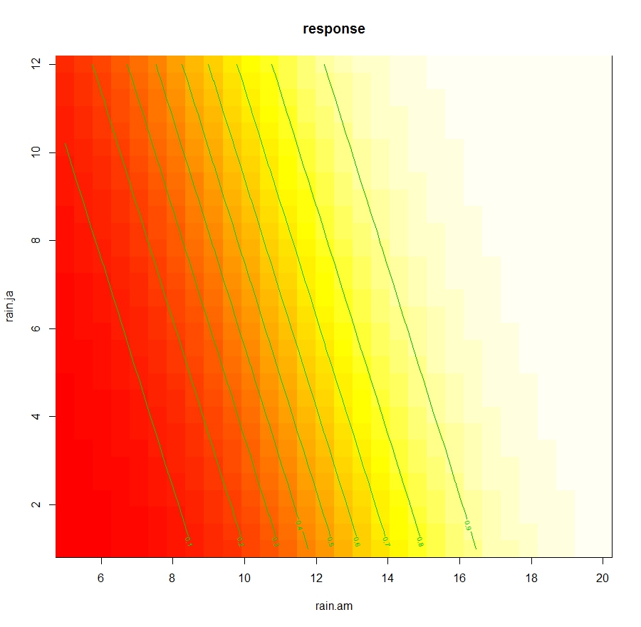
As part of my new role as Lecturer in Agri-data analysis at Harper Adams University, I found myself applying a lot of techniques based on linear modelling. Another thing I noticed is that there is a lot of confusion among researchers in regards to what technique should be used in each instance and how to interpret the model. For this reason I started reading material from books and on-line to try and create a sort of reference tutorial that researchers can use. This post is the result of my work so far and I will keep updating it with new information.
Please feel free to comment, provide feedback and constructive criticism!!
Theoretical Background - Linear Model and ANOVA
Linear Model
The classic
linear model forms the basis for ANOVA (with categorical treatments) and ANCOVA
(which deals with continuous explanatory variables). Its basic equation is the
following:
where β_0 is the intercept (i.e. the value of the line at zero), β_1 is the slope for the variable x, which indicates the changes in y as a function of changes in x. For example if the slope is +0.5, we can say that for each unit increment in x, y increases of 0.5. Please note that the slope can also be negative. The last element of the equation is the random error term, which we assume normally distributed with mean zero and constant variance.
This equation can be expanded to accommodate more that one explanatory variable x:
In this case the interpretation is a bit more complex because for example the coefficient β_2 provides the slope for the explanatory variable x_2. This means that for a unit variation of x_2 the target variable y changes by the value of β_2, if the other explanatory variables are kept constant.
In case our model includes interactions, the linear equation would be changed as follows:
notice the interaction term between x_1 and x_2. In this case the interpretation becomes extremely difficult just by looking at the model.
In fact, if we rewrite the equation focusing for example on x_1:
we can see that its slope become affected by the value of x_2 (Yan & Su, 2009), for this reason the only way we can actually determine how x_1 changes Y, when the other terms are kept constant, is to use the equation with new values of x_1.
This linear model can be applied to continuous target variables, in this case we would talk about an ANCOVA for exploratory analysis, or a linear regression if the objective was to create a predictive model.
ANOVA
The Analysis of variance is based on the linear model presented above, the only difference is that its reference point is the mean of the dataset. When we described the equations above we said that to interpret the results of the linear model we would look at the slope term; this indicates the rate of changes in Y if we change one variable and keep the rest constant. The ANOVA calculates the effects of each treatment based on the grand mean, which is the mean of the variable of interest.
In mathematical terms ANOVA solves the following equation (Williams, 2004):
where y is the effect on group j of treatment τ_1, while μ is the grand mean (i.e. the mean of the whole dataset). From this equation is clear that the effects calculated by the ANOVA are not referred to unit changes in the explanatory variables, but are all related to changes on the grand mean.
Examples of ANOVA and ANCOVA in R
For this example we are going to
use one of the datasets available in the package agridat
available in CRAN:
install.packages("agridat")
We also need to include other packages for the examples below. If some of these are not installed in your system please use again the function install.packages (replacing the name within quotation marks according to your needs) to install them.
 library(agridat)
 library(ggplot2)
 library(plotrix)
 library(moments)
 library(car)
 library(fitdistrplus)
 library(nlme)
 library(multcomp)
 library(epade)
 library(lme4)
Now we can load the dataset lasrosas.corn, which has more that 3400 observations of corn yield in a field in Argentina, plus several explanatory variables both factorial (or categorical) and continuous.
 > dat = lasrosas.corn
 > str(dat)
 'data.frame':  3443 obs. of 9 variables:
  $ year : int 1999 1999 1999 1999 1999 1999 1999 1999 1999 1999 ...
  $ lat : num -33.1 -33.1 -33.1 -33.1 -33.1 ...
  $ long : num -63.8 -63.8 -63.8 -63.8 -63.8 ...
  $ yield: num 72.1 73.8 77.2 76.3 75.5 ...
  $ nitro: num 132 132 132 132 132 ...
  $ topo : Factor w/ 4 levels "E","HT","LO",..: 4 4 4 4 4 4 4 4 4 4 ...
  $ bv  : num 163 170 168 177 171 ...
  $ rep : Factor w/ 3 levels "R1","R2","R3": 1 1 1 1 1 1 1 1 1 1 ...
  $ nf  : Factor w/ 6 levels "N0","N1","N2",..: 6 6 6 6 6 6 6 6 6 6 ...
Important for the purpose of this tutorial is the target variable yield, which is what we are trying to model, and the explanatory variables: topo (topographic factor), bv (brightness value, which is a proxy for low organic matter content) and nf (factorial nitrogen levels). In addition we have rep, which is the blocking factor.
Checking Assumptions
Since we are planning to use an
ANOVA we first need to check that our data fits with its assumptions. ANOVA is
based on three assumptions:
- Independence, in terms of independence of the error term
- Normality of the response variable (y)
- Normality of the error term (i.e. residuals).
- Equality of variances between groups
- Balance design (i.e. all groups have the same
number of samples)
NOTE:
Normality of the response variable is a contested point and not all authors agree with this. In my reading I found some author explicitly talk about normality of the response variable, while others only talk about normality of the errors. In the R Book the author states as assumption only normality of error, but says that the ANOVA can be applied to random variables, which in a way should imply normality of the response.
Let’s see how we can test for
them in R. Clearly we are talking about environmental data so the assumption of
independence is not met, because data are autocorrelated with distance.
Theoretically speaking, for spatial data ANOVA cannot be employed and more
robust methods should be employed (e.g. REML); however, over the years it has
been widely used for analysis of environmental data and it is accepted by the
community. That does not mean that it is the correct method though, and later
on in this tutorial we will see the function to perform linear modelling with
REML.
The third assumption is the one
that is most easy to assess using the function tapply:
 > tapply(dat$yield, INDEX=dat$nf, FUN=var)
    N0    N1    N2    N3    N4    N5
 438.5448 368.8136 372.8698 369.6582 366.5705 405.5653
In this case we used tapply to calculate the variance of yield for each subgroup (i.e. level of nitrogen). There is some variation between groups but in my opinion it is not substantial. Now we can shift our focus on normality. There are tests to check for normality, but again the ANOVA is flexible (particularly where our dataset is big) and can still produce correct results even when its assumptions are violated up to a certain degree. For this reason, it is good practice to check normality with descriptive analysis alone, without any statistical test. For example, we could start by plotting the histogram of yield:
hist(dat$yield, main="Histogram of Yield", xlab="Yield (quintals/ha)")
 qqnorm(dat$yield, main="QQplot of Yield")
 qqline(dat$yield)
For normally distributed data the
points should all be on the line. This is clearly not the case but again the
deviation is not substantial. The final element we can calculate is the skewness
of the distribution, with the function skewness
in the package moments:
 > skewness(dat$yield)
 [1] 0.3875977
According to Webster and Oliver (2007)
is the skewness is below 0.5, we can consider the deviation from normality not
big enough to transform the data. Moreover, according to Witte and Witte (2009)
if we have more than 10 samples per group we should not worry too much about
violating the assumption of normality or equality of variances.
To see how many samples we have
for each level of nitrogen we can use once again the function tapply:
 > tapply(dat$yield, INDEX=dat$nf, FUN=length)
  N0 N1 N2 N3 N4 N5
 573 577 571 575 572 575
As you can see we have definitely
more than 10 samples per group, but our design is not balanced (i.e. some groups
have more samples). This implies that the normal ANOVA cannot be used, this is
because the standard way of calculating the sum of squares is not appropriate
for unbalanced designs (look here for more info:
http://goanna.cs.rmit.edu.au/~fscholer/anova.php).
The same function tapply can be used to check the assumption of equality of variances. We just need to replace the function length with the function var for the option FUN.
In summary, even though from the
descriptive analysis it appears that our data are close to being normal and
have equal variance, our design is unbalanced, therefore the normal way of doing
ANOVA cannot be used. In other words we cannot function aov
for this dataset. However, since this is a tutorial we are still going to start
by applying the normal ANOVA with aov.
ANOVA with aov
The first thing we need to do is
think about the hypothesis we would like to test. For example, we could be
interested in looking at nitrogen levels and their impact on yield. Let’s start
with some plotting to better understand our data:
 means.nf = tapply(dat$yield, INDEX=dat$nf, FUN=mean)
 StdErr.nf = tapply(dat$yield, INDEX=dat$nf, FUN= std.error)

 BP = barplot(means.nf, ylim=c(0,max(means.nf)+10))
 segments(BP, means.nf - (2*StdErr.nf), BP,
      means.nf + (2*StdErr.nf), lwd = 1.5)

 arrows(BP, means.nf - (2*StdErr.nf), BP,
      means.nf + (2*StdErr.nf), lwd = 1.5, angle = 90,
     code = 3, length = 0.05)
This code first uses the function
tapply to compute mean and
standard error of the mean for yield in each nitrogen group. Then it plots the
means as bars and creates error bars using the standard error (please remember
that with a normal distribution ± twice the standard error provides a
95% confidence interval around the mean value). The result is the following
image:

By plotting our data we can start
figuring out what is the interaction between nitrogen levels and yield. In
particular, there is an increase in yield with higher level of nitrogen.
However, some of the error bars are overlapping, and this may suggest that
their values are not significantly different. For example, by looking at this
plot N0 and N1 have error bars very close to overlap, but probably not
overlapping, so it may be that N1 provides a significant different from N0. The
rest are all probably significantly different from N0. For the rest their
interval overlap most of the times, so their differences would probably not be
significant.
We could formulate the hypothesis
that nitrogen significantly affects yield and that the mean of each subgroup
are significantly different. Now we just need to test this hypothesis with a
one-way ANOVA:
mod1 = aov(yield ~ nf, data=dat)
The code above uses the function aov to perform an ANOVA; we can specify to perform a
one-way ANOVA simply by including only one factorial term after the tilde (~)
sign. We can plot the ANOVA table with the function summary:
 > summary(mod1)
        Df Sum Sq Mean Sq F value  Pr(>F)
 nf       5  23987  4797  12.4 6.08e-12 ***
 Residuals  3437 1330110   387
 ---
 Signif. codes: 0 ‘***’ 0.001 ‘**’ 0.01 ‘*’ 0.05 ‘.’ 0.1 ‘ ’ 1
It is clear from this output that
nitrogen significantly affects yield, so we tested our first hypothesis. To
test the significance for individual levels of nitrogen we can use the Tukey’s
test:
 > TukeyHSD(mod1, conf.level=0.95)
  Tukey multiple comparisons of means
   95% family-wise confidence level

 Fit: aov(formula = yield ~ nf, data = dat)

 $nf
       diff    lwr    upr   p adj
 N1-N0 3.6434635 0.3353282 6.951599 0.0210713
 N2-N0 4.6774357 1.3606516 7.994220 0.0008383
 N3-N0 5.3629638 2.0519632 8.673964 0.0000588
 N4-N0 7.5901274 4.2747959 10.905459 0.0000000
 N5-N0 7.8588595 4.5478589 11.169860 0.0000000
 N2-N1 1.0339723 -2.2770686 4.345013 0.9489077
 N3-N1 1.7195004 -1.5857469 5.024748 0.6750283
 N4-N1 3.9466640 0.6370782 7.256250 0.0089057
 N5-N1 4.2153960 0.9101487 7.520643 0.0038074
 N3-N2 0.6855281 -2.6283756 3.999432 0.9917341
 N4-N2 2.9126917 -0.4055391 6.230923 0.1234409
 N5-N2 3.1814238 -0.1324799 6.495327 0.0683500
 N4-N3 2.2271636 -1.0852863 5.539614 0.3916824
 N5-N3 2.4958957 -0.8122196 5.804011 0.2613027
 N5-N4 0.2687320 -3.0437179 3.581182 0.9999099
There are significant differences
between the control and the rest of the levels of nitrogen, plus other
differences between N4 and N5 compared to N1, but nothing else. If you look
back at the bar chart we produced before, and look carefully at the overlaps
between error bars, you will see that for example N1, N2, and N3 have
overlapping error bars, thus they are not significantly different. On the
contrary, N1 has no overlaps with either N4 and N5 , which is what we
demonstrated in the ANOVA.
The function model.tables provides a quick way to print the table
of effects and the table of means:
 > model.tables(mod1, type="effects")
 Tables of effects

  nf
      N0   N1   N2    N3   N4   N5
    -4.855 -1.212 -0.178  0.5075  2.735  3.003
 rep 573.000 577.000 571.000 575.0000 572.000 575.000
These values are all referred to
the gran mean, which we can simply calculate with the function mean(dat$yield) and it is equal to 69.83. This means
that the mean for N0 would be 69.83-4.855 = 64.97. we can verify that with
another call to the function model.tables,
this time with the option type=”means”:
 > model.tables(mod1, type="means")
 Tables of means
 Grand mean

 69.82831

  nf
     N0   N1   N2   N3   N4   N5
    64.97 68.62 69.65 70.34 72.56 72.83
 rep 573.00 577.00 571.00 575.00 572.00 575.00
Update 05/02/2018
Nonparametric One-Way ANOVA
For certain datasets the assumption of normality cannot be met. In such cases we may consider different options, GLM is one of them and it should be a good solution for datasets like counts and proportions. Another option could be to transform the data to normalize them and therefore meet the assumption of normality. However, with transformations we need to be extremely careful because the estimates of the slopes will also be transformed, and so we always need to know how to back-transform our data. The final option would be to use nonparametric tests, which do not assume a normal distribution.
For the one-way ANOVA the nonparametric alternative is the Kruskal-Wallis test:
kruskal.test(yield ~ nf, data=dat)
This function returns the following result:
 > kruskal.test(yield ~ nf, data=dat)
      Kruskal-Wallis rank sum test
 data: yield by nf
 Kruskal-Wallis chi-squared = 81.217, df = 5, p-value = 4.669e-16
The p-value is very low, which means the nf treatments are significant.
Linear Model with 1 factor
The same results can be obtain by
fitting a linear model with the function lm, only their interpretation would be
different. The assumption for fitting a linear models are again independence
(which is always violated with environmental data), and normality.
Let’s look at the code:
mod2 = lm(yield ~ nf, data=dat)
This line fits the same model but
with the standard linear equation. This become clearer by looking at the
summary table:
 > summary(mod2)

 Call:
 lm(formula = yield ~ nf, data = dat)

 Residuals:
   Min   1Q Median   3Q   Max
 -52.313 -15.344 -3.126 13.563 45.337

 Coefficients:
       Estimate Std. Error t value Pr(>|t|)
 (Intercept) 64.9729   0.8218 79.060 < 2e-16 ***
 nfN1     3.6435   1.1602  3.140  0.0017 **
 nfN2     4.6774   1.1632  4.021 5.92e-05 ***
 nfN3     5.3630   1.1612  4.618 4.01e-06 ***
 nfN4     7.5901   1.1627  6.528 7.65e-11 ***
 nfN5     7.8589   1.1612  6.768 1.53e-11 ***
 ---
 Signif. codes: 0 ‘***’ 0.001 ‘**’ 0.01 ‘*’ 0.05 ‘.’ 0.1 ‘ ’ 1

 Residual standard error: 19.67 on 3437 degrees of freedom
 Multiple R-squared: 0.01771,  Adjusted R-squared: 0.01629
 F-statistic: 12.4 on 5 and 3437 DF, p-value: 6.075e-12
There are several information in
this table that we should clarify. First of all it already provides with some
descriptive measures for the residuals, from which we can see that their
distribution is relatively normal (first and last quartiles have similar but
opposite values and the same is true for minimum and maximum). As you remember when we talked about assumptions, one was that the error term is normal. This first part of the output allows us to check whether we are meeting this assumption.
Other important information we should look at are the R-squared and Adjusted R-squared (please look at the end of the page to know more about these two values). In essence, R-squared tells us how much variance in the data can be explained by the model, in this case not much. However, this is an exploratory rather than a predictive model, so we know that there may be other factors that affect the variability of yield, but we are not interested in them. We are only interested in understanding in the impact of the level of nitrogen. Another important information is the F-statistics at the end, with the p-value (which is very low). The F-statistic is the ration between the variability between groups (meaning between different level of N) and within groups (meaning the variability with samples with the same value of N). This ratio and the related p-value tell us that our model is significant (because the variability that we obtain increasing N is higher that the normal variability we expect from random variation), which means that nitrogen has an effect on yield.
Then we have the
table of the coefficients, with the intercept and all the slopes, plus their standard errors. These can be used to build confidence intervals for the coefficients, which are used to assess the uncertainty around their estimation. We can actually compute the confidence intervals with the function confint (the option level is used to specify for example that we are looking at the 95% confidence interval):
 > confint(mod2, level = 0.95)
         2.5 %  97.5 %
 (Intercept) 63.361592 66.584202
 nfN1     1.368687 5.918240
 nfN2     2.396712 6.958160
 nfN3     3.086217 7.639711
 nfN4     5.310402 9.869853
 nfN5     5.582112 10.135607
Another important element about coefficients is that there measuring unit is the same as the dependent variable, because it provides an estimate of the effect of a predictor to the dependent variable, i.e. yield.
As you can
see the level N0 is not shown in the list; this is called the reference level,
which means that all the other are referenced back to it. In other words, the
value of the intercept is the mean of nitrogen level 0 (in fact is the same we
calculated above 64.97). To calculate the means for the other groups we need to
sum the value of the reference level with the slopes. For example N1 is 64.97 +
3.64 = 68.61 (the same calculated from the ANOVA). The p-value and the significance
are again in relation to the reference level, meaning for example that N1 is
significantly different from N0 (reference level) and the p-value is 0.0017.
This is similar to the Tukey’s test we performed above, but it is only valid in
relation to N0. As you can see the p-value is computed from the t-statistic, this is because R computes t-test comparing all the factors to the reference level.
We need to change the reference level, and fit another model,
to get the same information for other nitrogen levels:
 dat$nf = relevel(dat$nf, ref="N1")

 mod3 = lm(yield ~ nf, data=dat)
 summary(mod3)
Now the reference level is N1, so
all the results will tell us the effects of nitrogen in relation to N1.
 > summary(mod3)

 Call:
 lm(formula = yield ~ nf, data = dat)

 Residuals:
   Min   1Q Median   3Q   Max
 -52.313 -15.344 -3.126 13.563 45.337

 Coefficients:
       Estimate Std. Error t value Pr(>|t|)
 (Intercept)  68.616   0.819 83.784 < 2e-16 ***
 nfN0     -3.643   1.160 -3.140 0.001702 **
 nfN2      1.034   1.161  0.890 0.373308
 nfN3      1.720   1.159  1.483 0.138073
 nfN4      3.947   1.161  3.400 0.000681 ***
 nfN5      4.215   1.159  3.636 0.000280 ***
 ---
 Signif. codes: 0 ‘***’ 0.001 ‘**’ 0.01 ‘*’ 0.05 ‘.’ 0.1 ‘ ’ 1

 Residual standard error: 19.67 on 3437 degrees of freedom
 Multiple R-squared: 0.01771,  Adjusted R-squared: 0.01629
 F-statistic: 12.4 on 5 and 3437 DF, p-value: 6.075e-12
For example, we can see that N0
has a lower value compared to N1, and that only N0, N4 and N5 are significantly
different from N1, which is what we saw from the bar chart and what we found
from the Tukey’s test.
Interpreting the output of the
function aov is much easier compare to lm. However, in many cases we can only use the
function lm (for example in an ANCOVA
where alongside categorical we have continuous explanatory variables) so it is
important that we learn how to interpret its summary table.
We can obtain the ANOVA table
with the function anova:
 > anova(mod2)
 Analysis of Variance Table

 Response: yield
       Df Sum Sq Mean Sq F value  Pr(>F)
 nf      5  23987 4797.4 12.396 6.075e-12 ***
 Residuals 3437 1330110  387.0
 ---
 Signif. codes: 0 ‘***’ 0.001 ‘**’ 0.01 ‘*’ 0.05 ‘.’ 0.1 ‘ ’ 1
This uses the type I sum of
squares (more info at: http://www.utstat.utoronto.ca/reid/sta442f/2009/typeSS.pdf),
which is the standard way and it is not indicated for unbalanced designs. The
function Anova in the package car has the option to select which type of sum of
squares to calculate and we can specify type=c(“III”)
to correct for the unbalanced design:
 > Anova(mod2, type=c("III"))
 Anova Table (Type III tests)

 Response: yield
        Sum Sq  Df F value  Pr(>F)
 (Intercept) 2418907  1 6250.447 < 2.2e-16 ***
 nf      23987  5  12.396 6.075e-12 ***
 Residuals  1330110 3437
 ---
 Signif. codes: 0 ‘***’ 0.001 ‘**’ 0.01 ‘*’ 0.05 ‘.’ 0.1 ‘ ’ 1
In this example the two results
are the same, probably the large sample size helps in this respect. However,
for smaller samples this distinction may become important. For this reason, if
your design is unbalanced please remember not to use the function aov, but always lm
and Anova with the option for type
III sum of squares.
Two-way ANOVA
So far we have looked on the
effect of nitrogen on yield. However, in the dataset we also have a factorial
variable named topo, which stands for topographic factor and has 4 levels: W =
West slope, HT = Hilltop, E = East slope, LO = Low East. We already formulated
an hypothesis about nitrogen, so now we need to formulate an hypothesis about
topo as well. Once again we can do that by using the function tapply and a simple bar charts with error bars. Look
at the code below:
 means.topo = tapply(dat$yield, INDEX=dat$topo, FUN=mean)
 StdErr.topo = tapply(dat$yield, INDEX=dat$topo, FUN= std.error)

 BP = barplot(means.topo, ylim=c(0,max(means.topo)+10))
 segments(BP, means.topo - (2*StdErr.topo), BP,
      means.topo + (2*StdErr.topo), lwd = 1.5)

 arrows(BP, means.topo - (2*StdErr.topo), BP,
      means.topo + (2*StdErr.topo), lwd = 1.5, angle = 90,
     code = 3, length = 0.05)
Here we are using the same exact approach we used before to
formulate an hypothesis about nitrogen. We first calculate mean and standard
error of yield for each level of topo, and then plot a bar chart with error
bars.
The result is the plot below:
From this plot it is clear that the topographic factor has
an effect on yield. In particular, hilltop areas have low yield while the low
east corner of the field has high yield. From the error bars we can say with a
good level of confidence that probably all the differences will be significant,
at least up to an alpha of 95% (significant level, meaning a p-value of 0.05).
We can test this hypothesis with a two way ANOVA, by simply
adding the term topo to the equation:
 mod1b = aov(yield ~ nf + topo, data=dat)

 summary(mod1b)

        Df Sum Sq Mean Sq F value Pr(>F)
 nf       5 23987  4797  23.21 <2e-16 ***
 topo      3 620389 206796 1000.59 <2e-16 ***
 Residuals  3434 709721   207
 ---
 Signif. codes: 0 ‘***’ 0.001 ‘**’ 0.01 ‘*’ 0.05 ‘.’ 0.1 ‘ ’ 1
From the summary table it is clear that both factors have a
significant effect on yield, but just by looking at this it is very difficult
to identify clearly which levels are the significant ones. Top do that we need
the Tukey’s test:
 TukeyHSD(mod1b, conf.level=0.95, which=c("topo"))

  Tukey multiple comparisons of means
   95% family-wise confidence level

 Fit: aov(formula = yield ~ nf + topo, data = dat)

 $topo
       diff    lwr    upr p adj
 HT-LO -36.240955 -38.052618 -34.429291   0
 W-LO -18.168544 -19.857294 -16.479794   0
 E-LO  -6.206619 -8.054095 -4.359143   0
 W-HT  18.072411 16.326440 19.818381   0
 E-HT  30.034335 28.134414 31.934257   0
 E-W  11.961925 10.178822 13.745028   0
The zero p-values indicate a large significance for each
combination, as it was clear from the plot. With the function model.table you can easily obtain a table of means or
effects, if you are interested.
Two-Way ANOVA with Interactions
One step further we can take to get more insights into our
data is add an interaction between nitrogen and topo, and see if this can
further narrow down the main sources of yield variation. Once again we need to
start our analysis by formulating an hypothesis. Since we are talking about an
interaction we are now concern in finding a way to plot yield responses for
varying nitrogen level and topographic position, so we need a 3d bar chart. We
can do that with the function bar3d.ade from
the package epade, so please install this
package and load it.
Then please look at the following R code:
 dat$topo = factor(dat$topo,levels(dat$topo)[c(2,4,1,3)])

 means.INT = tapply(dat$yield, INDEX=list(dat$nf, dat$topo), FUN=mean)

 bar3d.ade(means.INT, col="grey")
The first line is only used to reorder the levels in the
factorial variable topo. This is because from the previous plot we clearly saw
that HT is the one with the lowest yield, followed by W, E and LO. We are doing
this only to make the 3d bar chart more readable.
The next line applies once again the function tapply, this
time to calculate the mean of yield for subgroups divided by nitrogen and
topographic factors. The result is a matrix that looks like this:
 > means.INT
      LO    HT    W    E
 N0 81.03027 41.50652 62.08192 75.13902
 N1 83.06276 48.33630 65.74627 78.12808
 N2 85.06879 48.79830 66.70848 78.92632
 N3 85.23255 50.18398 66.16531 78.99210
 N4 87.14400 52.12039 70.10682 80.39213
 N5 87.94122 51.03138 69.65933 80.55078
This can be used directly within the function bar3d.ade to create the 3d bar chart below:

From this plot we can see two things very clearly: the first
is that there is an increase in yield from HT to LO in the topographic factor,
the second is that we have again and increase from N0 to N1 in the nitrogen
levels. These were all expected since we already noticed them before. What we
do not see in these plot is any particular influence from the interaction
between topography and nitrogen. For example, if you look at HT, you have an
increase in yield from N0 to N5 (expected) and overall the yield is lower than
the other bars (again expected). If there was an interaction we would expect
this general pattern to change, for example with relatively high yield on the
hilltop at high nitrogen level, or very low yield in the low east side with N0.
This does not happen and all the bars follow an expected pattern, so we can
hypothesise that the interaction will not be significant.
We can further explore a possible interaction between nf and topo by creating an interaction plot:
with(dat, interaction.plot(topo, nf, yield))
This line applies the function interaction plot within the call to the function with, which indicates to R that the names are referred to the dataset named dat. The result is the following image:
Again, all the lines increase with changes in topography, but there no additional effect provided by changes in nf. In fact, the lines never cross, or just cross slightly: this is a good indication of lack of interaction.
To formally test our hypothesis of lack of interaction, we need to run another ANOVA with an interaction
term:
mod1c = aov(yield ~ nf * topo, data=dat)
This formula test for both main effects and their
interaction. To see the significance we can use the summary table:
 > summary(mod1c)
        Df Sum Sq Mean Sq F value Pr(>F)
 nf       5 23987  4797 23.176 <2e-16 ***
 topo      3 620389 206796 999.025 <2e-16 ***
 nf:topo    15  1993   133  0.642 0.842
 Residuals  3419 707727   207
 ---
 Signif. codes: 0 ‘***’ 0.001 ‘**’ 0.01 ‘*’ 0.05 ‘.’ 0.1 ‘ ’ 1
From this we can conclude that our hypothesis was correct
and that the interaction has no effect on yield.
Update 05/02/2018
Nonparametric k-way ANOVA
Above we looked at the Kruskal-Wallis test for nonparametric one-way ANOVA. However, there may be cases when we have more complex factorial designs and still struggle to meet the assumption of normality.
In such cases one of the possibilities we have is to use a nonparametric test, from the package Rfit:
 install.packages("Rfit")
 library(Rfit)
 mod.RAOV = raov(yield ~ nf * topo, data=dat)
 mod.RAOV
 > mod.RAOV
 Robust ANOVA Table
     DF     RD  Mean RD     F p-value
 nf    5  764.56053 152.91211 21.96030 0.00000
 topo   3 17418.76333 5806.25444 833.85875 0.00000
 nf:topo 15  59.15213  3.94348  0.56634 0.90215
As you can see the function we need to use here is raov, which stands for Robust ANOVA (Please read the book "Nonparametric statistical Methods Using R" by Kloke and McKean).
The syntax is the same as for the function aov, the result table is also very similar. The only difference is that we do not have the stars to indicate significance, but we can easily work that out using the p-values.
For other models we can use the function rfit, which is similar to lm in syntax and results.
We can have a even better ides of the interaction effect by using some functions in the package phia:
 library(phia)

 plot(interactionMeans(mod1c))
This function plots the effects of the interactions in a 2 by 2 plot, including the standard error of the coefficients, so that we can readily see which overlap:
We already knew from the 3d plot that there is a general increase between N0 and N5 that mainly drives the changes we see in the data. However, from the top-right plot we can see that topo plays a little role between N0 and the other (in fact the black line only slightly overlap with the other), but it has no effect on N1 to N5.
We can look at the numerical break-out of what we see in the plot with another function:
 > testInteractions(mod1c)
 F Test:
 P-value adjustment method: holm
         Value  Df Sum of Sq   F Pr(>F)
 N0-N1 : HT-W -3.1654  1    377 1.8230   1
 N0-N2 : HT-W -2.6652  1    267 1.2879   1
 N0-N3 : HT-W -4.5941  1    784 3.7880   1
 N0-N4 : HT-W -2.5890  1    250 1.2072   1
 N0-N5 : HT-W -1.9475  1    140 0.6767   1
 N1-N2 : HT-W 0.5002  1     9 0.0458   1
 N1-N3 : HT-W -1.4286  1    76 0.3694   1
 N1-N4 : HT-W 0.5765  1    12 0.0604   1
 N1-N5 : HT-W 1.2180  1    55 0.2669   1
 N2-N3 : HT-W -1.9289  1    139 0.6711   1
 N2-N4 : HT-W 0.0762  1     0 0.0011   1
 N2-N5 : HT-W 0.7178  1    19 0.0924   1
 N3-N4 : HT-W 2.0051  1    149 0.7204   1
The table is very long so only the first lines are included. However, from this it is clear that the interaction has no effect (p-value of 1), but if it was this function can give us numerous details about the specific effects.
Now we could try to compare the two models to see if they are different in the amount of variability they can explain in the data. This can be done with the function anova, and performing an F test:
 > anova(mod1b, mod1c, test="F")
 Analysis of Variance Table
 Model 1: yield ~ nf + topo
 Model 2: yield ~ nf * topo
  Res.Df  RSS Df Sum of Sq   F Pr(>F)
 1  3434 709721
 2  3419 707727 15  1993.2 0.6419 0.8421
As we can see from this output, the p-value is not significant. This means that the two model are no different in their explanatory power. This further support the fact that including an interaction does not change the accuracy of the model, and probably decreases it. We could test this last statement for example by looking at the AIC for both models, we will see how to do that later on in the tutorial.
Please remember that the method we just used can be employed to compare probably all the models we are going to fit in this tutorial, so it is a very powerful method!
ANCOVA with lm
The Analysis of covariance
(ANCOVA) fits a new model where the effects of the treatments (or factorial
variables) is corrected for the effect of continuous covariates, for which we
can also see the effects on yield.
The code is very similar to what
we saw before, and again we can perform an ANCOVA with the lm function; the only difference is that here we are
including an additional continuous explanatory variable in the model:
 > mod3 = lm(yield ~ nf + bv, data=dat)
 > summary(mod3)

 Call:
 lm(formula = yield ~ nf + bv, data = dat)

 Residuals:
   Min   1Q Median   3Q   Max
 -78.345 -10.847 -3.314 10.739 56.835

 Coefficients:
        Estimate Std. Error t value Pr(>|t|)
 (Intercept) 271.55084  4.99308 54.385 < 2e-16 ***
 nfN0     -3.52312  0.95075 -3.706 0.000214 ***
 nfN2     1.54761  0.95167  1.626 0.103996
 nfN3     2.08006  0.94996  2.190 0.028619 *
 nfN4     3.82330  0.95117  4.020 5.96e-05 ***
 nfN5     4.47993  0.94994  4.716 2.50e-06 ***
 bv      -1.16458  0.02839 -41.015 < 2e-16 ***
 ---
 Signif. codes: 0 ‘***’ 0.001 ‘**’ 0.01 ‘*’ 0.05 ‘.’ 0.1 ‘ ’ 1

 Residual standard error: 16.12 on 3436 degrees of freedom
 Multiple R-squared: 0.3406,  Adjusted R-squared: 0.3394
 F-statistic: 295.8 on 6 and 3436 DF, p-value: < 2.2e-16
By printing the summary table we
can already see some differences compared to the model we only nitrogen as
explanatory variable. The first is related to the Adjusted R-squared (which is
simply the R-squared corrected for the number of predictors so that it is less
affected by overfitting), which in this case is around 0.3. If we look back at
the summary table of the model with only nitrogen, the R-squared was only 0.01.
This means that by adding the continuous variable bv we are able to massively
increase the explanatory power of the model; in fact, this new model is capable
of explaining 33% of the variation in yield. Moreover, we can also see that
other terms become significant, for example N3. This is because the inclusion
of bv changes the entire model and its interpretation becomes less obvious
compared to the simple bar chart we plotted at the beginning.
The interpretation of the ANCOVA
model is more complex that the one for the one-way ANOVA. In fact, the
intercept value has changed and it is not the mean of the reference level N1.
This is because the model now changes based on the covariate bv. The slope can
be used to assess the relative impact of each term; for example, N0 has a
negative impact on yield in relation to its reference level. Therefore,
shifting from a nitrogen level N1 to N0 decreases the yield by -3.52, if bv is
kept constant.
Take a look at the following
code:
 > test.set = data.frame(nf="N1", bv=150)
 > predict(mod3, test.set)
     1    2
 96.86350 38.63438
 >
 > test.set = data.frame(nf="N0", bv=150)
 > predict(mod3, test.set)
     1
 93.34037
Here we are using the model (mod3) to estimate new values of
yield based on set parameters. In the first example we set nf to N1 (reference
level) and bv constant at 150. With the function predict
we can see estimate these new values using mod3. For N1 and bv equal to 150 the
yield is 96.86. In the second example we did the same but for nitrogen level
N0. The result is a yield equal to 93.34, that is a difference of exactly 3.52,
which is the slope of the model.
For computing the ANOVA table, we
can again use either the function
anova (if the
design is balanced) or
Anova with type
III (for unbalanced designs).
Let's now look at some diagnostic plots we can use to test whether our model meets all the assumptions for linear models. We can use the default plot function in R to do so:
 par(mfrow=c(2,2))
 plot(mod3)
Here I first used the function par, to divide the plotting window into 2 rows and two columns so that we can plot all four diagnostic plots into the same window. The result is the following:
The top left plot is represents the residuals against the fitted values (or the estimates from the model). One of our assumptions was that the error term had mean equal to zero and constant variance. This means that we should see the residuals equally spread around zero. We should see a more or less horizontal line with intercept on the zero. In fact, we actually see that for low values of yield (x axis) we have a sort of equal spread around zero, but this changes with the increase in yield; this is clearly a violation of the assumption. The second plot on the top represents the QQplot of the residuals, which again should be on the middle line because another assumption is that the error should be normal. Again we have some values that do not fit with normality. A good thing is that R prints the ID of these values so that we can evaluate whether we think they are outliers or we have another explanation for the violations of the assumptions.
In the second row on the left we have a plot that again is used to check whether we meet the assumption of constant variance. We should again see a more or less horizontal line, but again we have an increase in variance, which violates the assumption. Finally, we have the residuals vs. leverage plot and the Cook's Distance. Leverage represents the influence of each point on the model; again we see that some points have larger influence on the model. This should not be the case, we should see again a more or less equal spread of point. Another information we can have from this plot is whether the extreme observations may be outliers. If our extreme points would lie outside the Cook's Distance zone we would suspect them to be outliers. However, in this case the zone is not even plotted because it is outside the plotting area, so we probably do not have outliers.
For more info about diagnostic plots please take a look here:
http://data.library.virginia.edu/diagnostic-plots/
http://www.statmethods.net/stats/rdiagnostics.html
We can further investigate as to why our model does not meet all assumptions by looking at the residuals vs. fitted values and try to color the points based for example on topo. We can do that easily with ggplot2:
qplot(fitted(mod3), residuals(mod3), col=dat$topo, geom="point", xlab="Fitted Values", ylab="Residuals")
This creates the following image:
From this image it is clear that all the points that look as possible outliers come from a specific topographic category. This may mean different things depending on the data. In this case I think it only means that we should include topo in our model. However, for other data it may mean that we should exclude certain categories, but the point I want to make is that it is always important not to look only at the summary table but try to explore the model a bit more in details to draw more meaningful conclusions.
Update 24/07/2017
In the package agricolae there are functions to compute Tukey's and LSD pairwise comparisons. The code is very simple:
 install.packages("agricolae")
 library(agricolae)
Now we can perform the Tukey's test first:
 > HSD.test(mod3, trt="nf", console=T, alpha=0.05)
 Study: mod3 ~ "nf"
 HSD Test for yield
 Mean Square Error: 259.8756
 nf, means
    yield   std  r  Min  Max
 N0 64.97290 20.94146 573 12.66 108.84
 N1 68.61636 19.20452 577 27.44 110.54
 N2 69.65033 19.30984 571 31.79 112.85
 N3 70.33586 19.22650 575 19.41 110.12
 N4 72.56302 19.14603 572 32.05 117.90
 N5 72.83176 20.13865 575 31.79 117.19
 alpha: 0.05 ; Df Error: 3436
 Critical Value of Studentized Range: 4.032372
 Harmonic Mean of Cell Sizes 573.8261
 Honestly Significant Difference: 2.713646
 Means with the same letter are not significantly different.
 Groups, Treatments and means
 a    N5   72.83
 a    N4   72.56
 ab    N3   70.34
 b    N2   69.65
 b    N1   68.62
 c    N0   64.97
and the the LSD:
 > LSD.test(mod3, trt="nf", console=T, alpha=0.05)
 Study: mod3 ~ "nf"
 LSD t Test for yield
 Mean Square Error: 259.8756
 nf, means and individual ( 95 %) CI
    yield   std  r   LCL   UCL  Min  Max
 N0 64.97290 20.94146 573 63.65249 66.29330 12.66 108.84
 N1 68.61636 19.20452 577 67.30054 69.93218 27.44 110.54
 N2 69.65033 19.30984 571 68.32762 70.97305 31.79 112.85
 N3 70.33586 19.22650 575 69.01776 71.65397 19.41 110.12
 N4 72.56302 19.14603 572 71.24147 73.88458 32.05 117.90
 N5 72.83176 20.13865 575 71.51365 74.14986 31.79 117.19
 alpha: 0.05 ; Df Error: 3436
 Critical Value of t: 1.960655
 t-Student: 1.960655
 Alpha  : 0.05
 Minimum difference changes for each comparison
 Means with the same letter are not significantly different
 Groups, Treatments and means
 a    N5   72.83176
 a    N4   72.56302
 b    N3   70.33586
 b    N2   69.65033
 b    N1   68.61636
 c    N0   64.9729
The results should be easy to interpret.
Two-factors and one continuous explanatory variable
Let’s look now at another example
with a slightly more complex model where we include two factorial and one
continuous variable. We also include in the model the variable topo. We can
check these with the function levels:
 > levels(dat$topo)
 [1] "E" "HT" "LO" "W"
Please notice that E is the first
and therefore is the reference level for this factor. Now let’s fit the model
and look at the summary table:
 > mod4 = lm(yield ~ nf + bv + topo, data=dat)
 >
 > summary(mod4)

 Call:
 lm(formula = yield ~ nf + bv + topo, data = dat)

 Residuals:
   Min   1Q Median   3Q   Max
 -46.394 -10.927 -2.211 10.364 47.338

 Coefficients:
        Estimate Std. Error t value Pr(>|t|)
 (Intercept) 171.20921  5.28842 32.374 < 2e-16 ***
 nfN0     -3.73225  0.81124 -4.601 4.36e-06 ***
 nfN2     1.29704  0.81203  1.597  0.1103
 nfN3     1.56499  0.81076  1.930  0.0537 .
 nfN4     3.71277  0.81161  4.575 4.94e-06 ***
 nfN5     3.88382  0.81091  4.789 1.74e-06 ***
 bv      -0.54206  0.03038 -17.845 < 2e-16 ***
 topoHT   -24.11882  0.78112 -30.877 < 2e-16 ***
 topoLO    3.13643  0.70924  4.422 1.01e-05 ***
 topoW    -10.77758  0.66708 -16.156 < 2e-16 ***
 ---
 Signif. codes: 0 ‘***’ 0.001 ‘**’ 0.01 ‘*’ 0.05 ‘.’ 0.1 ‘ ’ 1

 Residual standard error: 13.75 on 3433 degrees of freedom
 Multiple R-squared: 0.5204,  Adjusted R-squared: 0.5191
 F-statistic: 413.8 on 9 and 3433 DF, p-value: < 2.2e-16
The adjusted R-squared increases again and now we are able
to explain around 52% of the variation in yield.
The interpretation is similar to what we said before, the
only difference is that here both factors have a reference level. So for
example, the effect of topoHT is related to the reference level, which is the
one not shown E. So if we change the topographic position from E to HT, while
keeping everything else in the model constant (meaning same value of bv and
same nitrogen level), we obtain a decrease in yield of 24.12.
Another thing we can see from this table is that the p-value
change, and for example N3 becomes less significant. This is probably because
when we consider more variables the effect of N3 on yield is explained by other
variables, maybe partly bv and partly topo.
One last thing we can check, and this is something we should
check every time we perform an ANOVA or a linear model is the normality of the
residuals. We already saw that the summary table provides us with some data
about the residuals distribution (minimum, first quartile, median, third
quartile and maximum) that gives us a good indication of normality, since the
distribution is centred around 0. However, we can also use other tools to check
this. For example a QQ plot:
 RES = residuals(mod4)
 qqnorm(RES)
 qqline(RES)
The function residuals automatically extract the residuals
from the model, which can then be used to create the following plot:

It looks approximately normal, but to have a further
confirmation we can use again the function
skewness,
which returns a value below 0.5, so we can consider this a normal distribution.
Update 26/07/2017
The function lsmeans computes the predicted marginal means for combinations of factors and also allows the pairwise comparison. Let's look at the code:
 install.packages("lsmeans")
 library(lsmeans)
After installing lsmeans we can run the function lsmeasn to compute the marginal means for nf and topo:
 > lsmeans(mod4, specs=c("nf","topo"), adjust="tukey")
  nf topo  lsmean    SE  df lower.CL upper.CL
  N0 E  72.93305 0.7320960 3433 71.49766 74.36844
  N1 E  76.66530 0.7303482 3433 75.23334 78.09726
  N2 E  77.96234 0.7309577 3433 76.52919 79.39550
  N3 E  78.23029 0.7333588 3433 76.79243 79.66815
  N4 E  80.37807 0.7334009 3433 78.94012 81.81602
  N5 E  80.54912 0.7352323 3433 79.10758 81.99065
  N0 HT  48.81423 0.7696117 3433 47.30529 50.32317
  N1 HT  52.54648 0.7631689 3433 51.05017 54.04279
  N2 HT  53.84352 0.7709208 3433 52.33201 55.35503
  N3 HT  54.11147 0.7751608 3433 52.59164 55.63129
  N4 HT  56.25925 0.7695510 3433 54.75042 57.76807
  N5 HT  56.43029 0.7781928 3433 54.90453 57.95606
  N0 LO  76.06948 0.7358242 3433 74.62678 77.51218
  N1 LO  79.80173 0.7372548 3433 78.35622 81.24723
  N2 LO  81.09877 0.7374276 3433 79.65293 82.54461
  N3 LO  81.36672 0.7285789 3433 79.93823 82.79521
  N4 LO  83.51450 0.7382983 3433 82.06695 84.96205
  N5 LO  83.68554 0.7269067 3433 82.26033 85.11076
  N0 W  62.15548 0.6765945 3433 60.82891 63.48204
  N1 W  65.88772 0.6768164 3433 64.56072 67.21473
  N2 W  67.18477 0.6778270 3433 65.85578 68.51375
  N3 W  67.45271 0.6749090 3433 66.12945 68.77598
  N4 W  69.60049 0.6749314 3433 68.27719 70.92380
  N5 W  69.77154 0.6726693 3433 68.45267 71.09041

 Confidence level used: 0.95
Now we can use the function cld to obtain the letters specifying which combinations are significantly different:
 > cld(lsmeans(mod4, specs=c("nf","topo"), adjust="tukey"),
 +      alpha  = 0.05,
 +      Letters = letters,
 +      adjust = "tukey")
  nf topo  lsmean    SE  df lower.CL upper.CL .group
  N0 HT  48.81423 0.7696117 3433 46.44912 51.17934 a
  N1 HT  52.54648 0.7631689 3433 50.20116 54.89179  b
  N2 HT  53.84352 0.7709208 3433 51.47439 56.21266  bc
  N3 HT  54.11147 0.7751608 3433 51.72930 56.49363  bc
  N4 HT  56.25925 0.7695510 3433 53.89432 58.62417  c
  N5 HT  56.43029 0.7781928 3433 54.03881 58.82178  c
  N0 W  62.15548 0.6765945 3433 60.07622 64.23473   d
  N1 W  65.88772 0.6768164 3433 63.80778 67.96766   e
  N2 W  67.18477 0.6778270 3433 65.10172 69.26781   ef
  N3 W  67.45271 0.6749090 3433 65.37863 69.52679   ef
  N4 W  69.60049 0.6749314 3433 67.52635 71.67464    fg
  N5 W  69.77154 0.6726693 3433 67.70434 71.83874    fg
  N0 E  72.93305 0.7320960 3433 70.68323 75.18287    g
  N0 LO  76.06948 0.7358242 3433 73.80820 78.33076     h
  N1 E  76.66530 0.7303482 3433 74.42085 78.90975     h
  N2 E  77.96234 0.7309577 3433 75.71602 80.20867     hij
  N3 E  78.23029 0.7333588 3433 75.97659 80.48399     hi k
  N1 LO  79.80173 0.7372548 3433 77.53605 82.06740     ijkl
  N4 E  80.37807 0.7334009 3433 78.12424 82.63190     ijklm
  N5 E  80.54912 0.7352323 3433 78.28966 82.80858     ijkl n
  N2 LO  81.09877 0.7374276 3433 78.83257 83.36498      klmno
  N3 LO  81.36672 0.7285789 3433 79.12770 83.60573      j lmno
  N4 LO  83.51450 0.7382983 3433 81.24562 85.78338        no
  N5 LO  83.68554 0.7269067 3433 81.45167 85.91942       m o

 Confidence level used: 0.95
 Conf-level adjustment: sidak method for 24 estimates
 P value adjustment: tukey method for comparing a family of 24 estimates
 significance level used: alpha = 0.05
ANCOVA with interactions
Let’s now add a further layer of complexity by adding an
interaction term between bv and topo. Once again we need to formulate an
hypothesis before proceeding to test it. Since we are interested in an
interaction between a continuous variable (bv) and a factorial variable (topo)
on yield, we could try to create scatterplots of yield versus bv, for the
different levels in topo. We can easily do that with the package ggplot2:
 qplot(yield, bv, data=dat, geom="point", xlab="Yield", ylab="bv") +
 facet_wrap(~topo)+
 geom_smooth(method = "lm", se = TRUE)
Explaining every bit of the three lines of code above would
require some time and it is beyond the scope of this tutorial. In essence,
these lines create a scatterplot yield versus bv for each subgroup of topo and
then fit a linear regression line through the points. For more info about the
use of ggplot2 please start by looking here:
http://www.statmethods.net/advgraphs/ggplot2.html
This create the plot below:
From this plot it is clear that the four lines have
different slopes, so the interaction between bv and topo may well be
significant and help us further increase the explanatory power of our model. We
can test that by adding this interaction:
mod5 = lm(yield ~ nf + bv * topo, data=dat)
We can use the function Anova to check the significance:
 > Anova(mod5, type=c("III"))
 Anova Table (Type III tests)

 Response: yield
       Sum Sq  Df F value  Pr(>F)
 (Intercept) 20607  1 115.225 < 2.2e-16 ***
 nf      23032  5 25.758 < 2.2e-16 ***
 bv      5887  1 32.920 1.044e-08 ***
 topo     40610  3 75.691 < 2.2e-16 ***
 bv:topo   36059  3 67.209 < 2.2e-16 ***
 Residuals  613419 3430
 ---
 Signif. codes: 0 ‘***’ 0.001 ‘**’ 0.01 ‘*’ 0.05 ‘.’ 0.1 ‘ ’ 1
As you can see this interaction is significant. To check the
details we can look at the summary table:
 > summary(mod5)

 Call:
 lm(formula = yield ~ nf + bv * topo, data = dat)

 Residuals:
   Min   1Q Median   3Q   Max
 -46.056 -10.328 -1.516  9.622 50.184

 Coefficients:
        Estimate Std. Error t value Pr(>|t|)
 (Intercept) 93.45783  8.70646 10.734 < 2e-16 ***
 nfN1     3.96637  0.78898  5.027 5.23e-07 ***
 nfN2     5.24313  0.79103  6.628 3.93e-11 ***
 nfN3     5.46036  0.79001  6.912 5.68e-12 ***
 nfN4     7.52685  0.79048  9.522 < 2e-16 ***
 nfN5     7.73646  0.79003  9.793 < 2e-16 ***
 bv      -0.27108  0.04725 -5.738 1.04e-08 ***
 topoW    88.11105  12.07428  7.297 3.63e-13 ***
 topoE    236.12311  17.12941 13.785 < 2e-16 ***
 topoLO   -15.76280  17.27191 -0.913  0.3615
 bv:topoW   -0.41393  0.06726 -6.154 8.41e-10 ***
 bv:topoE   -1.21024  0.09761 -12.399 < 2e-16 ***
 bv:topoLO   0.28445  0.10104  2.815  0.0049 **
 ---
 Signif. codes: 0 ‘***’ 0.001 ‘**’ 0.01 ‘*’ 0.05 ‘.’ 0.1 ‘ ’ 1

 Residual standard error: 13.37 on 3430 degrees of freedom
 Multiple R-squared: 0.547,   Adjusted R-squared: 0.5454
 F-statistic: 345.1 on 12 and 3430 DF, p-value: < 2.2e-16
The R-squared is a bit higher, which means that we can
explain more of the variability in yield by adding the interaction. For the
interpretation, once again everything is related to the reference levels in the
factors, even the interaction. So for example, bv:topoW tells us that the
interaction between bv and topo changes the yield negatively if we change from
HT to W, keeping everything else constant.
For information about individual changes we would need to
use the model to estimate new data as we did for mod3.
GLS – For violations of independence
As we mentioned, there are certain assumptions we need to
check before starting an analysis with linear models. Assumptions about
normality and equality of variance can be relaxed, particularly if sample sizes
are large enough. However, other assumptions for example balance in the design and
independence tend to be stricter, and we need to be careful in violating them.
We can check for independence by looking at the correlation
between predictors and coefficient directly in the summary table. We do that because we need to check the independence of the error (i.e. the residuals). If residuals are independent the correlation will be low.
 > summary(mod5, cor=T)
 […]
 Correlation of Coefficients:
      (Intercept) nfN1 nfN2 nfN3 nfN4 nfN5 bv  topoW topoE topoLO
 nfN1   -0.05
 nfN2   -0.04    0.50
 nfN3   -0.05    0.50 0.50
 nfN4   -0.05    0.50 0.50 0.50
 nfN5   -0.05    0.50 0.50 0.50 0.50
 bv    -1.00    0.01 -0.01 0.01 0.00 0.00
 topoW   -0.72    0.00 0.00 0.00 0.00 0.00 0.72
 topoE   -0.51    0.01 0.02 0.03 0.01 0.02 0.51 0.37
 topoLO  -0.50    -0.02 -0.01 0.02 -0.01 0.02 0.50 0.36 0.26
 bv:topoW  0.70    0.00 0.00 0.00 0.00 0.00 -0.70 -1.00 -0.36 -0.35
 bv:topoE  0.48    -0.01 -0.02 -0.03 -0.01 -0.02 -0.48 -0.35 -1.00 -0.24
 bv:topoLO 0.47    0.02 0.01 -0.02 0.01 -0.02 -0.47 -0.34 -0.24 -1.00
      bv:topoW bv:topoE
 nfN1
 nfN2
 nfN3
 nfN4
 nfN5
 bv
 topoW
 topoE
 topoLO
 bv:topoW
 bv:topoE  0.34
 bv:topoLO 0.33   0.23
If we exclude the interaction, which would clearly be
correlated with the single covariates, the rest of the coefficients are not
much correlated. From this we may conclude that our assumption of independence
holds true for this dataset.
We can also graphically check the independence of the error by simply plotting the residuals agains the fitted values and then fit a line through the points:
 qplot(fitted(mod5), residuals(mod5), geom="point", xlab="Fitted Values", ylab="Residuals") +
 geom_smooth(method = "lm", se = TRUE)
The result is the image below, which is simply another way to obtain the same result we saw for the ANCOVA but this time in ggplot2:
As you can see the line is horizontal, which means the residuals have no trend. Moreover, their spread is more or less constant for the whole range of fitted values. As you remember we assume the error term of the linear model to have zero mean and constant variance. For both these reason I think we can consider that the model meets both assumptions. However, if we color the points based on the variable topo (which is not shown but it is very easy to do with the option col in qplot) we can see that the 3-4 smaller clouds we see in the plot above are produced by particular topographical categories. This coupled with the fact that our data are probably autocorrelated, since they are sampled in space, may let us conclude that we should not assume independence and therefore GLS would be the best method.
In cases where the assumption of independence is violated, we would need to use a more robust method
of maximum likelihood (ML) and residuals maximum likelihood (REML) for
computing the coefficients. This can be done with the function
gls in the package
nlme,
using the same syntax as for
lm:
 mod6 = gls(yield ~ nf + bv * topo, data=dat, method="REML")

 Anova(mod6, type=c("III"))

 summary(mod6)
As you can see despite the different function (gls instead of lm),
the rest of the syntax is the same as before. We can still use the function Anova to print the ANOVA table and summary to check
the individual coefficients.
Moreover, we can also use the function anova
to compare the two models (the one from gls
and lm) and see which is the best
performer:
 > anova(mod6, mod5)
    Model df   AIC   BIC  logLik
 mod6   1 14 27651.21 27737.18 -13811.61
 mod5   2 14 27651.21 27737.18 -13811.61
The indexes AIC, BIC and logLik are all used to check the
accuracy of the model and should be as low as possible. For more info please
look at the appendix about assessing the accuracy of our model.
References and Further Reading
Finch, W.H., Bolin, J.E. and Kelley, K., 2014.
Multilevel modeling using R. Crc Press.
Yan, X. and Su, X., 2009.
Linear regression analysis: theory and computing. World Scientific.
James, G., Witten, D., Hastie, T. and Tibshirani, R., 2013.
An introduction to statistical learning (Vol. 6). New York: springer. http://www-bcf.usc.edu/~gareth/ISL/ISLR%20Sixth%20Printing.pdf
Long, J. Scott. 1997.
Regression Models for Categorical and Limited Dependent Variables. Sage. pp104-106. [For pseudo R-Squared equations, page available on google books]
Webster, R. and Oliver, M.A., 2007.
Geostatistics for environmental scientists. John Wiley & Sons.
West, B.T., Galecki, A.T. and Welch, K.B., 2014.
Linear mixed models. CRC Press.
Gałecki, A. and Burzykowski, T., 2013.
Linear mixed-effects models using R: A step-by-step approach. Springer Science & Business Media.
Williams, R., 2004.
One-Way Analysis of Variance. URL: https://www3.nd.edu/~rwilliam/stats1/x52.pdf
Witte, R. and Witte, J. 2009.
Statistics. 9th ed. Wiley.
 It may seem like a complex equation, but actually it is pretty simple to understand. The first thing to notice is that with GAM we are not necessarily estimating the response directly, i.e. we are not modelling y. In fact, as with GLM we have the possibility to use link functions to model non-normal response variables (and thus perform poisson or logistic regression). Therefore, the term g(μ) is simply the transformation of y needed to "linearize" the model. When we are dealing with a normally distributed response this term is simply replace by y.
 Since y is normal we do not need the link function g(). Then we are modelling x1 as a linear model with intercept beta zero and coefficient beta one. However, since we observed a curvilinear relation between x2 and y we also including a non-parametric smoothing function to model x2.


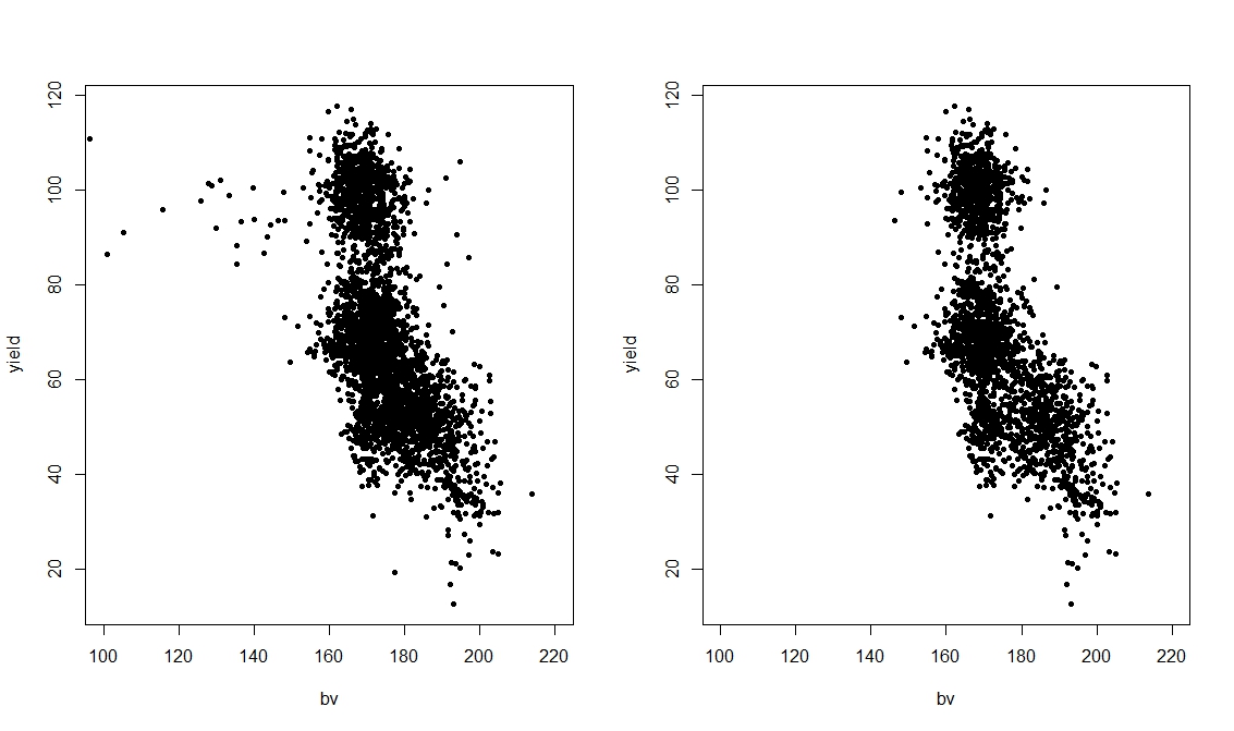


 This shows the response on the z axis and the two variables associated in the interaction. Since this plot is a bit difficult to interpret we can also plot is as contours:
 This allows to determine the changes in Leaves dependent only from the interaction between rain.am and rain.ja.