Introduction
In the previous post I explored the use of linear model in the forms most commonly used in agricultural research.Clearly, when we are talking about linear models we are implicitly assuming that all relations between the dependent variable y and the predictors x are linear. In fact, in a linear model we could specify different shapes for the relation between y and x, for example by including polynomials (read for example: https://datascienceplus.com/fitting-polynomial-regression-r/). However, we can do that only in cases where we can clearly see a particular shape of the relation, for example quadratic. The problem is in many cases we can see from a scatterplot that we have a non-linear distribution of the points, but it is difficult to understand its form. Moreover, in a linear model the interpretation of polynomial coefficients become more difficult and this may decrease their usefulness.
An alternative approach is provided by Generalized Additive Models, which allows us to fit models with non-linear smoothers without specifying a particular shape a priori.
I will not go into much details about the theory behind GAMs. You can refer to these two books (freely available online) to know more:
Wood, S.N., 2017. Generalized additive models: an introduction with R. CRC press.
http://reseau-mexico.fr/sites/reseau-mexico.fr/files/igam.pdf
Crawley, M.J., 2012. The R book. John Wiley & Sons.
https://www.cs.upc.edu/~robert/teaching/estadistica/TheRBook.pdf
Some Background
As mentioned above, GAM models are more powerful that the other linear model we have seen in previous posts since they allow to include non-linear smoothers into the mix. In mathematical terms GAM solve the following equation:
 It may seem like a complex equation, but actually it is pretty simple to understand. The first thing to notice is that with GAM we are not necessarily estimating the response directly, i.e. we are not modelling y. In fact, as with GLM we have the possibility to use link functions to model non-normal response variables (and thus perform poisson or logistic regression). Therefore, the term g(μ) is simply the transformation of y needed to "linearize" the model. When we are dealing with a normally distributed response this term is simply replace by y.
Now we can explore the second part of the equation, where we have two terms: the parametric and the non-parametric part. In GAM we can include all the parametric terms we can include in lm or glm, for example linear or polynomial terms. The second part is the non-parametric smoother that will be fitted automatically and it is the key point of GAMs.
To better understand the difference between the two parts of the equation we can explore an example. Let's say we have a response variable (normally distributed) and two predictors x1 and x2. We look at the data and we observe a clear linear relation between x1 and y, but a complex curvilinear pattern between x2 and y. Because of this we decide to fit a generalized additive model that in this particular case will take the following equation:
 Since y is normal we do not need the link function g(). Then we are modelling x1 as a linear model with intercept beta zero and coefficient beta one. However, since we observed a curvilinear relation between x2 and y we also including a non-parametric smoothing function to model x2.
Now we can explore the second part of the equation, where we have two terms: the parametric and the non-parametric part. In GAM we can include all the parametric terms we can include in lm or glm, for example linear or polynomial terms. The second part is the non-parametric smoother that will be fitted automatically and it is the key point of GAMs.
To better understand the difference between the two parts of the equation we can explore an example. Let's say we have a response variable (normally distributed) and two predictors x1 and x2. We look at the data and we observe a clear linear relation between x1 and y, but a complex curvilinear pattern between x2 and y. Because of this we decide to fit a generalized additive model that in this particular case will take the following equation:
Practical Example
In this tutorial we will work once again with the package agridat so that we can work directly with real data in agriculture. Other packages we will use are ggplot2, moments, pscl and MuMIn:
In R there are two packages to fit generalized additive models, I will talk about the package mgcv. For an overview of GAMs from the package gam you can refer to this post: https://datascienceplus.com/generalized-additive-models/ library(agridat)
library(ggplot2)
library(moments)
library(pscl)
library(MuMIn)
The first thing we need to do is install the package mgcv:
 install.packages("mgcv")
 library(mgcv)
Now we can load once again the package lasrosas.corn with measures of yield based on nitrogen treatments, plus topographic position and brightness value (for more info please take a look at my previous post: Linear Models (lm, ANOVA and ANCOVA) in Agriculture). Then we can use the function pairs to plot all variable in scatterplots, colored by topographic position:
 dat = lasrosas.corn
 attach(dat)
 pairs(dat[,4:9], lower.panel = NULL, col=topo)
This produces the following image:

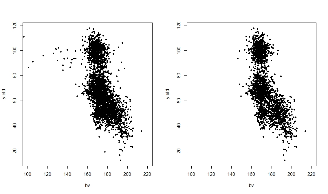
In the previous post we only fitted linear models to these data, and therefore the relations between yield and all other predictors were always modelled as lines. However, if we look at the scatterplot between yield and bv, we can clearly see a pattern that does not really look linear, with some blue dots that deviates from the main cloud. If these blue dots were not present we would be happy in modelling this relation as linear. In fact we can prove that by only focusing on this plot and removing the level W from topo:
 par(mfrow=c(1,2))
 plot(yield ~ bv, pch=20, data=dat, xlim=c(100,220))
 plot(yield ~ bv, pch=20, data=dat[dat$topo!="W",], xlim=c(100,220))
which creates the following plot:
 mod.lm = lm(yield ~ bv)
 mod.quad = lm(yield ~ bv + I(bv^2))
 mod.gam = gam(yield ~ s(bv), data=dat)
Here we are testing three models: standard linear model, a linear model with a quadratic term and finally a GAM. We do that because clearly we are not sure which model is the best and we want to make sure we do not overfit our data.
We can compare these models in the same way we explored in previous posts: by calculating the Akaike Information Criterion (AIC) and with an F test.
 > AIC(mod.lm, mod.quad, mod.gam)
         df   AIC
 mod.lm  3.000000 29005.32
 mod.quad 4.000000 28924.18
 mod.gam 7.738304 28853.72
 > anova(mod.lm, mod.quad, mod.gam, test="F")
 Analysis of Variance Table
 Model 1: yield ~ bv
 Model 2: yield ~ bv + I(bv^2)
 Model 3: yield ~ s(bv)
  Res.Df  RSS   Df Sum of Sq   F  Pr(>F)
 1 3441.0 917043
 2 3440.0 895165 1.0000   21879 85.908 < 2.2e-16 ***
 3 3436.3 875130 3.7383   20034 21.043 3.305e-16 ***
 ---
 Signif. codes: 0 ‘***’ 0.001 ‘**’ 0.01 ‘*’ 0.05 ‘.’ 0.1 ‘ ’ 1
The AIC suggests that the GAM is slightly more accurate that the other two, even with more degrees of freedom. The F test again results in significant difference between models, thus suggesting that we should use the more complex model.
We can look at the difference in fitting of the three models graphically first using the standard plotting function and then with ggplot2:
 plot(yield ~ bv, pch=20)
 abline(mod.lm,col="blue",lwd=2)
 lines(50:250,predict(mod.gam, newdata=data.frame(bv=50:250)),col="red",lwd=2)
 lines(50:250,predict(mod.quad, newdata=data.frame(bv=50:250)),col="green",lwd=2)
This produces the following image:

The same can be achieved with ggplot2:
 ggplot(data=dat, aes(x=bv, y=yield)) +
      geom_point(aes(col=dat$topo))  +
      geom_smooth(method = "lm", se = F, col="red")+
      geom_smooth(method="gam", formula=y~s(x), se = F, col="blue") +
      stat_smooth(method="lm", formula=yield~x+I(x^2),se = F, col="green")
which produces the following:

This second image is even more informative because when we decide to use a categorical variable to color the dots, ggplot2 automatically creates a legend for it, so we know which level causes the shift in the data (i.e. W).
As you can see all of these lines do not really fit the data perfectly, since the large cloud around 100 in yield and 180 in bv is not considered. However, the blue line of the non-parametric smoother seems to better catch the violet dots on the left and also bends when reaches the cloud, mimicking the quadratic behavior we observed before.
With GAM we can still use the function summary to look at the model in details:
 > summary(mod.gam)
 Family: gaussian
 Link function: identity
 Formula:
 yield ~ s(bv)
 Parametric coefficients:
       Estimate Std. Error t value Pr(>|t|)
 (Intercept)  69.828   0.272  256.7  <2e-16 ***
 ---
 Signif. codes: 0 ‘***’ 0.001 ‘**’ 0.01 ‘*’ 0.05 ‘.’ 0.1 ‘ ’ 1
 Approximate significance of smooth terms:
     edf Ref.df   F p-value
 s(bv) 5.738 6.919 270.7 <2e-16 ***
 ---
 Signif. codes: 0 ‘***’ 0.001 ‘**’ 0.01 ‘*’ 0.05 ‘.’ 0.1 ‘ ’ 1
 R-sq.(adj) = 0.353  Deviance explained = 35.4%
 GCV = 255.17 Scale est. = 254.68  n = 3443
The interpretation is similar to linear models, and probably a bit easier that with GLM since in GAM we also have an R Squared directly from the summary output. As you can see the smooth term is highly significant and we can see its estimated degrees of freedom (around 6) and its F and p values. At the bottom of the output we see a numerical value for GCV, which stands for Generalized Cross Validation Score. This is what the model tries to reduce by default and it is given by the equation below:

where D is the deviance, n is the number of samples, and df the effective degrees of freedom of the model. for more info please refer to Wood's book. I read on-line in an answer on StackOverflow that GCV may produce underfitting, I am not completely sure about this because I have not found any mention of it on official documentations. However, just in case later on I will show you how to fit the smoother with REML, which according to StackOverflow should solve the issue with underfitting.
Include more parameters
Now that we have a general idea about what function to fit for bv we can add more predictors and try to create a more accurate model.
 > #Include more predictors
 > mod.lm = lm(yield ~ nitro + nf + topo + bv)
 > mod.gam = gam(yield ~ nitro + nf + topo + s(bv), data=dat)
 >
 > #Comparison R Squared
 > summary(mod.lm)$adj.r.squared
 [1] 0.5211237
 > summary(mod.gam)$r.sq
 [1] 0.5292042
In the code above we are comparing two models with all of the predictors we have in the datasets. As you can see there is not much difference in the two models in terms of R Squared, so both model are able to explain pretty much the same level of variation in yield.
However, as you remember from above, we clearly noticed changes in bv depending on topo, and we also noticed that if we exclude certain topographic categories the behavior of the curve would probably change. We can include this new hypothesis in the model by using the option by within s, to fit a non-parametric smoother to each topographic factor individually.
 > mod.gam2 = gam(yield ~ nitro + nf * topo + s(bv, by=topo), data=dat)
 >
 > summary(mod.gam2)$r.sq
 [1] 0.5612617
As you can see if we fit a curve to each subset of the plot above we can increase the R Squared, and therefore explain more variation in yield.
We can further explore the difference in models with function AIC and anova, as we've seen in previous posts:
 > AIC(mod.lm, mod.gam, mod.gam2)
         df   AIC
 mod.lm  12.00000 27815.23
 mod.gam 18.60852 27763.83
 mod.gam2 42.22616 27548.63
 >
 > #F test
 > anova(mod.lm, mod.gam, mod.gam2, test="F")
 Analysis of Variance Table
 Model 1: yield ~ nitro + nf + topo + bv
 Model 2: yield ~ nitro + nf + topo + s(bv)
 Model 3: yield ~ nitro + nf * topo + s(bv, by = topo)
  Res.Df  RSS   Df Sum of Sq   F  Pr(>F)
 1 3432.0 645661
 2 3425.4 633656 6.6085   12005 10.525 1.512e-12 ***
 3 3401.8 587151 23.6176   46505 11.408 < 2.2e-16 ***
 ---
 Signif. codes: 0 ‘***’ 0.001 ‘**’ 0.01 ‘*’ 0.05 ‘.’ 0.1 ‘ ’ 1
The AIC is lower for mod.gam2, and the F test suggest it is significantly different from the other, meaning that we should use the more complex model.
Another way of assessing the accuracy of our two models would be to use some diagnostic plots. Let's start with the model with a non-parametric smoother fitted to the whole datasets (mod.gam):
plot(mod.gam, all.terms=F, residuals=T, pch=20)
which produce the following image:

Now let's take a look at the same plot for mod.gam2, the one where we fitted a curve for each level of topo:
 par(mfrow=c(2,2))
 plot(mod.gam2, all.terms=F, residuals=T, pch=20, page=1)
In this case we need to use the function par to create 4 sub-plots within the plotting window. This is because now the model fits a curve for each of the four categories in topo, so four plots will be created.

Another useful function for producing diagnostic plots is gam.check:
 par(mfrow=c(2,2))
 gam.check(mod.gam2)
which creates the following:

This shows similar plots to what we see in the previous post about linear models. Again we are aiming at normally distributed residuals. Moreover, the plot residuals vs. fitted should show a cloud centered around 0 and with more or less equal variance throughout the range of fitted values, which is approximately what we see here.
Changing Parameters
The function s, used to fit non-parametric smoother, can take a series of option that changes it behavior. We will now look at some of them:
 mod.gam1 = gam(yield ~ s(bv), data=dat)
 mod.gam2 = gam(yield ~ s(bv), data=dat, gamma=1.4)
 mod.gam3 = gam(yield ~ s(bv), data=dat, method="REML")
 mod.gam4 = gam(yield ~ s(bv, bs="cr"), data=dat) #All options for bs at help(smooth.terms)
 mod.gam5 = gam(yield ~ s(bv, bs="ps"), data=dat)
 mod.gam6 = gam(yield ~ s(bv, k=2), data=dat)
The first line is the standard use, without any option and we will use it just for comparison. The second call (mod.gam2) changes the gamma, which increases the "penalty" per increment in degree of freedom. Its default value is 1, but Wood suggest that increasing it to 1.4 can reduce over-fitting (Pag. 227 of Wood's book, link on top of the page). The third model fits the GAM using REML instead of the standard GCV score, which should provide a more robust fitting. The fourth and fifth models use the option bs within the function s to change the way the curve is fitted. In mod.gam4, cr stands for cubic regression spline, while in mod.gam5 ps stands for P-Splines. There are several options available for bs and you can look at them with help(smooth.terms). Each of these option comes with advantages and disadvantages; to know more about this topic you can read pag. 222 from Wood's book.
The final model (mod.gam6) changes the dimension of the curve, with which we can select the maximum degrees of freedom (default value is 10). In this case we are basically telling R to fit a quadratic curve.
We can plot all the lines generated from the models above to have an idea of individual impacts:
 plot(yield ~ bv, pch=20)
 lines(50:250,predict(mod.gam1, newdata=data.frame(bv=50:250)),col="blue",lwd=2)
 lines(50:250,predict(mod.gam2, newdata=data.frame(bv=50:250)),col="red",lwd=2)
 lines(50:250,predict(mod.gam3, newdata=data.frame(bv=50:250)),col="green",lwd=2)
 lines(50:250,predict(mod.gam4, newdata=data.frame(bv=50:250)),col="yellow",lwd=2)
 lines(50:250,predict(mod.gam5, newdata=data.frame(bv=50:250)),col="orange",lwd=2)
 lines(50:250,predict(mod.gam6, newdata=data.frame(bv=50:250)),col="violet",lwd=2)

As you can see the violet line is basically a quadratic curve, while the rest are quite complex in shape. In particular, the orange line created with P-splines looks like is overfitting the data, while the other look generally the same.
Count Data - Poisson Regression
GAM can be used with all the distributions and link function we have explored for GLM (Generalized Linear Models). To explore this we are going to use another dataset from the package agridat: named mead.cauliflower. This dataset presents leaves for cauliflower plants at different times.
 dat = mead.cauliflower
 str(dat)
 attach(dat)
 pairs(dat, lower.panel = NULL)

 pois.glm = glm(leaves ~ year + degdays, data=dat, family=c("poisson"))
 pois.gam = gam(leaves ~ year + s(degdays), data=dat, family=c("poisson"))
as you can see there are only minor differences in the syntax between the two lines. We are still using the option family to specify that we want the poisson distribution for the error term, plus the log link (used by default so we do not need to specify it).
To compare the model we can again use AIC and anova:
 > AIC(pois.glm, pois.gam)
         df   AIC
 pois.glm 3.000000 101.4505
 pois.gam 3.431062 101.1504
 >
 > anova(pois.glm, pois.gam)
 Analysis of Deviance Table
 Model 1: leaves ~ year + degdays
 Model 2: leaves ~ year + s(degdays)
  Resid. Df Resid. Dev   Df Deviance
 1  11.000   6.0593
 2  10.569   4.8970 0.43106  1.1623
Both results suggest that in fact a GAM for this dataset is not needed, since it is only slightly different from the GLM model. We could also compare the R Squared of the two models, using the function to compute it for GLM we tested in the previous post:
 > pR2(pois.glm)
      llh   llhNull      G2   McFadden     r2ML     r2CU
  -47.7252627 -132.3402086 169.2298918  0.6393744  0.9999944  0.9999944
 > r.squaredLR(pois.glm)
 [1] 0.9999944
 attr(,"adj.r.squared")
 [1] 0.9999944
 >
 > summary(pois.gam)$r.sq
 [1] 0.9663474
For overdispersed data we have the option to use both the quasipoisson and the negative binomial distributions:
 pois.gam.quasi = gam(leaves ~ year + s(degdays), data=dat, family=c("quasipoisson"))
 pois.gam.nb = gam(leaves ~ year + s(degdays), data=dat, family=nb())
For more info about the use of the negative binomial please look at this article:
GAMs with the negative binomial distribution
Logistic Regression
Since we can use of the families we have in GLMs we can also use GAM with binary data, the syntax again is very similar to what we used for GLM:
 dat = johnson.blight
 str(dat)
 attach(dat)
 logit.glm = glm(blight ~ rain.am + rain.ja + precip.m, data=dat, family=binomial)
 logit.gam = gam(blight ~ s(rain.am, rain.ja,k=5) + s(precip.m), data=dat, family=binomial)
As you can see we are using an interaction between rain.am and rain.ja in the model, plus another smooth curve fitted only to precip.m.
We can compare the two models as follows:
Despite the identical AIC values, the fact that the anova test is significant suggests we should use the more complex model, i.e. the GAM.
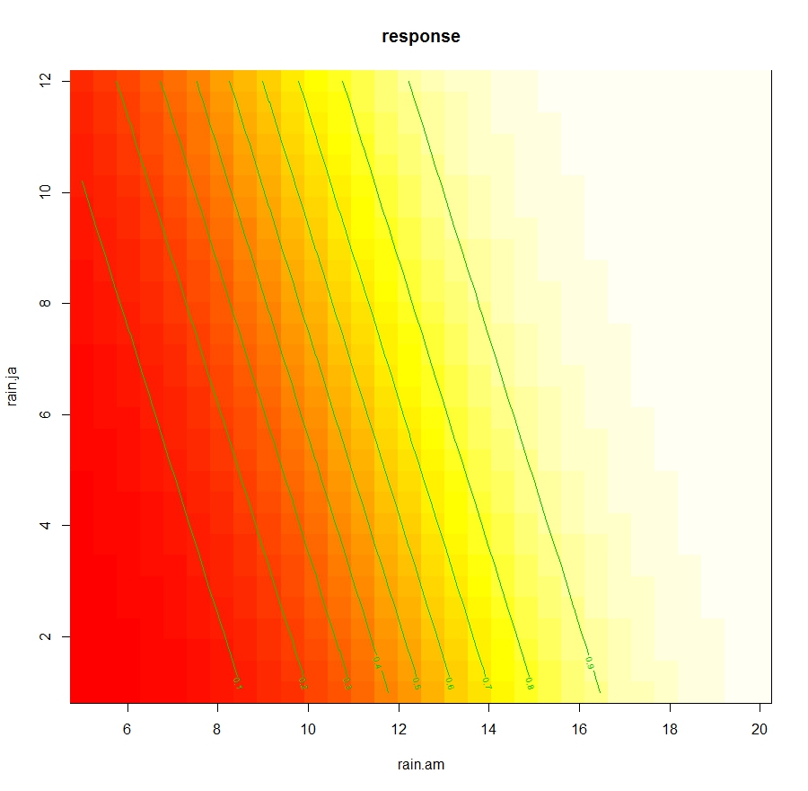
In the package mgcv there is also a function dedicated to the visualization of the curve on the response variable:
this creates the following 3D plot:
 This shows the response on the z axis and the two variables associated in the interaction. Since this plot is a bit difficult to interpret we can also plot is as contours:
 This allows to determine the changes in Leaves dependent only from the interaction between rain.am and rain.ja.
We can compare the two models as follows:
 > anova(logit.glm, logit.gam, test="Chi")
 Analysis of Deviance Table
 Model 1: blight ~ rain.am + rain.ja + precip.m
 Model 2: blight ~ s(rain.am, rain.ja, k = 5) + s(precip.m)
  Resid. Df Resid. Dev     Df  Deviance Pr(>Chi)
 1    21   20.029
 2    21   20.029 1.0222e-05 3.4208e-06 6.492e-05 ***
 ---
 Signif. codes: 0 ‘***’ 0.001 ‘**’ 0.01 ‘*’ 0.05 ‘.’ 0.1 ‘ ’ 1
 >
 > AIC(logit.glm, logit.gam)
         df   AIC
 logit.glm 4.00000 28.02893
 logit.gam 4.00001 28.02895
Despite the identical AIC values, the fact that the anova test is significant suggests we should use the more complex model, i.e. the GAM.
In the package mgcv there is also a function dedicated to the visualization of the curve on the response variable:
vis.gam(logit.gam, view=c("rain.am", "rain.ja"), type="response")
this creates the following 3D plot:

vis.gam(logit.gam, view=c("rain.am", "rain.ja"), type="response", plot.type="contour")
Generalized Additive Mixed Effects Models
In the package mgcv there is the function gamm, which allows fitting generalized additive mixed effects model, with a syntax taken from the package nlme. However, compared to what we see in the post about Mixed-Effects Models there are some changes we need to make.
Let's focus again on the dataset lasrosas.corn, which has a column year that we can consider as a possible source of additional random variation. The code below imports the dataset and then transform the variable year from numeric to factorial:
 dat = lasrosas.corn
 dat$year = as.factor(paste(dat$year))
We will start by looking at a random intercept model. If this was not a GAM with mixed effects, but a simpler linear mixed effects model, the code to fit it would be the following:
LME = lme(yield ~ nitro + nf + topo + bv, data=dat, random=~1|year)
This is probably the same line of code we used in the previous post. In the package nlme this same model can be fitted using a list as input for the option random. Look at the code below:
LME1 = lme(yield ~ nitro + nf + topo + bv, data=dat, random=list(year=~1))
Here in the list we are creating a new value year, which takes a value of ~1, indicating that its random effect applies only to the intercept.
We can use the anova function to see that LME and LME2 are in fact the same model:
 > anova(LME, LME1)
    Model df   AIC   BIC  logLik
 LME   1 13 27138.22 27218.05 -13556.11
 LME1   2 13 27138.22 27218.05 -13556.11
I showed you this alternative syntax with list because in gamm this is the only syntax we can use. So for fitting a GAM with random intercept for year we should use the following code:
gam.ME = gamm(yield ~ nitro + nf + topo + s(bv), data=dat, random=list(year=~1))
The object gam.ME is a list with two component, a mixed effect mode and a GAM. To check their summaries we need to use two lines:
 summary(gam.ME[[1]])
 summary(gam.ME[[2]])
Now we can see the code to fit a random slope and intercept model. gain we need to use the syntax with a list:
gam.ME2 = gamm(yield ~ nitro + nf + topo + s(bv), data=dat, random=list(year=~1, year=~nf))
Here we are including two random effects, one for just the intercept (year=~1) and another for random slope and intercept for each level of nf (year=~nf).
Is there an additive treatment program for "Addictive" models? :-)
ReplyDeleteIs there an additive treatment program for "Addictive" models? :-)
ReplyDeleteI "c"...
ReplyDeleteCheers!!
DeleteAnd yes, there is. I go to PSA (pseudo-statisticians anonymous) meetings every week. They helped overcome my obsession with p-values.
Very interesting, GAMs look quiet useful for modeling. Can we find out what function(s) have been fitted to the variable we have specified in GAM with s()?
ReplyDeleteOw its a nice post. Thanks for sharing this type of Freelancing tips.
ReplyDeleteI already bookmarking your site. You can also visit my Freelancing Blog
for get some more information about Freelancing Tutorial
and Where You can Watch all type of Live streaming Game/Sports.