Download EPA air pollution data
The US Environmental Protection Agency (EPA) provides tons of free data about air pollution and other weather measurements through their website. An overview of their offer is available here:
http://www.epa.gov/airdata/
The data are provided in hourly, daily and annual averages for the following parameters:
Ozone, SO2, CO,NO2, Pm 2.5 FRM/FEM Mass, Pm2.5 non FRM/FEM Mass, PM10, Wind, Temperature, Barometric Pressure, RH and Dewpoint, HAPs (Hazardous Air Pollutants), VOCs (Volatile Organic Compounds) and Lead.
All the files are accessible from this page:
http://aqsdr1.epa.gov/aqsweb/aqstmp/airdata/download_files.html
The web links to download the zip files are very similar to each other, they have an initial starting URL: http://aqsdr1.epa.gov/aqsweb/aqstmp/airdata/
and then the name of the file has the following format: type_property_year.zip
The type can be: hourly, daily or annual. The properties are sometimes written as text and sometimes using a numeric ID. Everything is separated by an underscore.
Since these files are identified by consistent URLs I created a function in R that takes year, property and type as arguments, downloads and unzip the data (in the working directory) and read the csv.
To complete this experiment we would need the following packages:
sp,
raster,
xts,
plotGoogleMaps
The code for this function is the following:
download.EPA <- function(year, property = c("ozone","so2","co","no2","pm25.frm","pm25","pm10","wind","temp","pressure","dewpoint","hap","voc","lead"), type=c("hourly","daily","annual")){
if(property=="ozone"){PROP="44201"}
if(property=="so2"){PROP="42401"}
if(property=="co"){PROP="42101"}
if(property=="no2"){PROP="42602"}

if(property=="pm25.frm"){PROP="88101"}
if(property=="pm25"){PROP="88502"}
if(property=="pm10"){PROP="81102"}

if(property=="wind"){PROP="WIND"}
if(property=="temp"){PROP="TEMP"}
if(property=="pressure"){PROP="PRESS"}
if(property=="dewpoint"){PROP="RH_DP"}
if(property=="hap"){PROP="HAPS"}
if(property=="voc"){PROP="VOCS"}
if(property=="lead"){PROP="lead"}

URL <- paste0("https://aqs.epa.gov/aqsweb/airdata/",type,"_",PROP,"_",year,".zip")
download.file(URL,destfile=paste0(type,"_",PROP,"_",year,".zip"))
unzip(paste0(type,"_",PROP,"_",year,".zip"),exdir=paste0(getwd()))
read.table(paste0(type,"_",PROP,"_",year,".csv"),sep=",",header=T)
}
This function can be used as follow to create a
data.frame with exactly the data we are looking for:
data <- download.EPA(year=2013,property="ozone",type="daily")
This creates a
data.frame object with the following characteristics:
> str(data)
'data.frame':   390491 obs. of  28 variables:
 $ State.Code         : int  1 1 1 1 1 1 1 1 1 1 ...
 $ County.Code        : int  3 3 3 3 3 3 3 3 3 3 ...
 $ Site.Num           : int  10 10 10 10 10 10 10 10 10 10 ...
 $ Parameter.Code     : int  44201 44201 44201 44201 44201 44201 44201 44201 44201 44201 ...
 $ POC                : int  1 1 1 1 1 1 1 1 1 1 ...
 $ Latitude           : num  30.5 30.5 30.5 30.5 30.5 ...
 $ Longitude          : num  -87.9 -87.9 -87.9 -87.9 -87.9 ...
 $ Datum              : Factor w/ 4 levels "NAD27","NAD83",..: 2 2 2 2 2 2 2 2 2 2 ...
 $ Parameter.Name     : Factor w/ 1 level "Ozone": 1 1 1 1 1 1 1 1 1 1 ...
 $ Sample.Duration    : Factor w/ 1 level "8-HR RUN AVG BEGIN HOUR": 1 1 1 1 1 1 1 1 1 1 ...
 $ Pollutant.Standard : Factor w/ 1 level "Ozone 8-Hour 2008": 1 1 1 1 1 1 1 1 1 1 ...
 $ Date.Local         : Factor w/ 365 levels "2013-01-01","2013-01-02",..: 59 60 61 62 63 64 65 66 67 68 ...
 $ Units.of.Measure   : Factor w/ 1 level "Parts per million": 1 1 1 1 1 1 1 1 1 1 ...
 $ Event.Type         : Factor w/ 3 levels "Excluded","Included",..: 3 3 3 3 3 3 3 3 3 3 ...
 $ Observation.Count  : int  1 24 24 24 24 24 24 24 24 24 ...
 $ Observation.Percent: num  4 100 100 100 100 100 100 100 100 100 ...
 $ Arithmetic.Mean    : num  0.03 0.0364 0.0344 0.0288 0.0345 ...
 $ X1st.Max.Value     : num  0.03 0.044 0.036 0.042 0.045 0.045 0.045 0.048 0.057 0.059 ...
 $ X1st.Max.Hour      : int  23 10 18 10 9 10 11 12 12 10 ...
 $ AQI                : int  25 37 31 36 38 38 38 41 48 50 ...
 $ Method.Name        : Factor w/ 1 level " - ": 1 1 1 1 1 1 1 1 1 1 ...
 $ Local.Site.Name    : Factor w/ 1182 levels ""," 201 CLINTON ROAD, JACKSON",..: 353 353 353 353 353 353 353 353 353 353 ...
 $ Address            : Factor w/ 1313 levels "  Edgewood  Chemical Biological Center (APG), Waehli Road",..: 907 907 907 907 907 907 907 907 907 907 ...
 $ State.Name         : Factor w/ 53 levels "Alabama","Alaska",..: 1 1 1 1 1 1 1 1 1 1 ...
 $ County.Name        : Factor w/ 631 levels "Abbeville","Ada",..: 32 32 32 32 32 32 32 32 32 32 ...
 $ City.Name          : Factor w/ 735 levels "Adams","Air Force Academy",..: 221 221 221 221 221 221 221 221 221 221 ...
 $ CBSA.Name          : Factor w/ 414 levels "","Adrian, MI",..: 94 94 94 94 94 94 94 94 94 94 ...
 $ Date.of.Last.Change: Factor w/ 169 levels "2013-05-17","2013-07-01",..: 125 125 125 125 125 125 125 125 125 125 ...
The
csv file contains a long series of columns that should again be consistent among all the dataset cited above, even though it changes slightly between hourly, daily and annual average.
A complete list of the meaning of all the columns is available here:
aqsdr1.epa.gov/aqsweb/aqstmp/airdata/FileFormats.html
Some of the columns are self explanatory, such as the various geographical names associated with the location of the measuring stations. For this analysis we are particularly interested in the address (that we can use to extract data from individual stations), event type (that tells us if extreme weather events are part of the averages), the date and the actual data (available in the column
Arithmetic.Mean).
Extracting data for individual stations
The
data.frame we loaded using the function
download.EPA contains Ozone measurements from all over the country. To perform any kind of analysis we first need a way to identify and then subset the stations we are interested in.
For doing so I though about using one of the interactive visualization I presented in the previous post. To use that we first need to transform the
csv into a spatial object. We can use the following loop to achieve that:
locations <- data.frame(ID=numeric(),LON=numeric(),LAT=numeric(),OZONE=numeric(),AQI=numeric())
for(i in unique(data$Address)){
dat <- data[data$Address==i,]
locations[which(i==unique(data$Address)),] <- data.frame(which(i==unique(data$Address)),unique(dat$Longitude),unique(dat$Latitude),round(mean(dat$Arithmetic.Mean,na.rm=T),2),round(mean(dat$AQI,na.rm=T),0))
}

locations$ADDRESS <- unique(data$Address)

coordinates(locations)=~LON+LAT
projection(locations)=CRS("+init=epsg:4326")
First of all we create an empty
data.frame declaring the type of variable for each column. With this loop we can eliminate all the information we do not need from the dataset and keep the one we want to show and analyse. In this case I kept Ozone and the Air Quality Index (AQI), but you can clearly include more if you wish.
In the loop we iterate through the addresses of each EPA station, for each we first subset the main dataset to keep only the data related to that station and then we fill the
data.frame with the coordinates of the station and the mean values of Ozone and AQI.
When the loop is over (it may take a while!), we can add the addresses to it and transform it into a
SpatialObject. We also need to declare the projection of the coordinates, which in
WGS84.
Now we are ready to create an interactive map using the package
plotGoogleMaps and the Google Maps API. We can simply use the following line:
map <- plotGoogleMaps(locations,zcol="AQI",filename="EPA_GoogleMaps.html",layerName="EPA Stations")
This creates a map with a marker for each EPA station, coloured with the mean AQI. If we click on a marker we can see the
ID of the station, the mean Ozone value and the address (below). The EPA map I created is shown at this link:
EPA_GoogleMaps
From this map we can obtain information regarding the EPA stations, which we can use to extract values for individual stations from the dataset.
For example, we can extract values using the
ID we created in the loop or the address of the station, which is also available on the Google Map, using the code below:
Once we have extracted only data for a single station we can proceed with the time-series analysis.
Time-Series Analysis
There are two ways to tell R that a particular
vector or
data.frame is in fact a time-series. We have the function
ts available in the package
basic and the function
xts, available in the package
xts.
I will first analyse how to use
xts, since this is probably the best way of handling time-series.
The first thing we need to do is make sure that our data have a column of class Date. This is done by transforming the current date values into the proper class. The EPA datasets has a Date.local column that R reads as factors:
> str(Ozone$Date.Local)
 Factor w/ 365 levels "2013-01-01","2013-01-02",..: 90 91 92 93 94 95 96 97 98 99 ...
We can transform this into the class Date using the following line, which creates a new column named DATE in the
Ozone object:
Ozone$DATE <- as.Date(Ozone$Date.Local)
Now we can use the function
xts to create a time-series object:
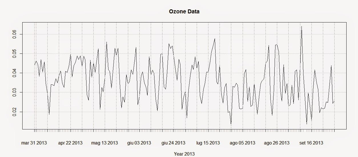
Ozone.TS <- xts(x=Ozone$Arithmetic.Mean,order.by=Ozone$DATE)
plot(Ozone.TS,main="Ozone Data",sub="Year 2013")
The first line creates the time-series using the Ozone data and the DATE column we created above. The second line plots the time-series and produces the image below:
To extract the dates of the object Ozone we can use the function
index and we can use the function
coredata to extract the ozone values.
index(Ozone.TS)
 Date[1:183], format: "2013-03-31" "2013-04-01" "2013-04-02" "2013-04-03" ...

coredata(Ozone.TS)
 num [1:183, 1] 0.044 0.0462 0.0446 0.0383 0.0469 ...
Subsetting the time-series is super easy in the package
xts, as you can see from the code below:
Ozone.TS['2013-05-06'] #Selection of a single day

Ozone.TS['2013-03'] #Selection of March data

Ozone.TS['2013-05/2013-07'] #Selection by time range
The first line extracts values for a single day (remember that the format is year-month-day); the second extracts values from the month of March. We can use the same method to extract values from one particular year, if we have time-series with multiple years.
The last line extracts values in a particular time range, notice the use of the forward slash to divide the start and end of the range.
We can also extract values by attributes, using the functions
index and
coredata. For example, if we need to know which days the ozone level was above 0.03 ppm we can simply use the following line:
index(Ozone.TS[coredata(Ozone.TS)>0.03,])
The package
xts features some handy function to apply custom functions to specific time intervals along the time-series. These functions are:
apply.weekly,
apply.monthly,
apply.quarterly and
apply.yearly
The use of these functions is similar to the use of the
apply function. Let us look at the example below to clarify:
apply.weekly(Ozone.TS,FUN=mean)
apply.monthly(Ozone.TS,FUN=max)
The first line calculates the mean value of ozone for each week, while the second computes the maximum value for each month. As for the function apply we are not constrained to apply functions that are available in R, but we can define our own:
in this case for example we can define a function to calculate the standard error of the mean for each month.
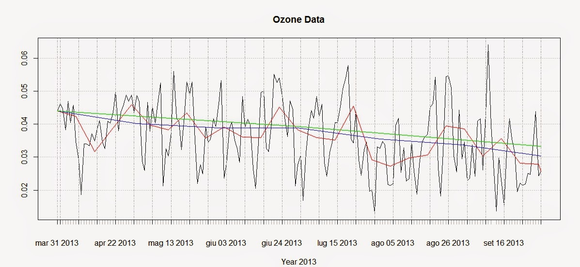
We can use these functions to create a simple plot that shows averages for defined time intervals with the following code:
plot(Ozone.TS,main="Ozone Data",sub="Year 2013")
lines(apply.weekly(Ozone.TS,FUN=mean),col="red")
lines(apply.monthly(Ozone.TS,FUN=mean),col="blue")
lines(apply.quarterly(Ozone.TS,FUN=mean),col="green")
lines(apply.yearly(Ozone.TS,FUN=mean),col="pink")
These lines return the following plot:
From this image it is clear that ozone presents a general decreasing trend over 2013 for this particular station. However, in R there are more precise ways of assessing the trend and seasonality of time-series.
Trends
Let us create another example where we use again the function
download.EPA to download NO2 data over 3 years and then assess their trends.
NO2.2013.DATA <- download.EPA(year=2013,property="no2",type="daily")
NO2.2012.DATA <- download.EPA(year=2012,property="no2",type="daily")
NO2.2011.DATA <- download.EPA(year=2011,property="no2",type="daily")

ADDRESS = "2 miles south of Ouray and south of the White and Green River confluence"  #Copied and pasted from the interactive map
NO2.2013 <- NO2.2013.DATA[paste(NO2.2013.DATA$Address)==ADDRESS&paste(NO2.2013.DATA$Event.Type)=="None",]
NO2.2012 <- NO2.2012.DATA[paste(NO2.2012.DATA$Address)==ADDRESS&paste(NO2.2012.DATA$Event.Type)=="None",]
NO2.2011 <- NO2.2011.DATA[paste(NO2.2011.DATA$Address)==ADDRESS&paste(NO2.2011.DATA$Event.Type)=="None",]


NO2.TS <- ts(c(NO2.2011$Arithmetic.Mean,NO2.2012$Arithmetic.Mean,NO2.2013$Arithmetic.Mean),frequency=365,start=c(2011,1))
The first lines should be clear from we said before. The only change is that the time-series is created using the function
ts, available in base R. With
ts we do not have to create a column of class Date in our dataset, but we can just specify the starting point of the time series (using the option start, which in this case is January 2011) and the number of samples per year with the option frequency. In this case the data were collected daily so the number of times per year is 365; if we had a time-series with data collected monthly we would specify a frequency of 12.
We can decompose the time-series using the function
decompose, which is based on moving averages:
The related plot is presented below:
There is also another method, based on the
loess smoother (for more info:
Article) that can be accessed using the function
stl:
STL <- stl(NO2.TS,"periodic")
plot(STL)
This function is able to calculate the trend along the whole length of the time-series:
Conclusions
This example shows how to download and access the open pollution data for the US available from the EPA directly from R.
Moreover we have seen here how to map the locations of the stations and subset the dataset. We also looked at ways to perform some introductory time-series analysis on pollution data.
For more information and material regarding time-series analysis please refer to the following references:
A Little Book of R For Time Series
Analysis of integrated and cointegrated time series with R
Introductory time series with R
R code snippets created by Pretty R at inside-R.org