Thursday, 21 May 2015

Introductory Point Pattern Analysis of Open Crime Data in London

Introduction
Police in Britain (http://data.police.uk/) not only register every single crime they encounter, and include coordinates, but also distribute their data free on the web.
They have two ways of distributing data: the first is through an API, which is extremely easy to use but returns only a limited number of crimes for each request, the second is a good old manual download from this page http://data.police.uk/data/. Again this page is extremely easy to use, they did a very good job in securing that people can access and work with these data; we can just select the time range and the police force from a certain area, and then wait for the system to create the dataset for us. I downloaded data from all forces for May and June 2014 and it took less than 5 minutes to prepare them for download.
These data are distributed under the Open Government Licence, which allows me to do basically whatever I want with them (even commercially) as long as I cite the origin and the license.


Data Preparation
For completing this experiment we would need the following packages: sp, raster, spatstat, maptools and plotrix.
As I mentioned above, I downloaded all the crime data from the months of May and June 2014 for the whole Britain. Then I decided to focus on the Greater London region, since here the most crimes are committed and therefore the analysis should be more interesting (while I am writing this part I have not yet finished the whole thing so I may be wrong). Since the Open Government License allows me to distribute the data, I uploaded them to my website so that you can easily replicate this experiment.
The dataset provided by the British Police is in csv format, so to load it we just need to use the read.csv function:

data <- read.csv("http://www.fabioveronesi.net/Blog/2014-05-metropolitan-street.csv")

We can look at the structure of the dataset simply by using the function str:

> str(data)
'data.frame':   79832 obs. of  12 variables:
 $ Crime.ID             : Factor w/ 55285 levels "","0000782cea7b25267bfc4d22969498040d991059de4ebc40385be66e3ecc3c73",..: 1 1 1 1 1 2926 28741 19664 45219 21769 ...
 $ Month                : Factor w/ 1 level "2014-05": 1 1 1 1 1 1 1 1 1 1 ...
 $ Reported.by          : Factor w/ 1 level "Metropolitan Police Service": 1 1 1 1 1 1 1 1 1 1 ...
 $ Falls.within         : Factor w/ 1 level "Metropolitan Police Service": 1 1 1 1 1 1 1 1 1 1 ...
 $ Longitude            : num  0.141 0.137 0.14 0.136 0.135 ...
 $ Latitude             : num  51.6 51.6 51.6 51.6 51.6 ...
 $ Location             : Factor w/ 20462 levels "No Location",..: 15099 14596 1503 1919 12357 1503 8855 14060 8855 8855 ...
 $ LSOA.code            : Factor w/ 4864 levels "","E01000002",..: 24 24 24 24 24 24 24 24 24 24 ...
 $ LSOA.name            : Factor w/ 4864 levels "","Barking and Dagenham 001A",..: 2 2 2 2 2 2 2 2 2 2 ...
 $ Crime.type           : Factor w/ 14 levels "Anti-social behaviour",..: 1 1 1 1 1 3 3 5 7 7 ...
 $ Last.outcome.category: Factor w/ 23 levels "","Awaiting court outcome",..: 1 1 1 1 1 21 8 21 8 8 ...
 $ Context              : logi  NA NA NA NA NA NA ...

This dataset provides a series of useful information regarding the crime: its locations (longitude and latitude in degrees), the address (if available), the type of crime and the court outcome (if available). For the purpose of this experiment we would only need to look at the coordinates and the type of crime.
For some incidents the coordinates are not provided, therefore before we can proceed we need to remove NAs from data:

data <- data[!is.na(data$Longitude)&!is.na(data$Latitude),]

This eliminates 870 entries from the file, thus data now has 78'962 rows.


Point Pattern Analysis
A point process is a stochastic process for which we observe its results, or events, only in a specific region, which is the area under study, or simply window. The location of the events is a point pattern (Bivand et al., 2008).
In R the package for Point Pattern Analysis is spatstat, which works with its own format (i.e. ppp). There are ways to transform a data.frame into a ppp object, however in this case we have a problem. The crime dataset contains lots of duplicated locations. We can check this by first transform data into a SpatialObject and then use the function zerodist to check for duplicated locations:

> coordinates(data)=~Longitude+Latitude
> zero <- zerodist(data)
> length(unique(zero[,1]))
[1] 47920

If we check the amount of duplicates we see that more than half the reported crimes are duplicated somehow. I checked some individual cases to see if I could spot a pattern but it is not possible. Sometime we have duplicates with the same crime, probably because more than one person was involved; in other cases we have two different crimes for the same locations, maybe because the crime belongs to several categories. Whatever the case the presence of duplicates creates a problem, because the package spatstat does not allow them. In R the function remove.duplicates is able to get rid of duplicates, however in this case I am not sure we can use it because we will be removing crimes for which we do not have enough information to assess whether they may in fact be removed.

So we need to find ways to work around the problem.
This sort of problems are often encountered when working with real datasets, but are mostly not referenced in textbook, only experience and common sense helps us in these situations.

There is also another potential issue with this dataset. Even though the large majority of crimes are reported for London, some of them (n=660) are also located in other areas. Since these crimes are a small fraction of the total I do not think it makes much sense to include them in the analysis, so we need to remove them. To do so we need to import a shapefile with the borders of the Greater London region. Natural Earth provides this sort of data, since it distributes shapefiles at various resolution. For this analysis we would need the following dataset: Admin 1 – States, Provinces

To download it and import it in R we can use the following lines:

download.file("http://www.naturalearthdata.com/http//www.naturalearthdata.com/download/10m/cultural/ne_10m_admin_1_states_provinces.zip",destfile="ne_10m_admin_1_states_provinces.zip")
unzip("ne_10m_admin_1_states_provinces.zip",exdir="NaturalEarth")
border <- shapefile("NaturalEarth/ne_10m_admin_1_states_provinces.shp")

These lines download the shapefile in a compressed archive (.zip), then uncompress it in a new folder named NaturalEarth in the working directory and then open it.

To extract only the border of the Greater London regions we can simply subset the SpatialPolygons object as follows:

GreaterLondon <- border[paste(border$region)=="Greater London",]

Now we need to overlay it with crime data and then eliminate all the points that do not belong to the Greater London region. To do that we can use the following code:

projection(data)=projection(border)
overlay <- over(data,GreaterLondon)
 
data$over <- overlay$OBJECTID_1
 
data.London <- data[!is.na(data$over),]

The first line assigns to the object data the same projection as the object border, we can do this safely because we know that the crime dataset is in geographical coordinates (WGS84), the same as border.
Then we can use the function over to overlay the two objects. At this point we need a way to extract from data only the points that belong to the Greater London region, to do that we can create a new column and assign to it the values of the overlay object (here the column of the overlay object does not really matter, since we only need it to identify locations where this has some data in it). In locations where the data are outside the area defined by border the new column will have values of NA, so we can use this information to extract the locations we need with the last line.

We can create a very simple plot of the final dataset and save it in a jpeg using the following code:

jpeg("PP_plot.jpg",2500,2000,res=300)
plot(data.London,pch="+",cex=0.5,main="",col=data.London$Crime.type)
plot(GreaterLondon,add=T)
legend(x=-0.53,y=51.41,pch="+",col=unique(data.London$Crime.type),legend=unique(data.London$Crime.type),cex=0.4)
dev.off()

This creates the image below:


Now that we have a dataset of crimes only for Greater London we can start our analysis.


Descriptive Statistics
The focus of a point pattern analysis is firstly to examine the spatial distribution of the events, and secondly making inferences about the process that generated the point pattern. Thus the first step in every point pattern analysis, as in every statistical and geostatistical analysis, is describe the dataset in hands with some descriptive indexes. In statistics we normally use mean and standard deviation to achieve this, however here we are working in 2D space, so things are slightly more complicated. For example instead of computing the mean we compute the mean centre, which is basically the point identified by the mean value of longitude and the mean value of latitude:


Using the same principle we can compute the standard deviation of longitude and latitude, and the standard distance, which measures the standard deviation of the distance of each point from the mean centre. This is important because it gives a measure of spread in the 2D space, and can be computed with the following equation from Wu (2006):


In R we can calculate all these indexes with the following simple code:

mean_centerX <- mean(data.London@coords[,1])
mean_centerY <- mean(data.London@coords[,2])
 
standard_deviationX <- sd(data.London@coords[,1])
standard_deviationY <- sd(data.London@coords[,2])
 
standard_distance <- sqrt(sum(((data.London@coords[,1]-mean_centerX)^2+(data.London@coords[,2]-mean_centerY)^2))/(nrow(data.London)))

We can use the standard distance to have a visual feeling of the spread of our data around their mean centre. We can use the function draw.circle in the package plotrix to do that:

jpeg("PP_Circle.jpeg",2500,2000,res=300)
plot(data.London,pch="+",cex=0.5,main="")
plot(GreaterLondon,add=T)
points(mean_centerX,mean_centerY,col="red",pch=16)
draw.circle(mean_centerX,mean_centerY,radius=standard_distance,border="red",lwd=2)
dev.off()

which returns the following image:


The problem with the standard distance is that it averages the standard deviation of the distances for both coordinates, so it does not take into account possible differences between the two dimensions. We can take those into account by plotting an ellipse, instead of a circle, with the two axis equal to the standard deviations of longitude and latitude. We can use again the package plotrix, but with the function draw.ellipse to do the job:

jpeg("PP_Ellipse.jpeg",2500,2000,res=300)
plot(data.London,pch="+",cex=0.5,main="")
plot(GreaterLondon,add=T)
points(mean_centerX,mean_centerY,col="red",pch=16)
draw.ellipse(mean_centerX,mean_centerY,a=standard_deviationX,b=standard_deviationY,border="red",lwd=2)
dev.off()

This returns the following image:


Working with spatstat
Let's now look at the details of the package spatstat. As I mentioned we cannot use this if we have duplicated points, so we first need to eliminate them. In my opinion we cannot just remove them because we are not sure about their cause. However, we can subset the dataset by type of crime and then remove duplicates from it. In that case the duplicated points are most probably multiple individuals caught for the same crime, and if we delete those it will not change the results of the analysis.
I decided to focus on drug related crime, since they are not as common as other and therefore I can better present the steps of the analysis. We can subset the data and remove duplicates as follows:

Drugs <- data.London[data.London$Crime.type==unique(data.London$Crime.type)[3],]
Drugs <- remove.duplicates(Drugs)

we obtain a dataset with 2745 events all over Greater London.
A point pattern is defined as a series of events in a given area, or window, of observation. It is therefore extremely important to precisely define this window. In spatstat the function owin is used to set the observation window. However, the standard function takes the coordinates of a rectangle or of a polygon from a matrix, and therefore it may be a bit tricky to use. Luckily the package maptools provides a way to transform a SpatialPolygons into an object of class owin, using the function as.owin (Note: a function with the same name is also available in spatstat but it does not work with SpatialPolygons, so be sure to load maptools):

window <- as.owin(GreaterLondon)

Now we can use the function ppp, in spatstat, to create the point pattern object:

Drugs.ppp <- ppp(x=Drugs@coords[,1],y=Drugs@coords[,2],window=window)


Intensity and Density
A crucial information we need when we deal with point patterns is a quantitative definition of the spatial distribution, i.e. how many events we have in a predefined window. The index to define this is the Intensity, which is the average number of events per unit area.
In this example we cannot calculate the intensity straight away, because the we are dealing with degrees and therefore we would end up dividing the number of crimes (n=2745) by the total area of Greater London, which in degrees in 0.2. It would make much more sense to transform all of our data in UTM and then calculate the number of crime per square meter. We can transform any spatial object in a different coordinate system using the function spTransform, in package sp:

GreaterLondonUTM <- spTransform(GreaterLondon,CRS("+init=epsg:32630"))

We just need to define the CRS of the new coordinate system, which can be found here: http://spatialreference.org/

Now we can compute the intensity as follows:

Drugs.ppp$n/sum(sapply(slot(GreaterLondonUTM, "polygons"), slot, "area"))

The numerator is the number of point in the ppp object; while the denominator is the sum of the areas of all polygons (this function was copied from here: r-sig-geo). For drug related crime the average intensity is 1.71x10^-6 per square meter, in the Greater London area.

Intensity may be constant across the study window, in that case in every square meter we would find the same number of points, and the process would be uniform of homogeneous. Most often the intensity is not constant and varies spatially throughout the study window, in that case the process is inhomogeneous. For inhomogeneous processes we need a way to determine the amount of spatial variation of the intensity. There are several ways of dealing with this problem, one example is quadrat counting, where the area is divided into rectangles and the number of events in each of them is counted:

jpeg("PP_QuadratCounting.jpeg",2500,2000,res=300)
plot(Drugs.ppp,pch="+",cex=0.5,main="Drugs")
plot(quadratcount(Drugs.ppp, nx = 4, ny = 4),add=T,col="blue")
dev.off()

which divides the area in 8 rectangles and then counts the number of events in each of them:


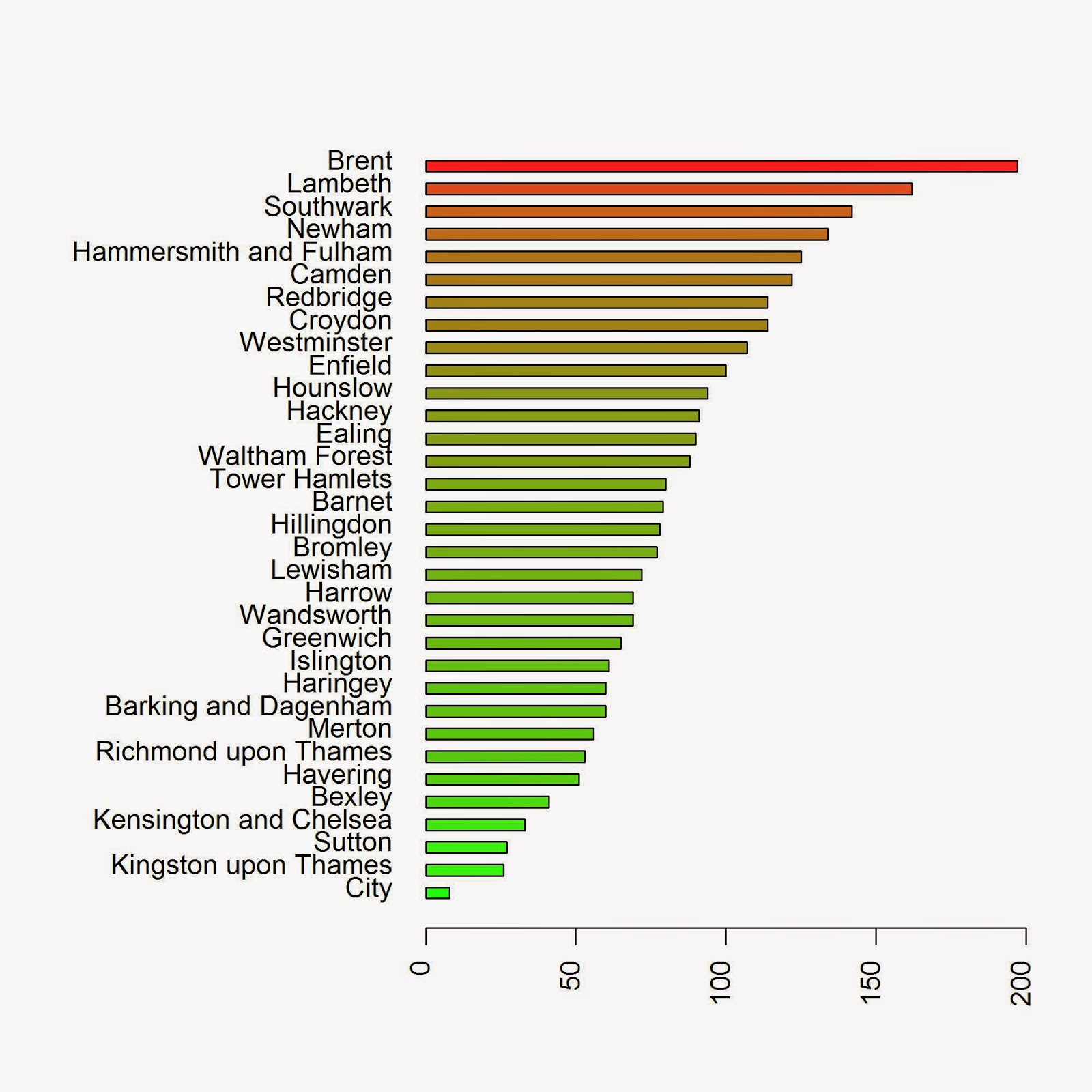
This function is good for certain datasets, but in this case it does not really make sense to use quadrat counting, since the areas it creates do not have any meaning in reality. It would be far more valuable to extract the number of crimes by Borough for example. To do this we need to use a loop and iterate through the polygons:

Local.Intensity <- data.frame(Borough=factor(),Number=numeric())
for(i in unique(GreaterLondonUTM$name)){
sub.pol <- GreaterLondonUTM[GreaterLondonUTM$name==i,]
 
sub.ppp <- ppp(x=Drugs.ppp$x,y=Drugs.ppp$y,window=as.owin(sub.pol))
Local.Intensity <- rbind(Local.Intensity,data.frame(Borough=factor(i,levels=GreaterLondonUTM$name),Number=sub.ppp$n))
}

We can take a look at the results in a barplot with the following code:

colorScale <- color.scale(Local.Intensity[order(Local.Intensity[,2]),2],color.spec="rgb",extremes=c("green","red"),alpha=0.8)
 
jpeg("PP_BoroughCounting.jpeg",2000,2000,res=300)
par(mar=c(5,13,4,2)) 
barplot(Local.Intensity[order(Local.Intensity[,2]),2],names.arg=Local.Intensity[order(Local.Intensity[,2]),1],horiz=T,las=2,space=1,col=colorScale)
dev.off()

which returns the image below:


Another way in which we can determine the spatial distribution of the intensity is by using kernel smoothing (Diggle, 1985; Berman and Diggle, 1989; Bivand et. al., 2008). Such method computes the intensity continuously across the study area. To perform this analysis in R we need to define the bandwidth of the density estimation, which basically determines the area of influence of the estimation. There is no general rule to determine the correct bandwidth; generally speaking if h is too small the estimate is too noisy, while if h is too high the estimate may miss crucial elements of the point pattern due to oversmoothing (Scott, 2009). In spatstat the functions bw.diggle, bw.ppl, and bw.scott can be used to estimate the bandwidth according to difference methods. We can test how they work with our dataset using the following code:

jpeg("Kernel_Density.jpeg",2500,2000,res=300)
par(mfrow=c(2,2))
plot(density.ppp(Drugs.ppp, sigma = bw.diggle(Drugs.ppp),edge=T),main=paste("h =",round(bw.diggle(Drugs.ppp),2)))
plot(density.ppp(Drugs.ppp, sigma = bw.ppl(Drugs.ppp),edge=T),main=paste("h =",round(bw.ppl(Drugs.ppp),2)))
plot(density.ppp(Drugs.ppp, sigma = bw.scott(Drugs.ppp)[2],edge=T),main=paste("h =",round(bw.scott(Drugs.ppp)[2],2)))
plot(density.ppp(Drugs.ppp, sigma = bw.scott(Drugs.ppp)[1],edge=T),main=paste("h =",round(bw.scott(Drugs.ppp)[1],2)))
dev.off()

which generates the following image, from which it is clear that every method works very differently:


As you can see a low value of bandwidth produces a very detailed plot, while increasing this value creates a very smooth surface where the local details are lost. This is basically an heat map of the crimes in London, therefore we need to be very careful in choosing the right bandwidth since these images if shown alone may have very different impact particularly on people not familiar with the matter. The first image may create the illusion that the crimes are clustered in very small areas, while the last may provide the opposite feeling.


Complete spatial randomness
Assessing if a point pattern is random is a crucial step of the analysis. If we determine that the pattern is random it means that each point is independent from each other and from any other factor. Complete spatial randomness implies that events from the point process are equally as likely to occur in every regions of the study window. In other words, the location of one point does not affect the probability of another being observed nearby, each point is therefore completely independent from the others (Bivand et al., 2008).
If a point pattern is not random it can be classified in two other ways: clustered or regular. Clustered means that there are areas where the number of events is higher than average, regular means that basically each subarea has the same number of events. Below is an image that should better explain the differences between these distributions:


In spatstat we can determine which distribution our data have using the G function, which computes the distribution of the distances between each event and its nearest neighbour (Bivand et al., 2008). Based on the curve generated by the G function we can determine the distribution of our data. I will not explain here the details on how to compute the G function and its precise meaning, for that you need to look at the references. However, just by looking at the plots we can easily determine the distribution of our data.
Let's take a look at the image below to clarify things:


These are the curves generated by the G function for each distribution. The blue line is the G function computed for a complete spatial random point pattern, so in the first case since the data more or less follow the blue line the process is random. In the second case the line calculated from the data is above the blue line, this indicates a clustered distribution. On the contrary, if the line generated from the data is below the blue line the point pattern is regular.
We can compute the plot this function for our data simply using the following lines:

jpeg("GFunction.jpeg",2500,2000,res=300)
plot(Gest(Drugs.ppp),main="Drug Related Crimes")
dev.off()

which generates the following image:


From this image is clear that the process is clustered. We could have deduced it by looking at the previous plots, since it is clear that there are areas where more crimes are committed; however, with this method we have a quantitative way of support our hypothesis.


Conclusion
In this experiment we performed some basic Point Pattern analysis on open crime data. The only conclusion we reached in this experiment is that the data are clearly clustered in certain areas and boroughs. However, at this point we are not able to determine the origin and the causes of these clusters.


References
Bivand, R. S., Pebesma, E. J., & Gómez-Rubio, V. (2008). Applied spatial data analysis with R (Vol. 747248717). New York: Springer.

Wu, C. (2006). Intermediate Geographic Information Science – Point Pattern Analysis. Department of Geography, The University of Winsconsin-Milwaukee. http://uwm.edu/Course/416-625/week4_point_pattern.ppt - Last accessed: 28.01.2015

Berman, M. and Diggle, P. J. (1989). Estimating weighted integrals of the second-order intensity of a spatial point process. Journal of the Royal Statistical Society B, 51:81–92. [184, 185]

Diggle, P. J. (1985). A kernel method for smoothing point process data. Applied Statistics, 34:138–147. [184, 185]

Scott, D. W. (2009). Multivariate density estimation: theory, practice, and visualization (Vol. 383). John Wiley & Sons.


R code snippets created by Pretty R at inside-R.org


The full script for this experiment is available below:

 library(sp)  
 library(plotGoogleMaps)  
 library(spatstat)  
 library(raster)  
 library(maptools)  
 library(plotrix)  
 library(rgeos)  
   
 data <- read.csv("http://www.fabioveronesi.net/Blog/2014-05-metropolitan-street.csv")  
   
 data <- data[!is.na(data$Longitude)&!is.na(data$Latitude),]  
   
 coordinates(data)=~Longitude+Latitude  
 zero <- zerodist(data)  
 length(unique(zero[,1]))  


 #Loading Natural Earth Provinces dataset to define window for Point Pattern Analysis  
 download.file("http://www.naturalearthdata.com/http//www.naturalearthdata.com/download/10m/cultural/ne_10m_admin_1_states_provinces.zip",destfile="ne_10m_admin_1_states_provinces.zip")  
 unzip("ne_10m_admin_1_states_provinces.zip",exdir="NaturalEarth")  
 border <- shapefile("NaturalEarth/ne_10m_admin_1_states_provinces.shp")  
   
   
 GreaterLondon <- border[paste(border$region)=="Greater London",]  
   
   
 #Extract crimes in London  
 projection(data)=projection(border)  
 overlay <- over(data,GreaterLondon)  
   
 data$over <- overlay$OBJECTID_1  
   
 data.London <- data[!is.na(data$over),]  
   
   
 #Simple Plot  
 jpeg("PP_plot.jpg",2500,2000,res=300)  
 plot(data.London,pch="+",cex=0.5,main="",col=data.London$Crime.type)  
 plot(GreaterLondon,add=T)  
 legend(x=-0.53,y=51.41,pch="+",col=unique(data.London$Crime.type),legend=unique(data.London$Crime.type),cex=0.4)  
 dev.off()  


 #Summary statistics for point patterns  
 #The coordinates of the mean center are simply the mean value of X and Y  
 #therefore we can use the function mean() to determine their value  
 mean_centerX <- mean(data.London@coords[,1])  
 mean_centerY <- mean(data.London@coords[,2])  
   
 #Similarly we can use the function sd() to determine the standard deviation of X and Y  
 standard_deviationX <- sd(data.London@coords[,1])  
 standard_deviationY <- sd(data.London@coords[,2])  
   
 #This is the formula to compute the standard distance  
 standard_distance <- sqrt(sum(((data.London@coords[,1]-mean_centerX)^2+(data.London@coords[,2]-mean_centerY)^2))/(nrow(data.London)))  


 jpeg("PP_Circle.jpeg",2500,2000,res=300)  
 plot(data.London,pch="+",cex=0.5,main="")  
 plot(GreaterLondon,add=T)  
 points(mean_centerX,mean_centerY,col="red",pch=16)  
 draw.circle(mean_centerX,mean_centerY,radius=standard_distance,border="red",lwd=2)  
 dev.off()  
   
 jpeg("PP_Ellipse.jpeg",2500,2000,res=300)  
 plot(data.London,pch="+",cex=0.5,main="")  
 plot(GreaterLondon,add=T)  
 points(mean_centerX,mean_centerY,col="red",pch=16)  
 draw.ellipse(mean_centerX,mean_centerY,a=standard_deviationX,b=standard_deviationY,border="red",lwd=2)  
 dev.off()  


 #Working with spatstat  
 Drugs <- data.London[data.London$Crime.type==unique(data.London$Crime.type)[3],]  
 Drugs <- remove.duplicates(Drugs)  
   
 #Transform GreaterLondon in UTM  
 GreaterLondonUTM <- spTransform(GreaterLondon,CRS("+init=epsg:32630"))  
 Drugs.UTM <- spTransform(Drugs,CRS("+init=epsg:32630"))  
   
   
 #Transforming the SpatialPolygons object into an owin object for spatstat, using a function in maptools  
 window <- as.owin(GreaterLondonUTM)  
   
 #Now we can extract one crime and   
 Drugs.ppp <- ppp(x=Drugs.UTM@coords[,1],y=Drugs.UTM@coords[,2],window=window)  
   
   
 #Calculate Intensity  
 Drugs.ppp$n/sum(sapply(slot(GreaterLondonUTM, "polygons"), slot, "area"))  
   
 #Alternative approach  
 summary(Drugs.ppp)$intensity  


 #Quadrat counting Intensity  
 jpeg("PP_QuadratCounting.jpeg",2500,2000,res=300)  
 plot(Drugs.ppp,pch="+",cex=0.5,main="Drugs")  
 plot(quadratcount(Drugs.ppp, nx = 4, ny = 4),add=T,col="red")  
 dev.off()  
   
   
 #Intensity by Borough  
 Local.Intensity <- data.frame(Borough=factor(),Number=numeric())  
 for(i in unique(GreaterLondonUTM$name)){  
 sub.pol <- GreaterLondonUTM[GreaterLondonUTM$name==i,]  
    
 sub.ppp <- ppp(x=Drugs.ppp$x,y=Drugs.ppp$y,window=as.owin(sub.pol))  
 Local.Intensity <- rbind(Local.Intensity,data.frame(Borough=factor(i,levels=GreaterLondonUTM$name),Number=sub.ppp$n))  
 }  


 colorScale <- color.scale(Local.Intensity[order(Local.Intensity[,2]),2],color.spec="rgb",extremes=c("green","red"),alpha=0.8)  
   
 jpeg("PP_BoroughCounting.jpeg",2000,2000,res=300)  
 par(mar=c(5,13,4,2))   
 barplot(Local.Intensity[order(Local.Intensity[,2]),2],names.arg=Local.Intensity[order(Local.Intensity[,2]),1],horiz=T,las=2,space=1,col=colorScale)  
 dev.off()  


 #Kernel Density (from: Baddeley, A. 2008. Analysing spatial point patterns in R)   
 #Optimal values of bandwidth  
 bw.diggle(Drugs.ppp)  
 bw.ppl(Drugs.ppp)  
 bw.scott(Drugs.ppp)  
   
 #Plotting  
 jpeg("Kernel_Density.jpeg",2500,2000,res=300)  
 par(mfrow=c(2,2))  
 plot(density.ppp(Drugs.ppp, sigma = bw.diggle(Drugs.ppp),edge=T),main=paste("h =",round(bw.diggle(Drugs.ppp),2)))  
 plot(density.ppp(Drugs.ppp, sigma = bw.ppl(Drugs.ppp),edge=T),main=paste("h =",round(bw.ppl(Drugs.ppp),2)))  
 plot(density.ppp(Drugs.ppp, sigma = bw.scott(Drugs.ppp)[2],edge=T),main=paste("h =",round(bw.scott(Drugs.ppp)[2],2)))  
 plot(density.ppp(Drugs.ppp, sigma = bw.scott(Drugs.ppp)[1],edge=T),main=paste("h =",round(bw.scott(Drugs.ppp)[1],2)))  
 dev.off()  


 #G Function  
 jpeg("GFunction.jpeg",2500,2000,res=300)  
 plot(Gest(Drugs.ppp),main="Drug Related Crimes")  
 dev.off()  
Monday, 18 May 2015

Introductory Time-Series analysis of US Environmental Protection Agency (EPA) pollution data

Download EPA air pollution data
The US Environmental Protection Agency (EPA) provides tons of free data about air pollution and other weather measurements through their website. An overview of their offer is available here: http://www.epa.gov/airdata/

The data are provided in hourly, daily and annual averages for the following parameters:
Ozone, SO2, CO,NO2, Pm 2.5 FRM/FEM Mass, Pm2.5 non FRM/FEM Mass, PM10, Wind, Temperature, Barometric Pressure, RH and Dewpoint, HAPs (Hazardous Air Pollutants), VOCs (Volatile Organic Compounds) and Lead.

All the files are accessible from this page:
http://aqsdr1.epa.gov/aqsweb/aqstmp/airdata/download_files.html

The web links to download the zip files are very similar to each other, they have an initial starting URL: http://aqsdr1.epa.gov/aqsweb/aqstmp/airdata/
and then the name of the file has the following format: type_property_year.zip
The type can be: hourly, daily or annual. The properties are sometimes written as text and sometimes using a numeric ID. Everything is separated by an underscore.

Since these files are identified by consistent URLs I created a function in R that takes year, property and type as arguments, downloads and unzip the data (in the working directory) and read the csv.
To complete this experiment we would need the following packages: sp, raster, xts, plotGoogleMaps
The code for this function is the following:

download.EPA <- function(year, property = c("ozone","so2","co","no2","pm25.frm","pm25","pm10","wind","temp","pressure","dewpoint","hap","voc","lead"), type=c("hourly","daily","annual")){
if(property=="ozone"){PROP="44201"}
if(property=="so2"){PROP="42401"}
if(property=="co"){PROP="42101"}
if(property=="no2"){PROP="42602"}
 
if(property=="pm25.frm"){PROP="88101"}
if(property=="pm25"){PROP="88502"}
if(property=="pm10"){PROP="81102"}
 
if(property=="wind"){PROP="WIND"}
if(property=="temp"){PROP="TEMP"}
if(property=="pressure"){PROP="PRESS"}
if(property=="dewpoint"){PROP="RH_DP"}
if(property=="hap"){PROP="HAPS"}
if(property=="voc"){PROP="VOCS"}
if(property=="lead"){PROP="lead"}
 
URL <- paste0("https://aqs.epa.gov/aqsweb/airdata/",type,"_",PROP,"_",year,".zip")
download.file(URL,destfile=paste0(type,"_",PROP,"_",year,".zip"))
unzip(paste0(type,"_",PROP,"_",year,".zip"),exdir=paste0(getwd()))
read.table(paste0(type,"_",PROP,"_",year,".csv"),sep=",",header=T)
}

This function can be used as follow to create a data.frame with exactly the data we are looking for:

data <- download.EPA(year=2013,property="ozone",type="daily")

This creates a data.frame object with the following characteristics:

> str(data)
'data.frame':   390491 obs. of  28 variables:
 $ State.Code         : int  1 1 1 1 1 1 1 1 1 1 ...
 $ County.Code        : int  3 3 3 3 3 3 3 3 3 3 ...
 $ Site.Num           : int  10 10 10 10 10 10 10 10 10 10 ...
 $ Parameter.Code     : int  44201 44201 44201 44201 44201 44201 44201 44201 44201 44201 ...
 $ POC                : int  1 1 1 1 1 1 1 1 1 1 ...
 $ Latitude           : num  30.5 30.5 30.5 30.5 30.5 ...
 $ Longitude          : num  -87.9 -87.9 -87.9 -87.9 -87.9 ...
 $ Datum              : Factor w/ 4 levels "NAD27","NAD83",..: 2 2 2 2 2 2 2 2 2 2 ...
 $ Parameter.Name     : Factor w/ 1 level "Ozone": 1 1 1 1 1 1 1 1 1 1 ...
 $ Sample.Duration    : Factor w/ 1 level "8-HR RUN AVG BEGIN HOUR": 1 1 1 1 1 1 1 1 1 1 ...
 $ Pollutant.Standard : Factor w/ 1 level "Ozone 8-Hour 2008": 1 1 1 1 1 1 1 1 1 1 ...
 $ Date.Local         : Factor w/ 365 levels "2013-01-01","2013-01-02",..: 59 60 61 62 63 64 65 66 67 68 ...
 $ Units.of.Measure   : Factor w/ 1 level "Parts per million": 1 1 1 1 1 1 1 1 1 1 ...
 $ Event.Type         : Factor w/ 3 levels "Excluded","Included",..: 3 3 3 3 3 3 3 3 3 3 ...
 $ Observation.Count  : int  1 24 24 24 24 24 24 24 24 24 ...
 $ Observation.Percent: num  4 100 100 100 100 100 100 100 100 100 ...
 $ Arithmetic.Mean    : num  0.03 0.0364 0.0344 0.0288 0.0345 ...
 $ X1st.Max.Value     : num  0.03 0.044 0.036 0.042 0.045 0.045 0.045 0.048 0.057 0.059 ...
 $ X1st.Max.Hour      : int  23 10 18 10 9 10 11 12 12 10 ...
 $ AQI                : int  25 37 31 36 38 38 38 41 48 50 ...
 $ Method.Name        : Factor w/ 1 level " - ": 1 1 1 1 1 1 1 1 1 1 ...
 $ Local.Site.Name    : Factor w/ 1182 levels ""," 201 CLINTON ROAD, JACKSON",..: 353 353 353 353 353 353 353 353 353 353 ...
 $ Address            : Factor w/ 1313 levels "  Edgewood  Chemical Biological Center (APG), Waehli Road",..: 907 907 907 907 907 907 907 907 907 907 ...
 $ State.Name         : Factor w/ 53 levels "Alabama","Alaska",..: 1 1 1 1 1 1 1 1 1 1 ...
 $ County.Name        : Factor w/ 631 levels "Abbeville","Ada",..: 32 32 32 32 32 32 32 32 32 32 ...
 $ City.Name          : Factor w/ 735 levels "Adams","Air Force Academy",..: 221 221 221 221 221 221 221 221 221 221 ...
 $ CBSA.Name          : Factor w/ 414 levels "","Adrian, MI",..: 94 94 94 94 94 94 94 94 94 94 ...
 $ Date.of.Last.Change: Factor w/ 169 levels "2013-05-17","2013-07-01",..: 125 125 125 125 125 125 125 125 125 125 ...

The csv file contains a long series of columns that should again be consistent among all the dataset cited above, even though it changes slightly between hourly, daily and annual average.
A complete list of the meaning of all the columns is available here:
aqsdr1.epa.gov/aqsweb/aqstmp/airdata/FileFormats.html

Some of the columns are self explanatory, such as the various geographical names associated with the location of the measuring stations. For this analysis we are particularly interested in the address (that we can use to extract data from individual stations), event type (that tells us if extreme weather events are part of the averages), the date and the actual data (available in the column Arithmetic.Mean).


Extracting data for individual stations
The data.frame we loaded using the function download.EPA contains Ozone measurements from all over the country. To perform any kind of analysis we first need a way to identify and then subset the stations we are interested in.
For doing so I though about using one of the interactive visualization I presented in the previous post. To use that we first need to transform the csv into a spatial object. We can use the following loop to achieve that:

locations <- data.frame(ID=numeric(),LON=numeric(),LAT=numeric(),OZONE=numeric(),AQI=numeric())
for(i in unique(data$Address)){
dat <- data[data$Address==i,]
locations[which(i==unique(data$Address)),] <- data.frame(which(i==unique(data$Address)),unique(dat$Longitude),unique(dat$Latitude),round(mean(dat$Arithmetic.Mean,na.rm=T),2),round(mean(dat$AQI,na.rm=T),0))
}
 
locations$ADDRESS <- unique(data$Address)
 
coordinates(locations)=~LON+LAT
projection(locations)=CRS("+init=epsg:4326")

First of all we create an empty data.frame declaring the type of variable for each column. With this loop we can eliminate all the information we do not need from the dataset and keep the one we want to show and analyse. In this case I kept Ozone and the Air Quality Index (AQI), but you can clearly include more if you wish.
In the loop we iterate through the addresses of each EPA station, for each we first subset the main dataset to keep only the data related to that station and then we fill the data.frame with the coordinates of the station and the mean values of Ozone and AQI.
When the loop is over (it may take a while!), we can add the addresses to it and transform it into a SpatialObject. We also need to declare the projection of the coordinates, which in WGS84.
Now we are ready to create an interactive map using the package plotGoogleMaps and the Google Maps API. We can simply use the following line:

map <- plotGoogleMaps(locations,zcol="AQI",filename="EPA_GoogleMaps.html",layerName="EPA Stations")

This creates a map with a marker for each EPA station, coloured with the mean AQI. If we click on a marker we can see the ID of the station, the mean Ozone value and the address (below). The EPA map I created is shown at this link: EPA_GoogleMaps


From this map we can obtain information regarding the EPA stations, which we can use to extract values for individual stations from the dataset.
For example, we can extract values using the ID we created in the loop or the address of the station, which is also available on the Google Map, using the code below:

ID = 135
Ozone <- data[paste(data$Address)==unique(data$Address)[ID]&paste(data$Event.Type)=="None",]
 
ADDRESS = "966 W 32ND"
Ozone <- data[paste(data$Address)==ADDRESS&paste(data$Event.Type)=="None",] 

Once we have extracted only data for a single station we can proceed with the time-series analysis.


Time-Series Analysis
There are two ways to tell R that a particular vector or data.frame is in fact a time-series. We have the function ts available in the package basic and the function xts, available in the package xts.
I will first analyse how to use xts, since this is probably the best way of handling time-series.
The first thing we need to do is make sure that our data have a column of class Date. This is done by transforming the current date values into the proper class. The EPA datasets has a Date.local column that R reads as factors:

> str(Ozone$Date.Local)
 Factor w/ 365 levels "2013-01-01","2013-01-02",..: 90 91 92 93 94 95 96 97 98 99 ...

We can transform this into the class Date using the following line, which creates a new column named DATE in the Ozone object:

Ozone$DATE <- as.Date(Ozone$Date.Local)

Now we can use the function xts to create a time-series object:

Ozone.TS <- xts(x=Ozone$Arithmetic.Mean,order.by=Ozone$DATE)
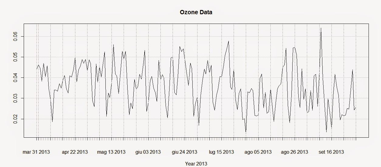
plot(Ozone.TS,main="Ozone Data",sub="Year 2013")

The first line creates the time-series using the Ozone data and the DATE column we created above. The second line plots the time-series and produces the image below:


To extract the dates of the object Ozone we can use the function index and we can use the function coredata to extract the ozone values.

index(Ozone.TS)
 Date[1:183], format: "2013-03-31" "2013-04-01" "2013-04-02" "2013-04-03" ...
 
coredata(Ozone.TS)
 num [1:183, 1] 0.044 0.0462 0.0446 0.0383 0.0469 ...


Subsetting the time-series is super easy in the package xts, as you can see from the code below:

Ozone.TS['2013-05-06'] #Selection of a single day
 
Ozone.TS['2013-03'] #Selection of March data
 
Ozone.TS['2013-05/2013-07'] #Selection by time range

The first line extracts values for a single day (remember that the format is year-month-day); the second extracts values from the month of March. We can use the same method to extract values from one particular year, if we have time-series with multiple years.
The last line extracts values in a particular time range, notice the use of the forward slash to divide the start and end of the range.

We can also extract values by attributes, using the functions index and coredata. For example, if we need to know which days the ozone level was above 0.03 ppm we can simply use the following line:

index(Ozone.TS[coredata(Ozone.TS)>0.03,])

The package xts features some handy function to apply custom functions to specific time intervals along the time-series. These functions are: apply.weekly, apply.monthly, apply.quarterly and apply.yearly

The use of these functions is similar to the use of the apply function. Let us look at the example below to clarify:

apply.weekly(Ozone.TS,FUN=mean)
apply.monthly(Ozone.TS,FUN=max)

The first line calculates the mean value of ozone for each week, while the second computes the maximum value for each month. As for the function apply we are not constrained to apply functions that are available in R, but we can define our own:

apply.monthly(Ozone.TS,FUN=function(x) {sd(x)/sqrt(length(x))})

in this case for example we can define a function to calculate the standard error of the mean for each month.

We can use these functions to create a simple plot that shows averages for defined time intervals with the following code:

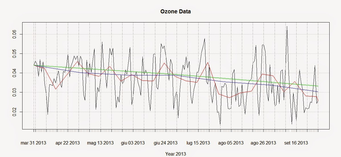
plot(Ozone.TS,main="Ozone Data",sub="Year 2013")
lines(apply.weekly(Ozone.TS,FUN=mean),col="red")
lines(apply.monthly(Ozone.TS,FUN=mean),col="blue")
lines(apply.quarterly(Ozone.TS,FUN=mean),col="green")
lines(apply.yearly(Ozone.TS,FUN=mean),col="pink")

These lines return the following plot:


From this image it is clear that ozone presents a general decreasing trend over 2013 for this particular station. However, in R there are more precise ways of assessing the trend and seasonality of time-series.

Trends
Let us create another example where we use again the function download.EPA to download NO2 data over 3 years and then assess their trends.

NO2.2013.DATA <- download.EPA(year=2013,property="no2",type="daily")
NO2.2012.DATA <- download.EPA(year=2012,property="no2",type="daily")
NO2.2011.DATA <- download.EPA(year=2011,property="no2",type="daily")
 
ADDRESS = "2 miles south of Ouray and south of the White and Green River confluence"  #Copied and pasted from the interactive map
NO2.2013 <- NO2.2013.DATA[paste(NO2.2013.DATA$Address)==ADDRESS&paste(NO2.2013.DATA$Event.Type)=="None",]
NO2.2012 <- NO2.2012.DATA[paste(NO2.2012.DATA$Address)==ADDRESS&paste(NO2.2012.DATA$Event.Type)=="None",]
NO2.2011 <- NO2.2011.DATA[paste(NO2.2011.DATA$Address)==ADDRESS&paste(NO2.2011.DATA$Event.Type)=="None",]
 
 
NO2.TS <- ts(c(NO2.2011$Arithmetic.Mean,NO2.2012$Arithmetic.Mean,NO2.2013$Arithmetic.Mean),frequency=365,start=c(2011,1))

The first lines should be clear from we said before. The only change is that the time-series is created using the function ts, available in base R. With ts we do not have to create a column of class Date in our dataset, but we can just specify the starting point of the time series (using the option start, which in this case is January 2011) and the number of samples per year with the option frequency. In this case the data were collected daily so the number of times per year is 365; if we had a time-series with data collected monthly we would specify a frequency of 12.

We can decompose the time-series using the function decompose, which is based on moving averages:

dec <- decompose(NO2.TS)
plot(dec)

The related plot is presented below:


There is also another method, based on the loess smoother (for more info: Article) that can be accessed using the function stl:

STL <- stl(NO2.TS,"periodic")
plot(STL)

This function is able to calculate the trend along the whole length of the time-series:


Conclusions
This example shows how to download and access the open pollution data for the US available from the EPA directly from R.
Moreover we have seen here how to map the locations of the stations and subset the dataset. We also looked at ways to perform some introductory time-series analysis on pollution data.
For more information and material regarding time-series analysis please refer to the following references:

A Little Book of R For Time Series

Analysis of integrated and cointegrated time series with R

Introductory time series with R


R code snippets created by Pretty R at inside-R.org

Friday, 15 May 2015

Interactive maps for the web in R

Static Maps
In the last post I showed how to download economic data from the World Bank's website and create choropleth maps in R (Global Economic Maps).
In this post I want to focus more on how to visualize those maps.

Sp Package
Probably the simplest way of plotting choropleth maps in R is the one I showed in the previous post, using the function ssplot(). For example with a call like the following:

library(sp)
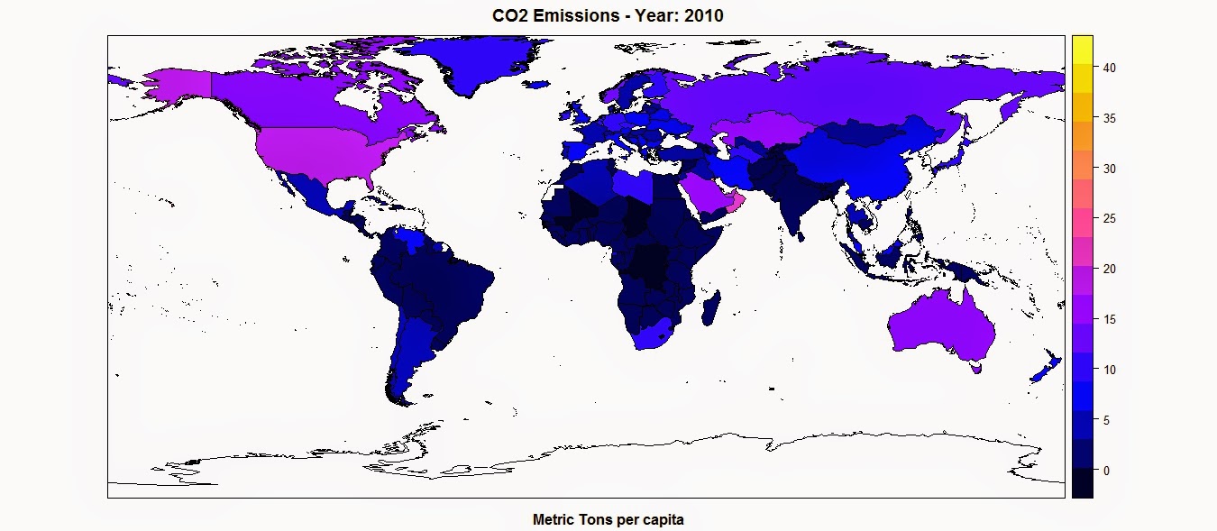
spplot(polygons,"CO2",main=paste("CO2 Emissions - Year:",CO2.year),sub="Metric Tons per capita")

This function takes the object polygons, which is a SpatialPolygonsDataFrame, and in quotations marks the name of the column where to find the values to assign, as colors, to each polygon. This are two basic mandatory elements to call the function. However, we can increase the information in the plot by adding additional elements, such as a title, option main, and a sub title, option sub.

This function creates the following plot:

The color scale is selected automatically and can be changed with a couple of standard functions or using customized color scales. For more information please refer to this page: http://rstudio-pubs-static.s3.amazonaws.com/7202_3145df2a90a44e6e86a0637bc4264f9f.html


Standard Plot
Another way of plotting maps is by using the standard plot() function, which allows us to increase the flexibility of the plot, for example by customizing the position of the color legend.
The flip side is that, since it is the most basic plotting function available and it does not have many built-in options, this function require more lines of code to achieve a good result.
Let's take a look at the code below:

library(plotrix)
CO2.dat <- na.omit(polygons$CO2)
colorScale <- color.scale(CO2.dat,color.spec="rgb",extremes=c("red","blue"),alpha=0.8)
 
colors.DF <- data.frame(CO2.dat,colorScale)
colors.DF <- colors.DF[with(colors.DF, order(colors.DF[,1])), ]
colors.DF$ID <- 1:nrow(colors.DF)
breaks <- seq(1,nrow(colors.DF),length.out=10)
 
 
jpeg("CO2_Emissions.jpg",7000,5000,res=300)
plot(polygons,col=colorScale)
title("CO2 Emissions",cex.main=3)
 
legend.pos <- list(x=-28.52392,y=-20.59119)
legendg(legend.pos,legend=c(round(colors.DF[colors.DF$ID %in% round(breaks,0),1],2)),fill=paste(colors.DF[colors.DF$ID %in% round(breaks,0),2]),bty="n",bg=c("white"),y.intersp=0.75,title="Metric tons per capita",cex=0.8) 
 
dev.off()


By simpling calling the plot function with the object polygons, R is going to create an image of the country borders with no filling. If we want to add colors to the plot we first need to create a color scale using our data. To do so we can use the function color.scale() in the package plotrix, which I used also in the post regarding the visualization seismic events from USGS (Downloading and Visualizing Seismic Events from USGS ). This function takes a vector, plus the color of the extremes of the color scale, in this case red and blue, and creates a vector of intermediate colors to assign to each element of the data vector.
In this example I first created a vector named CO2.dat, with the values of CO2 for each polygon, excluding NAs. Then I feed it to the color.scale() function.

The next step is the creation of the legend. The first step is the creation of the breaks we are going to need to present the full spectrum of colors used in the plot. For this I first created a data.frame with values and colors and then I subset it into 10 elements, which is the length of the legend.
Now we can submit the rest of the code to create a plot and the legend and save it into the jpeg file below:


Interactive Maps
The maps we created thus far are good for showing our data on papers and allow the reader to have a good understanding of what we are trying to show with them. Clearly these are not the only two methods available to create maps in R, many more are available. In particular ggplot2 now features ways of creating beautiful static maps. For more information please refer to these website and blog posts:
Maps in R
Making Maps in R
Introduction to Spatial Data and ggplot2
Plot maps like a boss
Making Maps with R

In this post however, I would like to focus on ways to move away from static maps and embrace the fact that we are now connected to the web all the times. This allow us to create maps specifically design for the web, which can also be much more easy to read by the general public that is used to them.
These sort of maps are the interactive maps that we see all over the web, for example from Google. These are created in javascript and are extremely powerful. The problem is, we know R and we work on it all the time, but we do not necessarily know how to code in javascript. So how can we create beautiful interactive maps for the web if we cannot code in javascript and HTML?

Luckily for us developers have create packages that allow us to create maps using standard R code but n the form of HTML page that we can upload directly on our website. I will now examine the packages I know and use regularly for plotting choropleth maps.


googleVis
This package is extremely simple to use and yet capable of creating beautiful maps that can be uploaded easily to our website.
Let's look at the code below:

data.poly <- as.data.frame(polygons)
data.poly <- data.poly[,c(5,12)]
names(data.poly) <- c("Country Name","CO2 emissions (metric tons per capita)")
 
map <- gvisGeoMap(data=data.poly, locationvar = "Country Name", numvar='CO2 emissions (metric tons per capita)',options=list(width='800px',heigth='500px',colors="['0x0000ff', '0xff0000']"))
plot(map)
 
print(map,file="Map.html")
 
#http://www.javascripter.net/faq/rgbtohex.htm
#To find HEX codes for RGB colors

The first thing to do is clearly to load the package googleVis. Then we have to transform the SpatialPolygonsDataFrame into a standard data.frame. Since we are interested in plotting only the data related to the CO2 emissions for each country (as far as I know with this package we can plot only one variable for each map), we can subset the data.frame, keeping only the column with the names of each country and the one with the CO2 emissions. Then we need to change the names of these two columns so that the user can readily understand what he is looking at.
Then we can simply use the function gvisGeoMap() to create a choropleth maps using the Google Visualisation API. This function does not read the coordinates from the object, but we need to provide the names of the geo locations to use with the option locationvar, in this case the Google Visualisation API will take the names of the polygons and match them to the geometry of the country. Then we have the option numvar, which takes the name of the column where to find the data for each country. Then we have options, where we can define various customizations available in the Google Visualisation API and provided at this link: GoogleVis API Options
In this case I specified the width and height of the map, plus the two color extremes to use for the color scale. 
The result is the plot below:


This is an interactive plot, meaning that if I hover the mouse over a country the map will tell me the name and the amount of CO2 emitted. This map is generated directly from R but it all written in HTML and javascript. We can use the function print(), presented in the snippet above, to save the map into an HTML file that can upload as is on the web.
The map above is accessible from this link:  GoogleVis Map


plotGoogleMaps
This is another great package that harness the power of Google's APIs to create intuitive and fully interactive web maps. The difference between this and the previous package is that here we are going to create interactive maps using the Google Maps API, which is basically the one you use when you look up a place on Google Maps.
Again this API uses javascript to create maps and overlays, such as markers and polygons. However, with this package we can use very simple R code and create stunning HTML pages that we can just upload to our websites and share with friends and colleagues.

Let's look at the following code:

library(plotGoogleMaps)
 
polygons.plot <- polygons[,c("CO2","GDP.capita","NAME")]
polygons.plot <- polygons.plot[polygons.plot$NAME!="Antarctica",]
names(polygons.plot) <- c("CO2 emissions (metric tons per capita)","GDP per capita (current US$)","Country Name")
 
#Full Page Map
map <- plotGoogleMaps(polygons.plot,zoom=4,fitBounds=F,filename="Map_GoogleMaps.html",layerName="Economic Data")
 
 
#To add this to an existing HTML page
map <- plotGoogleMaps(polygons.plot,zoom=2,fitBounds=F,filename="Map_GoogleMaps_small.html",layerName="Economic Data",map="GoogleMap",mapCanvas="Map",map.width="800px",map.height="600px",control.width="200px",control.height="600px")

Again there is a bit of data preparation to make. Again we need to subset the polygons dataset and keep only the variable we would need for the plot (with this package this is not mandatory, but it is maybe good to avoid large objects). Then we have to exclude Antarctica, otherwise the interactive map will have some problems (you can try and leave it to see what it does and maybe figure out a way to solve it). Then again we change the names of the columns in order to be more informative.

At this point we can use the function plotGoogleMaps() to create web maps in javascript. This function is extremely simple to use, it just takes one argument, which is the data.frame and creates a web map (R opens the browser to show the output). There are clearly ways to customize the output, for example by choosing a level of zoom (in this case the fiBounds option needs to be set to FALSE). We can also set a layerName to show in the legend, which is automatically created by the function.
Finally, because we want to create an HTML file to upload to our website, we can use the option filename to save it.
The result is a full screen map like the one below:


This map is available here: GoogleMaps FullScreen


With this function we also have ways to customize not only the map itself but also the HTML page so that we can later add information to it. In the last line of the code snippet above you can see that I added the following options to the function plotGoogleMaps():

mapCanvas="Map",map.width="800px",map.height="600px",control.width="200px",control.height="600px"


These options are intended to modify the aspect of the map on the web page, for example its width and height, and the aspect of the legend and controls, with controls.width and controls.height. We can also add the id of the HTML <div> element that will contain the final map.
If we have some basic experience with HTML we can then open the file and tweak a bit, for example by shifting map and legend to the center and adding a title and some more info.


This map is available here: GoogleMaps Small

The full code to replicate this experiment is presented below:

 #Methods to Plot Choropleth Maps in R  
 load(url("http://www.fabioveronesi.net/Blog/polygons.RData"))  
   
 #Standard method  
 #SP PACKAGE  
 library(sp)  
 spplot(polygons,"CO2",main=paste("CO2 Emissions - Year:",CO2.year),sub="Metric Tons per capita")  
   
   
 #PLOT METHOD  
 library(plotrix)  
 CO2.dat <- na.omit(polygons$CO2)  
 colorScale <- color.scale(CO2.dat,color.spec="rgb",extremes=c("red","blue"),alpha=0.8)  
   
 colors.DF <- data.frame(CO2.dat,colorScale)  
 colors.DF <- colors.DF[with(colors.DF, order(colors.DF[,1])), ]  
 colors.DF$ID <- 1:nrow(colors.DF)  
 breaks <- seq(1,nrow(colors.DF),length.out=10)  
   
   
 jpeg("CO2_Emissions.jpg",7000,5000,res=300)  
 plot(polygons,col=colorScale)  
 title("CO2 Emissions",cex.main=3)  
   
 legend.pos <- list(x=-28.52392,y=-20.59119)  
 legendg(legend.pos,legend=c(round(colors.DF[colors.DF$ID %in% round(breaks,0),1],2)),fill=paste(colors.DF[colors.DF$ID %in% round(breaks,0),2]),bty="n",bg=c("white"),y.intersp=0.75,title="Metric tons per capita",cex=0.8)   
   
 dev.off()  


 #INTERACTIVE MAPS  
 #googleVis PACKAGE  
 library(googleVis)  
   
 data.poly <- as.data.frame(polygons)  
 data.poly <- data.poly[,c(5,12)]  
 names(data.poly) <- c("Country Name","CO2 emissions (metric tons per capita)")  
   
 map <- gvisGeoMap(data=data.poly, locationvar = "Country Name", numvar='CO2 emissions (metric tons per capita)',options=list(width='800px',heigth='500px',colors="['0x0000ff', '0xff0000']"))  
 plot(map)  
   
 print(map,file="Map.html")  
   
 #http://www.javascripter.net/faq/rgbtohex.htm  
 #To find HEX codes for RGB colors  


 #plotGoogleMaps  
 library(plotGoogleMaps)  
   
 polygons.plot <- polygons[,c("CO2","GDP.capita","NAME")]  
 polygons.plot <- polygons.plot[polygons.plot$NAME!="Antarctica",]  
 names(polygons.plot) <- c("CO2 emissions (metric tons per capita)","GDP per capita (current US$)","Country Name")  
   
 #Full Page Map  
 map <- plotGoogleMaps(polygons.plot,zoom=4,fitBounds=F,filename="Map_GoogleMaps.html",layerName="Economic Data")  
   
   
 #To add this to an existing HTML page  
 map <- plotGoogleMaps(polygons.plot,zoom=2,fitBounds=F,filename="Map_GoogleMaps_small.html",layerName="Economic Data",map="GoogleMap",mapCanvas="Map",map.width="800px",map.height="600px",control.width="200px",control.height="600px")  


R code snippets created by Pretty R at inside-R.org